Friends,
I was trying to think of something that might create a bit of "imperial entertainment" for those who may not have a big interest in pre-1918 collectibles, such as medals and uniforms, etc, etc... Many of our members concern themselves chiefly with collecting and studying various aspects of the National Socialist-period, 1933-1945. As these forums are mainly dedicated to areas of German military-history just prior to, and during the Second World War, I thought perhaps we could take a look at some of the early images that may have influenced those who also lived during that later time period..?
Take for instance Himmler's obsession with German culture - what were the things that fascinated not only the RFSS, but his entire generation? Certainly artistic interpretation added its profound impact to the printed word - renderings of brave heroes, warriors from the epic Nordic sagas, tales of Germanic knighthood and the lore of all things Aryan ... I believe the affect of the imperial graphic and visual-arts was a definitive contributing factor in shaping the perceptions of those that took the reins of the NS hierarchy. Darwin's radical new theories were still a juicy topic for discussion in coffee-houses throughout Europe, as were brilliant, new scientific discoveries. Nature's influence flourished in the decorative arts, the naturalistic-style of illustration and design prevalent in most examples of Nouveau and Jugenstil arts and crafts.
Periodicals, magazines, books and newspapers were the greatest influences on the masses at the turn of the century and the majority of them were illustrated with artwork of one kind or another. Pen and ink line-illustrations, oil paintings and watercolors, engravings, etchings and myriads of lithographs, wood-cuts and crayon drawings - all played a part in the graphic-related industries.. Each concept easily worth a thousand words or more, many of these illustrations can be taken as well-defined reflections of current topics and events of those heady times.
So let's take a look at a few that I've nicked for the occasion ... sshhh!

Please share your thoughts and favorite pics with us, too. How hard can it be to pop something into your scanner? Give us your take on these early sources of NS influence and interest. Remember, no photos please, artwork only.
Some of these are a bit small but ... beggars can't be choosers ... nevertheless, hope you enjoy!
Bill
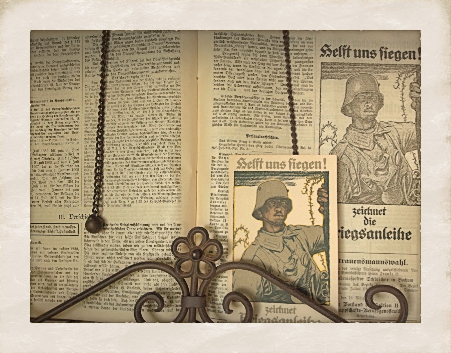
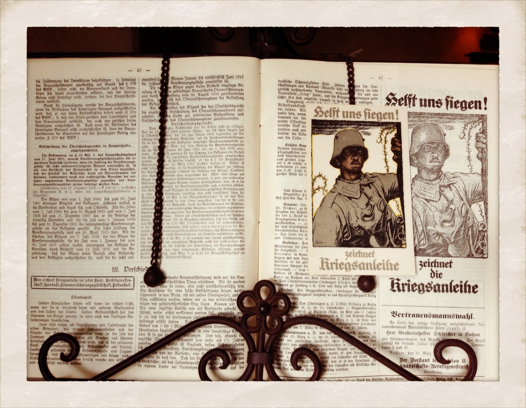
1/3 ... early German soldier

2/3 ... Bayerischer Soldat

3/3
Wotan and his ravens, Hugin & Munin. (thought and memory)

... Valkyries

... heh ...

Weapons and symbols of the Thirty-Years War ...

Gentlemen,
Sorry if nobody likes the images, I do ...
Maybe I can get a response on this little beauty? A nice pair of.., err, ah.. seahorses!

B~

They are great pictures. I agree that the obsession with Germanic culture; the past, fairy tails, etc. began long before the Third Reich and RF Himmler. Only he made a lot of it state funded and made certain aspect of it and its belief mandatory. At least for the General SS. Its sad in this age people do not care about culture at all really. The value culture, the arts, and even our own heroic past have, have cease to have a tremendous amount of value to anyone and especially to youth and today's popular culture. Too bad really. Anyways great pictures I really like them, but maybe I'm just one of those weird people that romanticize about the past and think it still holds some value.
I also really don't think it's that nobody likes these pictures, its just participation is down so much nowadays.

Something needs to be done to revive this forum, there has got to be a way. I have just always liked the set up of this forum over the others, the way the pages are viewed, etc.. Maybe I'm just nostalgic though.

Adam,
Thanks for your thoughts and kind response. You mention culture, or actually the lack of it today. heh... only time will tell, however, I'm sure there's something good going on somewhere out there? - Yeah, how about some of our own great and powerful cultural icons - Michael Jackson, Brittney, other tone-deaf singers in general, gangstas, buffoons, etc ... big smelly mounds of poop and pleez, ... spare me wid dat munchkin-brained cosmic debris!
It seems these days we're all pretty much fully occupied with our own unique and sometimes drastically normal work-a-day rat-races, or wheels-of-mis-fortune, or whatever the individual case may be? Work, get up, go to work again, on and on over and over, ad nauseum, ad infinitum ... well, for better or worse I've chosen this hobby and have stuck with it longer than many a passing fancy over the fleeting years. Hopefully I'd like to be able to pass on some of my small inspirations and personal triumphs to any who share the same kindred interests, but then again, maybe not? Leastwise, I'm willing to give 'er a go ...
For those who become really 'entranced/entrenced' in our hobby, we normally find most of the very sucessful boys keenly knowledgeable not only in their specific fields of interest, but also in many aspects of world history in general and European history, specifically. The more you know about how many different events in time interlock and actually influence one another, the greater your appreciation will be for some of the very things that we persue and collect. Seemingly insignificant details may add just the right icing on the cake, it's exactly why you'll see grown men get really jazzed about a simple number or code stamped into a seemingly common medal or dagger of some sort... it's all in the details, as one of our forum member's tag goes. Those are excellent words to live by if you're any kind of collector worth your salt.
I'd say learning about the culture of the people who's stuff we collect is imperative, that is, if we actually want to become even semi-serious about it, no? Yes, in that context it can be a most helpful and a valuable tool in our personal kitbag of collecting-tips. Knowing the mindset, terminology and general mood of the times may help you to make an important and costly decision someday in the future, maybe precisely when you're buying that ultra-rare presentation piece you've wanted and saved for all your life ... hmm?
From that perspective alone I'd say it'd be worth studying the years just prior to whatever era or period it is that you're interested in, too, as you'll make lots of new connections that way. Read and understand anything and everything from the time-slot that most grabs your fancy, Someday, an almost insignificant little detail might just pay off in trumps!
The past will always hold its value as long as there are those who have an appreciation for it.
Happy trails and good collecting to all you gents!
Bill
Hope this 1921 post card is along the lines of this thread.I don't know much about it but liked the art.

Dean,
Yes, you've nailed it exactly! Your postcard "Feuersprung zu Wintersonnwend" translates to, "fire-jumping at winter solstice," an old German ritual to celebrate the rebirth of the coming year. Large bonfires are built on the longest, darkest night of the year, the December solstice, an important link in nature's cycle.
Those who've given Himmler's SS more than a cursory glance will be able to explain the thoughts and reasoning behind some of these age-old traditions. This is the festival of JUL, the wheel, or turning of the cycle of life - hence, the Allach Julleuchter. The bonfire or flame represents the sun, and we are all likened to seeds in the earth, waiting to be reborn in the coming year, unlocking our potential for new, personal growth and strength. Himmler meant to rekindle many of these early Germanic customs through his Ahnenerbe staff, a powerful research department devoted to manufacturing evidence pointing to a direct German/Aryan link. The old boy was fascinated and consumed with these ideas, albeit many of their theories were completely contrived and patently false, nevertheless, they fueled his fertile and fevered imagination. Even Hitler made some snide comments over the Reichsf�hrer's obsession with early Germanic history.
Is there a date or anything printed on the back of the card? Sometimes that'll give you the publishers name or some indication of where the card originated?
Many thanks for your fine addition, I know it might not be easy finding something apropos to fit into this category.
Best!
Bill
The back of the Jung postcard is postmarked 1921.
It has correspondence,a small printers logo that looks 2 fingers holding what looks like a weight with a boy and lion (maybe.It's pretty small),and WIA under it.
On edge printed in very small letters is:
Wia-kunstlerkarten-Urlagg,Teplitz-Schonau.
Entmurf von Fr.Jung.
Here's something else that might be in the
renderings of brave heroes, warriors theme.
A exlibris dated 1915.
On the back of this one is:
Einzelpreis 10 Pfg.
Tiesdruck von O. Felsing, Charlottenburg.
Bill,where did you get the Wonton & his ravens photo?Nice one.

Dean,
Your ex libris bookplate is outstanding, the old Germanic warrior is the "Protector of German Spiritual Quality."
Gotta love that helmet ...
In the line, "Tiesdruck von O. Felsing, Charlottenburg." I'm fairly certain the first word should be spelled, Tiefdruck, with an "F."
That would translate to photogravure or intaglio, both are printing methods.
I found that nice graphic of Wotan on eBay,
someone was selling old German prints from the Art Nouveau publication, "Jugend." I told you I nicked them ...

Do you think you could possibly scan your ex libris plate on a good flatbed scanner and send me the file, please? I'd really enjoy taking a good look at the details on that one.

nice!
Keep 'em coming if you can?
Thanks!
Bill
Another postcard dated 1915 with Germania and eagles.The corrspondence on back was nice in my book so I included it too.

Back

Von Stuck

Other side

Dean,
You've really been busy at this for a good long while, haven't you? Those are definitely some excellent postcards, fantastic images.
Andrew Wyeth would have loved these old illustrations. Did you know he was a big fan of Paul Casberg, the German military artist? When I showed Herr Wyeth some of Casberg's illustrated mounted cavalry troops, he instantly fell in love with the horse paintings and begged me to get him a copy of the old imperial-aged book. I did ...
Franz Stuck's brilliant Medusa is especially frightening, that is one crazy-looking lady, Jesus ..! man, I would beat-feet if I knew she was even anywhere near the neighborhood! Some neat looking European vipers for her hairdo - I wonder what she feeds those buggers?
I'll have to go on another "treasure hunt" for more nice early images as soon as I can find a bit of time again...
This type of artwork is a great complement to the finest of militaria collections. One or two of the old German masters will certainly lend due creedence to the respectability to our much-maligned hobby.
Great stuff here, thanks!
Bill
Couldn't resist, what a great caricature of Kaiser Willi ...

Here my 'German War Bond Drive /Request ' art postcard .

It was never sent through the mail , but a soldier had started to write a note to his Dad --but never finished it !

A 'Feld-postcard 'showing the a drawing of the cityhall in Hamburg with a airship added in the sky !
Here the card >

It was sent through the mail.
Here the cards backside section .

Here now a small package box .

..and close-up of the 'German ' lefthand side .

....and the ' Austrian ' righthand side .

Bernd,
Very nice, I especially like the "war-bond"
card, it's a great illustration of an observer-gunner. I like the little finishing touches on the courthouse in Hamburg postcard. Nice how they worked the national colors - schwarz, weiss, rot, into the border rules. Your mailing label is in great shape, too. Bold bright colors indicate that this example has been well cared for over the years ...
Hope you might have some more examples that you can share with us... many thanks!
Bill
Bill : Thank you for your kind remarks .
Here now a 'little' art piece from my Grandfather's letter seal collection . I assume he gave some money to get this token ; he did live in Berlin .

Now I have 3 tabel display books , very thick and heavy , that I got from my other Grandfather who served on the frontlines in Belgium . These are very detailed about the entire WWI history as seen from the German side , with many photos , drawings and maps . The 3rd volume was actual printed after the war .

...and a close-up .

..and artist's name .

Now a black pencil drawing I got about a year ago . It is small like 8- by 9-inches . I can not make out the artist's name , only 1917.

...and a close up of this intense face !

Here now again a black pencil drawing of a WWI soldier : Heinrich Rueter .I got to know him as an older man , retired teacher in Luebeck , and good friend of the family .

...and a close-up again .

...and close-up of the artist's name .

Here's one of prince Wilhelm as a knight
Gary
.jpg "img048_(Large).jpg")
The Kaiser is on parade
.jpg "img049_(Large).jpg")
Here's another of the Kaiser from the same book.
.jpg "img050_(Small).jpg")
Bernd-
It's always great to see that penciled art of the soldier with the helmet.
The artist really got the battle hardend stare right on.
Are these 2 drawings by the same artist?
Gentlemen,
Glad to see these very impressive additions!
Bernd - that's a treasure-trove of personal items. Those are always the most valued and special things that one can have in a good collection. I have a small photo of my father in uniform in 1942, and a pencil drawing of him as a prisoner-of-war in Russia in 1947, done by a Luftwaffe master-sergeant in the same camp outside of Moscow. As small as these items are, I'd like for someone special to have them after I take that last ride into the unknown ...
What a cover illustration on that book, I wonder what type of printing method they used on it, printed on linen I'd imagine? I can't even see any scuffing on it..? The two pencil drawings are really lovely. The soldier bust is just so damn dynamic and powerful. One quick glance and your mind is running in fifteen different directions with questions and observations - precisely what good art should do, make you think!
Gary, I'm glad to see that you found some time to share with us, though, unfortunately I've got to hop into the shower and go 'a-printin'...
I'll get back to your illustrations a bit later on.
Carry on mates!
W~
Gary,
Three good patriotic illustrations of the two Kaisers, Wilhelm I and his successor, Wilhelm II.
At the time that these early drawings/engravings were produced, commercial photography was just gaining ground in the field of graphic arts. We're just starting to see photographic images coming into their own. The recently complete American Civil War was the testing-gound that proved the camera's viability. After that time a good photo could capture and stimulate the imagination as well as any of the finest of artistic, illustrative mediums. Sadly, something profound was lost.
With the advent of this or any other new technology, old ways and methods are superceeded and eventually discarded, for better or worse ...
Though, what photograph could surpass your third rendering of what looks to be Wilhelm and Bismarck sharing the limelight among the heads of state and military captains - no doubt celebrating their victory of the Franco-Prussian War of 1871? The complexity of this drawing and attention to detail is nothing short of astonishing, the shield and crown study in the foreground is a work of art in itself! The battle flags and standards that compose the background are simply amazing. It seems this artist's talent was almost boundless. How did he ever remember this colossal scene so well as to produce this vivid masterpiece? What about those ever-so-subtle personal touches, for instance, highlighting the Kaiser and his Iron Chancellor among all those bodies? Somehow the artist immediately draws our attention onto the two main subjects, there's a pre-planned yet very natural flow and movement there. Exceptional. There's so much symbolism depicted in there that truly it's cup runneth over!
It's hard to imagine that artwork like this wouldn't bring out the national patriot in everyman..? "united we stand..." and all that good stuff.., all brought to you by mind's eye.
Some mighty fine examples so far fellas!
Remember that famous line from "Night of the Generals," when Gen. Tanz says, "I must see decadent art ..!" ha!
Bill
1926 Postcard

Dean,
Nice postcard, the first Turnerbund example that I've seen or really looked at, I think? At first I thought it was produced a little later - the brownshirts would have loved this imagery. The type-font the artist created is a stylized runic alphabet, something one would expect from the SS, nicht? The saying sounds like some of those stern "Hitler-quote" cards that were fairly common at the time. This one boldly states, "The Last Victory Lies in the Sword." ... pretty heavy stuff for a gymnastics organization. Here, I'd say the sword has just cut through the binding Allied chain that was meant to crush the German spirit after WWI.
Great sunwheel-swastika, too. It reminds you of the outstanding Luftwaffe sword pommel design. There's a great Turnerbund tinnie that's a large, heavy depiction of their unique sunwheel - it's a very nice unit for those who like a good tinnie, still fairly inexpensive, too.
I think it's a great illustration, you can really feel the power and jubilant force in that painting. I'd think that by 1926 the Allied yoke was becoming just about unbearable for many Germans, especially any towns, industries or areas that were still under direct supervision for repaying the war-debt, and what a debt it was!
Many thanks for taking time to post.
B~
Bill-
Appreciate your time and input from a historian and graphic artist point of view.
Also, thanks for all the great art related contributions to the forum.
Great stuff and a pleasure to read about and view.
Dean,
My pleasure, thanks.
Time for a few more methinks?
For you NSFK aficionados out there, our old friend Icarus. I think the brownshirts may have chosen the wrong hero to use as their logo, after all, didn't this guy crash and burn?
... bad ju-ju from the get-go, ha!
... and a few more images for good measure.
Best!
Wm.

2/4

3/4

4/4

Nice art Bill.
I was hoping this thread would pick up again.
Those stamps are the coolest.
Can't get enough of this sort of thing.
Much appreciated.
Gents,
I apologize in advance, this won't be one of those inspiring heroic images like some of those above ...
This is just a neat old simple and direct graphic image that I found and thought was pretty cool. Very simplistic but right to the point, a vacuum-cleaner called the "vampire." Gauranteed to suuuck-up all that nasty stuff right out of your rugs and carpets!
I trust more of you gentlemen will share your goodies with us in all the forums during the upcoming New Year, 2010. I look forward to any and all contributions to the Imperial section you may care to make and I sincerely wish each and everyone of you boys the best collecting year ever! (even though the economy is in the dumper)
Best!
Wm. Warda, Jr.

Nice stuff guys! I think we still have our old vacuum cleaner somewhere.
We can't forget some of the old notes have some very nice art work as well.

.

Mikee,
Superb engraving on these fine notes, got any more? For a hundred Marks you could have almost paid for a nice Turkish Damascus Heer dagger back in the day ...
Have a great New Year!
Bill
Bill,
I sure wish I had a time machine!
I found a stash of stuff I forgot about until I opened it all up along with these notes and probably have more somewhere. Which reminds me to kindly ask Gaspare if he would translate a bronze Russian table medal that was among this stuff. That is if I can remember were I laid it down.
Isn�t that something, I really need to tell my wife to be more mindfull of this stuff.
Happy New Year to you as well!
,,Great images guys. An inspiring thread!
I'll post my contributions when able.
Cheers and Happy 2010 to All.
I'm already looking forward to seeing some new images of allsorts in the New Year. Hope I can get things rolling along on this first day with a lovely snapshot by a German Weimar-period photographer.
Best!
Bill

There's no doubt if you enjoy German 20th century graphic and visual arts, the Notgeld bills will provide some of the finest, striking colorful examples - Notgeld or "emergency-money," (pronounced note-gelt) was issued through national, state, local and private channels to financially assist Germans during the lean years after the First World War.
Often these bills portray a wide range of images from the pages of German history - legends, events, geography, family names, companies, large regional and small district advertising, children's tales, religion, industry, etc, etc... Many various styles, themes and artistic concepts can also be seen that reflect the "V�lkish-movement," that came to be so heralded and cherished by the "browns" of the NS regime.
Much larger than stamps, (for us old dogs with faltering peepers to enjoy) collecting these brilliant gems is still very affordable, at times they're downright bargains! Even common tinnies in good shape are expensive when compared to these vibrant historic illustrations.
There's much to be enjoyed in this area of collecting with lots of pertinent information out there on the web to help those with an interest. Lots of good articles have been written on the subject in militaria-related periodicals as of late, too.
Hope you might enjoy these ...
Bill

2/15

3/15

4/15

5/15

6/15

7/15

8/15

9/15

10/15

11/15

12/15

13/15

14/15

15/15
sorry for the miscalculation fellas ...
this last one doesn't qualify as Notgeld, just a nice illustration.
B~

Another area to see very good examples of German graphic art is/are, early 20th century bookplates. Some are intricate, some very simple, and above all entertaining to say the least.
Subject matter as wide and broad as the imagination! Another unique aspect is that we can take a peak into the favorite personal themes of the named individual, who marked his/her property with these noteworthy illustrations.
Woodblock, intaglio, line-art and so many other fine and difficult hand printing methods it literally boggles the mind. Naturally, only applicable with the pre-existing notion that you like this stuff too, heh ...
Good collecting gents!
B~

2/2

quote:
Originally posted by WWII:
Subject matter as wide and broad as the imagination! Another unique aspect is that we can take a peak into the favorite personal themes of the named individual, who marked his/her property with these noteworthy illustrations.
Woodblock, intaglio, line-art and so many other fine and difficult hand printing methods it literally boggles the mind. Naturally, only applicable with the pre-existing notion that you like this stuff too, heh ...
Good collecting gents!
B~
Oh I like the stuff.
Thanks for posting the cool images.
Really like hearing your input as a professional on the artistry and printing methods of the past.Great subject matter.
I love the beautiful exlibris you posted and am jealous I don't have it.
In trying to match the favor for posting it.. here's mine.

Oh my,I'm drooling. Fantastic stuff! More! More! More! Please!
Happy to oblige Mikee.
Kreigsbote-Spectre of war.
I wonder what reason someone would have to send out a postcard like this.
Maybe shows revolution was in the air.

Dean,
Thanks, that's a neat item,a War Messenger with flaming sword and torch. What's on the back of the post card? Their was a German newspaper called Der Kriegsbote(War Messenger).
quote:
Originally posted by WWII:
Woodblock, intaglio, line-art and so many other fine and difficult hand printing methods it literally boggles the mind.B~
As a graphic artist can you show or tell me of something that demonstrates this concept and breifly explain why.
I enjoy 'good art' but know virtually nothing about what makes a print complex or simple.
I believe that it would be difficult to briefly explain all of the different styles of print making. It is way to easy to get off on a tangent of the nuances of various printing techniques and how they affect the image.
Dean,
As SteveRay correctly pointed out, briefly explaining the different methods of reproducing artwork would be a daunting and lengthy task. While some of the basic principles remain basically the same, the methods can range far and wide. I'll touch briefly on a couple techniques, but then I'd like to pose my own question to the forum members who might read this thread.
The level of printing difficulty can range from reproducing a simple, spontaneous charcoal line sketch or pen and ink drawing printed in a single color, to a complex, multi-colored, hand-engraving or wood-cutting process that requires much forethought, exact planning and perfect registration of the colors. A photograph, oil painting or watercolor has to be converted into some type of mechanical process for reproduction, depending on the type of press and printing process that will be used to reproduce the image. The original artwork can be photgraphed or scanned by a computer, and then reassembled into a series of dot or other halftone patterns, set at specific angles for each of the colors. Normally the colors that are used are cyan, magenta, yellow and black - this is called the four-color process, and in most instances will yield pleasing, professional results. Each color in turn has to be perfectly registered, one on top of the other so that those pre-angled screen patterns will re-align into a faithful reproduction of the original. This is the standard for offset printing and is only one small facet of the various reproduction methods.
At times certain colors found in an original will change slightly and subtly when the printer prepares a work for his mechanical process. At times a complex work will call for the addition of more screen-angled plates, in order to print more colors to achieve success at matching the original's color nuances. This is where it starts to get tricky and at times extremely difficult. I've seen fine art collotype reproductions that took over twenty-five different colors to match an original, a very exacting and expensive process, but the end result is exquisite. This is an old, seldom used process simply due to it's complexity, difficulty and cost, like so many other time-consuming crafts and artforms that have fallen by the wayside.
I believe the bookplate that you posted was produced by some kind of engraving process, in which case the artist will grave and cut that image into some sort of metal master plate. The metal can range from hardened steel to a much softer copper for example, but each line has to be hand cut to a proper depth to receive and correctly transfer the ink onto to paper or printing substrate. (plastics and other synthetic materials can also be used as plates) Cutting into the metal can be similar to engraving a rifle or firearm, however, in reverse. The plate is then properly inked, the paper positioned and then must come into contact with the plate under a very precise and uniform pressure to evenly transfer the ink onto the surface of the paper. One small mis-step in any of the pre-press operations can result in abject failure and misery. The engraving, ink, pressure and paper also have to be compatible to achieve a proper result.
Now, it's time for my question to you, simply, what makes art good? Is it the artist, the medium or technique? Perhaps it's the composition, structure and balance? Or is it simply the message that's conveyed to the viewer/interpreter/us? The styles and ingenuity that can be utilized to produce a piece of art are as varied as the subject matter. What is it then that ultimately captures our imaginations when we look at an image? What is it that causes us to think either this is very good, or just more mediocre talent and/or horrible trash? That's what I'd like to hear from you gentlemen, what are your opinions? In the end isn't it all about what the individual viewer sees and interperates for him/her self?
Best regards!
Bill
Ps - a few Belgian anti-German postcards to enjoy ...

2/3
"Outta here.."

3/3

My vote is for the message that's conveyed to the viewer.
All the better if this art has more qualities that are in addition to that aspect.
Thanks for helping in the understanding of the time and effort that went into some of these.
Probably the more it's understood the greater the appreciation will be?
Dean,
I agree, the message is exactly what's important to me, too. How does it relate to me on a personal level? What do I take from this
particular image and can I express that feeling verbally? Remember the old Confucius saying about a picture being worth a thousand words?
That's what I enjoy, other peoples descriptions and observations on a given subject, sort of like an excellent dagger description ...
a good verbal interpretation also paints a picture for me, everybody sees things from a different perspective. Take any ordinary household item, say a pencil. Could you describe that simple thing to a blind person, well enough so that that person could form a good, clear mental image of that object? Sometimes it's not easy, heh.
Yes, I also agree the more one can appreciate the difficult techniques behind a certain image or object, the more you will enjoy it. Exactly the same way as if you know the history behind a Knight's Cross and what it took to win one of those awards, then it becomes even more important/valuable/respected by us, the viewers.
Here's a lovely Aquarelle, (transparent watercolor) illustration by one of my favorites, Professor Sturm. Simply titled, "Silver Pheasant & Rhododendron."
Hope to hear what some of you may think about it?
Good collecting gents!
Bill

For me it's all about the subject matter, I'm not too worried about how it was made what form it takes or anything other than "Do I Like It", it's a simple matter really for me.
Gary
Bill-
Is this one of those jaw dropping,mind blowing prints with the highest of difficulty ratings?
Like you mentioned a picture is worth a 1000 words and if this is a labor intense print I think it's becoming a bit clearer now on why.
Also, you mentioned that some engravings are done with different metals.What would be the benefit of using a hard metal as opposed to a softer one?
Baz 69-
At first I would tend to agree that subject matter might be where it's at but what quality is it that sets apart when you have 2 peices with the same subject matter and favor one over the other?
Dean,
Believe it or not, the pheasant print is beautifully reproduced but still isn't at the highest skill-level of printing, though, I'd consider this example to rank just below the gold-standard. The printers who produced this graphic were master-journeymen and absolute tops in their profession.
Gary -
Yes, I agree with you to a certain extant and will try to explain ... first - do I like it, yes or no? (that's the easy part) Much like any of our other collectibles, the details are what it's all about after everything's said and done. I believe that's what Dean was saying -"Does the printing method add something additional to the image?" In which case I'd have to say yes, a small pinch of added flavor. To most, they couldn't give a tinker's darn and that's fair enough - if you like something, that's it, fini. But knowing a little bit more about it never hurt, eh? For instance, if you know all the details that go into producing one of those outstanding Imperial Hirschf�nger, you sort of appreciate it a bit more, nicht war? Attention to the myriads of producer-markings, stampings, codes and such is another detail that would add to the overall appeal of a fine hunting weapon, no?
True, in the end it all boils down to, "Do I like it..." ... but here my question is, why?
Sturm's Pheasant -
To my eye the symmetry, structure and balance of the decorative, Jugendstil iris-border is fantastic and stands all by itself. The lovely bird and flowers really pull one's concentration right into the heart of the painting and that bold spot of black on the fowl's head and chest makes for a powerful contrast, bold as brass. It really fastens the attention directly to the main subject. The anatomy and structure of the bird is excellent and the detail to the Rhododendron leaves, flowers and buds is near photographic quality, which I personally like. The pastel color-palette is so soft and yet vibrant and rich, an absolutely wonderful spectrum of pleasing tints. At once the whole thing has an enchanted, hazy look about it, while at the same time it's razor sharp and crystal clear. Almost like looking at an image while being in a dream-state ... nice, nice, nice! Something I could enjoy looking at for a long, long time.
Hope you might enjoy the Professor's classic illustration ... thanks fellas!
WWII
Bill
I know what I like but I don't know how to express why I like it???
I know exactly what you are saying, the hardship for most people is knowing exactly how it was produced in the first place, it's not always obvious and many a print has been mistaken for a painted picture. You would have to understand the nuances within the printing world to determine why you like one above the other before any conclusions could be drawn as to why you like it better. I agree that it's all about studying your subject, that way you can become informed on the nuances of that particular subject, I ask myself that basic question first, "do I like it" if the answer is yes and I think the item worth more research then I would delve more into it's manufacture, but still for me it is the most important fact to like it first. That's not to say I cannot appreciate the way it was produced, it's just hard to express myself because I know little of the method of manufacture.
I like most of the images posted within this thread to date, some are better than others, if it helps I like the images that are more lifelike that have good colour and are sharp in definition, I'm not sure I look too much past the composition and those traits listed above.
Gary
Gary,
Well put ...
... a few more nice birds by the Professor.
W~

Nice symmetry,nouveau styling,and realistic looking colors/birds on your latest post.
Old postcard.
Back reads: Hotel Prinz Wilhelm
Ernst Zierenberg
Berlin NW 7 Dorotheensrt.14
Then: 'Jlwerba' G.m.b.H Berlin S14
What do you guys think the eagle represents in this case?

I would think the eagle represents Germany ( spec. German dominance or German right to dominance)... flying over the west bank of the Rhine (Alsace) establishing that, as the caption indicates, "the Rhine (is) Germany's river, (but) not Germany's border". The "mission" of the German Siegfried-type defender, with the eagle shield, is then pretty obvious.
Hope this helps (..also hope this is at least somewhat accurate

)
Dean,
Roger's answer is right on the money ...
I also think the eagle represents the German nation, with its mighty champion battling a powerful unseen foe, his shield partially shattered and full of the enemy's arrows. The country will send its bravest warriors against any and all challenges that threaten her borders, this one in the southwest, namely France.
Another great nationalistic postcard to remind the Germans of what is/was rightfully theirs. I would think it indicates production sometime after the Versailles Treaty when the Alsace region was given back to the French. This beautiful area was hotly contested between the two nations. For long years the region had a history of going back and forth, on and on, depending on who was more powerful at the moment.
The eagle on the hero's shield looks to be Prussian but I'm not certain if it was meant to represent that of the royal house?
Nice powerful image, thanks for posting!
Bill
Great input and observations Foxart & WWII- Thank you
I just assumed it was an eagle kind of representing death coming to take a fatally wounded warrior off to Valhalla.
Appreciate you guys expanding the thoughts of a tiny mind.
quote:
Originally posted by WWII:
I also think the eagle represents the German nation, with its mighty champion battling a powerful unseen foe, his shield partially shattered and full of the enemy's arrows. The country will send its bravest warriors against any and all challenges that threaten her borders, this one in the southwest, namely France.
Bill
Good verbal interpretation Bill
Dean,
The fact that a few of us are enjoying these graphics pleases me no end ...
Good thing for us collectors the Germans were prolific at producing these postcard images, there are so many diverse themes to study and admire, plenty with military overtones, too. Some of those that are "staged" in a photographer's studio are very unique - having props, background-drops, great lighting as well as trick-photography methods that were no doubt "state-of-the-art" for that time period.
Here's a humorous example that I like that's titled, "A Strong Knocking-together," inferring the English, French and Russian dwarfs were going to get their collective heads bashed together ... and we all know how well that worked out ... heh..
The second is a plain, simple Easter greeting with military/patriotic motifs, most likely something one could purchase in the PX for a penny or two.
The third image is of Siegfried/Sigmund from Nordic Sagas which were found written on runic tablets, decyphered and then written into slightly different versions with character names changing regionally, here and there. This is the Icelandic version and the hero's name is Sigurd, whereas in the middle-high German version our champion's name is Siegfried, who slays the mighty dragon, Fafnir. These old tales are full of descriptions of legendary, powerful, magical swords and edged weapons that were painstakingly forged by sophisticated elves, dwarves and gnomes for both the heroes and villains of the stories. It's also one of the reasons why the sword is a common leitmotif in older German culture, especially in books and illustrations.
Borrowed this brief background on Sigurd/Siegfried that will give you a small taste for the Sagas ...
In the V�lsunga saga, Sigurd is the posthumous son of Sigmund and his second wife, Hiordis. Sigmund dies in battle when he attacks Odin (who is in disguise), and Odin shatters Sigmund's sword. Dying, Sigmund tells Hiordis of her pregnancy and bequeaths the fragments of his sword to his unborn son.
Sigurd agrees to kill Fafnir, who has turned himself into a dragon in order to be better able to guard the gold. Sigurd has Regin make him a sword, which he tests by striking the anvil. The sword shatters, so he has Regin make another. This also shatters. Finally, Sigurd has Regin make a sword out of the fragments that had been left to him by Sigmund. The resulting sword, Gram, cuts through the anvil. To kill Fafnir the dragon, Regin advises him to dig a pit, wait for Fafnir to walk over it, and then stab the dragon. Odin, posing as an old man, advises Sigurd to dig trenches also to drain the blood, and to bathe in it after killing the dragon; bathing in Fafnir's blood confers invulnerability. Sigurd does so and kills Fafnir; Sigurd then bathes in the dragon's blood, which touches all of his body except for one of his shoulders where a leaf was stuck. Regin then asked Sigurd to give him Fafnir's heart for himself. Sigurd drinks some of Fafnir's blood and gains the ability to understand the language of birds. Birds advise him to kill Regin, since Regin is plotting Sigurd's death. Sigurd beheads Regin, roasts Fafnir's heart and consumes part of it. This gives him the gift of "wisdom" (prophecy).
For anyone who collects German swords and daggers my best advice would be to read some of the old Norse legends, you'll gain a lot of insight into why the Germans held them in such high esteem.
Cheers!
Bill

2/2

3/3

Look at the facial expression of the head basher.Like he's having a great time.
Something art does to religion,mythology,& legends that for me makes it even more intresting and appealing.
Here's a postcard dealing with a German legend (I think) and is postaly dated 1905.
Not sure what the German text means but from breif online reading I think Lorelei drown herself in a river over love then turned into a siren that would sing hypnotic music that lured sailors to their death.

At Bacharach, a blonde sorceress there was,
Who made all men perish from love.
So the French poet Guillaume Apollinaire described the Lorelei, and so we see her, a golden-haired girl whose irresistible song attracted the vessels of the Rhine and led them to shipwreck.
Though the legend has probably lived in the hearts of Rhine sailors since antiquity, the Lorelei we know dates from the beginning of the 19th century. The famous crag overhanging the waters of the Rhine downstream from Bacharach was the subject of legends long before the Lorelei appeared on the scene, however.
Situated at one of the most dangerous passes in the Rhine, the rock inspired fear and curiosity because of its echo, which was believed to possess the powers of an oracle. When ships approached, passengers shouted questions about their fates. According to anonymous 12th century verses, dwarfs perched on the rock sent back answers through the echo. The crag also figured in the epic poem the Nibelungenlied. The hero, Siegfried, possessed a treasure, but the villain, Hagen, killed Siegfried and threw the treasure into the Rhine not far from the echoing rock.
In 1801, in his novel Godwi, the German poet Clemens Brentano published a ballad, "Lora-Lay,� set in medieval times. He claimed to have created the myth by leading his readers to believe that the Lorelei was a part of popular folklore. His heroine, "so beautiful and so slender," was summoned by the bishop on account of the havoc she was wreaking among the local menfolk.
My lord bishop, make me die;
I am weary of life,
For all must perish
Who gaze into my eyes.
The young girl, victim of an evil spell that was fatal even for her, had another reason to beg for death: her lover had been unfaithful and had left her. But the bishop, charmed like all the others, could not bring himself to condemn her to death and sent her to a convent. On her way, she climbed a rock to take one last look at the waters of the Rhine. On the horizon she perceived a sail, and thought her lover was returning.
My heart with joy is full,
That must, must be my love!
And then the lass bent down
And plunged into the Rhine.
To Brentano, who was twenty-three when he wrote the tale, the poor girl was the victim of her feelings and of her own gaze. She incarnated the curse of love. This theme was popular with other Romantics, who were fascinated by her at about the same age. Both Joseph Eichendorff and Apollinaire were twenty-two when they took up the tale, and the German poet Heinrich Heine was twenty-five. Eichendorff s contribution was significant because he added to the legend. In his version, put to music by Robert Schumann, the Lorelei is dressed in black with a white veil and wears a crown of pearls in her blond hair.
In Heine's version, the Lorelei is associated with the sirens of the Odyssey whose voices called sailors to their death. There is no longer anything about her magic gaze. Brentano's notion of the siren's fatal gaze was not taken up again until the 20th century. Apollinaire, inspired by the famous rock, wrote:
My heart becomes so tender - it is my lover
approaching
And then she leaned forward and fell in the
Rhine
For she, had seen in the water the beauteous
Loreley,
Her eyes the color of the Rhine, her hair of sun.
B~
Wish I had 1/10 of your writting talent Bill.
That was a really intresting and in depth write up that I learned allot from. Thanks for that.
Another image of a warrior being schooled by an elder.I wonder what words of wisdom he's offering.
With so much material of this type it's no wonder the generations that were brought up on this stuff turned out to be such a fierce and patriotic fighting force.

Dean,
You've got a fine collection of postcards, really an excellent cultural study. History and legend seem to blend well together.
By the way, that nice compliment about my writing skill is undeserved, I just cobbled that together from a couple of encyclopedias ...
... I'll add some more brief, borrowed explanations here to help describe your latest image.
The elder you mention is none other than Wotan or Odin. Wotan, in Norse Mythology was a warrior sovereign, and is often seen as the primary god. The Nazis used the archetype of Wotan because of his "Warrior-King" traits, but many of even the top ranking officials believed in the Mythological character as more than merely Archetype. Josef Goebbels, in his conference notes once made the remark regarding what was to be let known about the Nazi agenda for the post-war period, said, "We will of course not let them know about Wotan. (Woden)". More remarkably, Wotan, or Odin, was rumored to have hung himself on a tree to obtain knowledge which was granted him, and gave his victory in doing so gave him the ability to travel freely in the nether-worlds (like hell) or in the heavens. The Nazis at the highest level intended after Europe was in their control, to assimilate the Church, and re-interpret such central doctrines as Christ's crucifixtion and victory over death, with the keys to Heaven and Hell in terms of old Norse Legend, or as it was referred to as 'volkish mysticism'. Wotan or Odin is also said to have learned runes in this way, which fascinated the Nazis.(the swastika is an example of a rune)
On the young warrior's shield we can see, "Bund der Deutschen in B�hmen," or League of Germans in Bohemia. That will bring us to this ...
Lands constituting German Bohemia were historically an integral part of the Habsburgs Kingdom of Bohemia but, with the imminent collapse of Habsburg Austria-Hungary at the end of World War I, areas of the Czech-majority Bohemia with an ethnic German majority who began to take actions to avoid joining a new Czechoslovak state. On 27 October 1918, the Egerland region declared independence from Bohemia and a day later the independence of Czechoslovakia was proclaimed in the Bohemian capital of Prague.
On 11 November 1918, Emperor Charles I of Austria relinquished power and, on 12 November, the ethnic German areas of the empire were declared the Republic of German Austria with the intent of unifying with Germany. The Province of German Bohemia (German: Provinz Deutschb�hmen) was formed from the part of Bohemia containing the most ethnic Germans (however, ethnic German areas of southwestern Bohemia in the Bohemian Forest Region were added to Upper Austria instead of German Bohemia). The capital of the province was Liberec.
In late November 1918, the Czechoslovak army began an invasion of German Bohemia and during December it occupied whole area of the region with Liberec falling on 16 December and the last major city, Litom??ice, falling on 27 December 1918. The status of German areas in Bohemia and Moravia was definitively settled by the 1919 peace treaties of Versailles and Saint-Germain-en-Laye that declared that the areas belong to Czechoslovakia. The Czechoslovak Government then granted amnesty for all activities against the new state.
The region was then reintegrated into the Bohemian Land of the First Republic of Czechoslovakia and remained a part of it until the Nazi dismemberment of Czechoslovakia when it was added to Sudetenland. After World War II, the area was returned to Czechoslovakia. Most of the remaining German population living in the region following the War were driven out of the country; many of these persons were killed or died during their flight from the attacking Czech and Soviet armies.
The date of the Christmas greeting, December 20, 1918, on your card coincides perfectly with the events depicted and those described - neat!
Bill
Your being modest in estimating your knowledge and talent,but that's about what I'd expected.
Anyways, thanks for the better appreciation for the postcard because of this extra info.
I think the plan you mentioned for post war 'volkish mysticism' is intresting and am wondering who in the N.S. government were the biggest fans of this and how big was Hitler on it from a propaganda point of view and on a personal beleif point of view?
Also this thread shows how this art was displayed for generations and generations before the 3rd Reich era.Are these beliefs/practices now pretty much gone in modern day Europe?
Dean,
I believe Himmler was the chief proponent behind many of the new laws in store for conquered territories and peoples that were thoroughly steeped in v�lkisch tenets. Rosenberg was a big-believer too, but far, far less influential. I would also think that German culture in general, hand-in-hand with a healthy dose of romantic mysticism, was a common thread that ran through many German and National Socialist minds of the time? Hitler, G�hring and Goebbels may have been far too pragmatic, especially once the war had started, than to entertain themselves with fanciful thoughts of old legends and tales, though, each was very well-versed and familiar with the subject matter. To Himmler, more than any of the others, these thoughts and notions played an important role and even dominated his perception of the world around him, a brave new world in which he would have the power to shape and create - frightening.
I really can't say how much of an influence the old epics have in today's modern German culture? I'd venture to say no more than American kids pay attention to old lore and fairy tales? However, the old warrior legends do tend to make for exciting Xbox gaming, so I'm told ...
Best!
B~
I really liked the art on this one.
Measures about 16 x 12

Back

Middle

Post card

Postcard #2 from same lot.
Amazing penmanship and writing skills these generations possessed.
Shows yet just another example of how civilization has reached it's peak and has been in the state of decline for some time now.JMO

Dean,
"Unser Volk in Waffen" is one of the German classics written about the First World War. I believe Christian Speyer did the illustrations, which are some of the best military depictions out there. His drawing style reminds me of the work of one of his famous contemporaries, Paul Casberg, a personal favorite. Those are some fabulous uniform studies that you've posted, talk about photo-realism with a pencil.
The postcards have that distinct imperial look to them, there's a feeling to these images that's somehow almost tangible? The Hohenzollern/German eagle chasing the proud French cock back over the border is mindful of the Belgians herding the German swine home, too. Very powerful in black and white, it immediately focuses one's attention on the two birds and the banner headline, "Steadfast and True, The Watch Over the Rhine..."
The second illustration makes me think of the artwork that's found on German military beersteins. Very colorful line-art of the artillery boys bombarding the Fortress of Reims.
Great use of the searchlight's cone of vision to highlight the stronghold, the wisps of smoke playing through the light are especially well rendered.
Lots of outstanding graphics here!
B~
Again WWII, great verbal interpetation on the postcard.I totally missed the searchlight cone of vision and the wisps of smoke details that you picked up on.
Seriously I think you would have mad talent for auction write ups.
In trying to keep this thread going here's a 7 X 5 ex libris that I know absolutely nothing about but had to pay dearly for (at least on my budget) so kind of hoping it turns out to be something good.
To me it seemed to me be type of art that had the message conveyed idea going on.
Not knowing German I kind of thought it had the life and death theme behind it but just guessing.
It seems to be signed at the bottom.
There is evidence of it being once attatched and there is also a penciled name of W. Rehn-1925 plus a series of numbers on the back.
Looked cool to me but if it doesn't fall into the lines of the thread don't hesitate to pull it.

Art close up

Dean,
Looks pretty cool if you ask me and falls dead on concerning this thread and don't think it should be pulled.
I'm sure Bill will know more about this. His insight and calibrated eyes are phenomenal.
Thanks for the nice words Mikee.
Agree with you on Bill's talent's which he is so modest about.
How great is it to have access to all the great minds on this forum.
Dean,
Some might find these themes appalling but I find them somewhat appealing and tend to focus strictly on the art form and talent it takes to create such things. I guess in many cultures including Germany, skeletons were and still are a popular theme. Some I guess more so than others and no doubt a popular theme due to events in history or believe. I have an old deer antler that was carved in Germany with skeletons, an interesting piece that Bill identified as Franz Liszt�s Totentanz or Danse Macabre.
I think we are very fortunate indeed!
Sounds interesting.Do you happen to have a link?
Also, any idea on how old you think it is?
Along with the skeletons in German culture I've been seeing quite a few owls.
One exlibris book plate even had the owl eyeballing a skull.Unfortunately I wasn't able to get that one.
Wish it was as easy for me to focus on the art form and talent involved but there's allot I don't know about the subject.Just trying to learn along the way.
Dean,
Owls play a big part in folklore. In some cultures Owls are associated with death, probably due to their nocturnal life, while others view the owl as wise. We are a strange creature us humans. I'll try to post a picture of the carved antler for you.
Dean,
Here it is, a portion of it anyway. Please continue to post your nice collection. It's very much appreciated by us art lovers. Thanks.

Holy Crap.What a find.
I wasn't expecting a mueseum type piece like this.
That's stunningly impressive.
Dean,
Delete it, no way! This is exactly the sort of thing I'd like to bring to the fore - the German mindset before, during and after the First World War. For those that might give a small rat's behind, these great illustrations give us a candid peek into some of the myriad smaller ideas that blended together in a vast cauldron of thoughts and emotions that helped shape 1933 Germany - non-Nazis and National Socialists alike.
Your latest addition (looks like an engraving of some nature) is also a variation on the theme of the "Totentanz," or "Dance of Death." A very old European idea regarding the "Black Plague" dating way back to the 13th century, with the outbreak of the disease on the continent.
The traumatic impact of the Black Death inspired a rich tradition of "Totentanz", "Danse Macabre", or "Triumph of Death", paintings; and since the Middle Ages, throughout the Renaissance until today, painters, such as Bosch, Brueghel, Holbein, and many others, have ritually cleansed our subconscious of this archetypal fear with fantastic, and sometimes humorously horrible, images of dancing corpses and armies of skeletons. Those images contained a moral message as well: they were to remind us of how fragile our bodies were and how vain the glories of earthly life are.
The artist who did this card must have had a dark sense of humor to send this off to his friends, and I think I can see the reason why. In the last line of his poem he uses the phrase, "Gl�ck auf!" An old German/Austrian miner's saying, literally, Luck-up, but in other words, hope to see you topside again, or, cheers to your next ride up! The old miner's suffered tremendously back then, a time when casualty-lists were extremely high for the poor buggers. Safety measures were almost non-existant and must have been an awful irritant to the big mining bosses. Those safety measures cost money, with those Marks and Schillings coming directly out of their profits/pockets ... not! Anyway, it's an old miner's greeting for a dangerous profession and
I believe it comes into play here:
"Mein Futter wird vom Tragen blank u. weiss
Mein Aussres schwarz u. fahl:
Zum Jahresende wende ich lebensleis
Den Mantel jedesmal
Gl�ck auf und glaub dir der bestimmt Sein anders schon fur besser nimmt."
auf englisch -
"My liner worn clean and white
My outer black and wan
On New Year's Eve I turn the coat with feeble life
Luck up and believe ordained to you
is he who takes his "other" yet as better..."
I may be off a bit but it's something along these lines..? German poetry, old limericks and rhymes can be a real thorn in the side and open to several interpretations. A few times I've seen 19th century, German military presentation swords with lines of poetry that stumped the best of the best translators, causing heated arguments. That is until an older gentleman came along and put it into context in it's true poetic sense and viola,' at once the meaning became crystal clear! Sometimes, the art of a good translation can be difficult at best.
So for better or for worse, that's my take on the image and I hope we now have at least one leg to stand on..? heh ...I'd appreciate hearing any and all criticisms and comments, maybe I've overlooked a key element somewhere along the line? Sorry it took so long to get back on this one but those poems can be a killer!
Thanks again for posting from your nice art collection!
Bill
Bill, Thanks for all this info and input.
I'm liking the idea that just maybe the artist possibly knew first hand about the subject matter from life experiences.
It really adds to the art and gives it a 'learn from my wisdom' quality that the artist delivers in both poetry and in art form.
Your comment about how some of these death images portrayed 'how vain the glories of earthly life are' was awesome and I kept the thought in mind after stepping out into the world last night and saw this and the fragility of life theory going on everywhere.
Here it is almost 100 years later and the same thing still exist only in a slightly different way.Probably will till the end of civilization.
I'm starting to see your point clearer and clearer about "the affect of the imperial graphic and visual-arts was a definitive contributing factor in shaping the perceptions of those that took the reins of the NS hierarchy."
Great thread.I'm learning about art and more.
Dean,
Here I thought I was the only one to get up at such an ungodly time of day ...
A card like this or other image can convey many important messages, some very subtle and some blunt and to the point. Either way, they should be consumed as food for thought. It seems also that the more one knows the history behind some of these items, the more intriguing they can become. Sometimes I think about how it would feel to walk down the street in 1905 Wien or Berlin, to get a newspaper and go to the bar to hear questions of the day being discussed at the Biergarten? Art, literature, politics, science - almost anything would be interesting,
no? That's what some of the postcards remind me of, little snippets or candid snapshots of ordinary life.
Though some may convey deep meanings like this last one, I seem to favor those pieces of art that focus on nature, mainly animals and such.
Anything from a cartoon caricature to a realistic painting, as long as I like it, then it's a done-deal. In that way I'm only judging the artist's skill I guess, not the meaning behind it too? Maybe it makes things simpler that way?
Mikee - I forgot how impressive that carving was! That must've made your day when you found that ... thanks for hooking us up.
A few more animal illustrations by Professor Sturm ...
Best to all!
B~

2/3

3/3

quote:
Originally posted by WWII:
Though some may convey deep meanings like this last one, I seem to favor those pieces of art that focus on nature, mainly animals and such.
Anything from a cartoon caricature to a realistic painting, as long as I like it, then it's a done-deal. In that way I'm only judging the artist's skill I guess, not the meaning behind it too? Maybe it makes things simpler that way?
B~
I think your absolutely right.
Maybe by thinking and over analysis on some pieces it takes something away from them.
Maybe on others the artist wanted to provoke thought and made sure only a few would truly get the meaning after paying their dues.
It's kind of refreshing to view the animal art you posted where there is just a great skilled presentation with nothing more to really think about other than it pleases the eye or not.
Simplicity in a world where there's many complexities is refreshing,tranquil,and just a great change of pace.
Something to be said for the peaceful calming effect of art that you don't have to think about (whoops, guess I'm over thinking it already).
Forgot to ask you Bill, are the last 3 Sturm examples you posted wood block prints?
WWII,
I know you said "no photos please, artwork only", but I have a postcard that shows artwork on a old German building.
I'm thinking this art may date back to Imperial times and it was displayed in a very public place so perhaps it had some effect on shaping NS culture and may be relevant to this thread.
Hoping I'm not out of line or breaking your rules in posting it.
I promise to give the skeleton thing a rest after this one also.
As you probably can see the clock/art is actually on the face of the building on the left hand side.
Kind of curious if this beautiful building and it's clock are still in existence today.
Any info appreciated.

Close up of art/clock

Dean,
One heck of a nice postcard. I don't think it is?
Altes Rathaus,
Closeup
I think that's it but the clock art changed.
I'm going to try to find out when and why the art got changed around.
Thanks for the help.
A weird postcard.
1901 Friedland cancelation.
I think it's German by the writting and adressed to Friedland i/ Meckl ???
Thought it has a little bit of a Nouveau look to it.Strange or what?

Postcard w/ a 1902 cancellation.
Photo taken in it's protective sleve due to it's condition.
German?

Dean,
This just gets better all the time ... let me see if I can add a few tidbits of info ...
"Probably he who has the last hour of life in front of his eyes." In this case most likely the good looking young maiden having her "last dance with death." Beautiful, obscenely ugly, young, old and in-between, I guess sooner or later we all take our turn to have that final dance ..?
A very Nouveau flavor to your next card, though, I don't think too awfully strange for that date. I've seen lots of Jugendstil illustrations that combine natural overtones with the fantastic, like this oddfellow. Perhaps an elf, woodnymph or satyr-like being? If that was my daughter I wouldn't want her anywhere near this old boy, possibly a take on Beauty and the Beast? Quite unique.
The last one is my personal favorite of this group - definitely German. "Deutschland �ber Alles," underneath the sword pommel pretty much clinches that. As to the warrior or maybe even king, my first instinct says Charlemagne, or possibly even Wotan in disguise as he often did? The two crows could lend a bit of credence to that, Wotan's spies were a pair of crows, Hugin and Munin. Great image and a nice painting!
Do you guys know the work of John Heartfield? I really like his photomontage compositions and I'll see if I can find a couple of his relevant works.
In the meantime I wanted to ask, how did you come to choose these particular cards and bookplates to purchase for your collection? Was there a particular theme in mind? These are all a bit out of the ordinary from average imperial postcard collections. Well done and thanks for sharing them.
Best!
Bill
WWII-
Thank you for your takes on these.
In answering your question it goes back to what you asked about why people choose the art they do.For me it's usually the message before quality,subject,or artist technique.
You sure know how to put a image into words well Bill.
Last dance with death & I guess sooner or later we all have that final dance couldn't describe the clock photo any better and draws me to the art more and more.What talent for description.
Looked at some of Heartfield's photo's and even recognized a few.
Bill, Those illustrations are so full of color, very nice and impressive work. I love animal art as well. Your right I was a happy camper when I found that antler. You must have a ton of art work and hope this thread never runs out. Much appreciated and thank you.
Dean, Like Bill that last post card from this group is my favorite as well. And agree with Bill that it's a depiction of Charlemagne, due to his unmistakable great crown, and his sword Joyeuse. I know this because I have seen much of these treasures in person. Let me add that the German word Siebenb�rgen means seven fortresses, because of the seven ethnic German Saxon cities in that region. This is why Transylvania was known in German as Siebenb�rgen ... Keep it coming!
Mikee,
Always a pleasure reading your keen insights, much appreciated.
Up for consideration a few of Heartfield's powerful anti-Nazi images. Dynamic and intelligent, most of his artwork was just as brutal as the Brownshirts and Reds were, right there in your face!
One of my all-time favorites would have to be, "Adolf the Uebermensch" - he swallows gold and spouts tin..."
Heartfield's visuals could be as bitng and crafty as anything old Goebbels could verbally pen, heh. Both men could be judged as having very "sharp swords" in their repertoire.
Best!
Bill

2/3

3/3

Bill,
This is great stuff. Although the 2nd one looks familar, I don't believe I 've seen this stuff before. He sure had a sense of humor. I can imagine the wanted "dead or alive" posters on him. This is better than a Dean Martin roast!
One of my favorite Jugend covers by Jank

Nice.
Hard to choose a favorite Jugend cover.
Great art.
L,
Do you have more Jugend magazine covers tucked away, or just the one? It's a fantastic illustration, I'd like to own the original of this one!
The Jugend covers that I've seen portray such a wide variety of interesting subject matter and on top of that, all those accomplished artists and their different mediums to see. Some just knocked my socks clean off ...
For any of you fellas who might enjoy looking at some fine German Jugendstil/Art Nouveau drawings and designs, I highly recommend searching the web to check out some of these printed covers. This can be a most pleasant diversion and/or time out from looking at fake SS armbands and Totenkopf rings ... heh.
Best to all, please keep these nice images coming!
Bill
Hi Bill, no other Jugend covers yet - Ludwig Hohlwein is another fantastic artist of the period - this second picture isn't original but looks great next to (some) of the Imperial visor collection
Luke

closeup

I also collect Cavalry postcards. Hohlwein and D�brich-Steglitz were tops in that category (in my opinion) - I'd love to own the original full size painting of any of these pictures, just outstanding - I especially love this one - it sits next to my 20th Leib Dragoner Regt visor, wrong regiment in the picture, but they shared colours
.... nothing more noble (or as it turns out in modern war, futile and suicidal) than a sword drawn cavalry charge
Luke

Another great DS postcard and last for tonight -earmarked to sit next to the right J�ger zu Pferd visor, whenever it happens to come along
Luke

OK...one more - sits with my (soon to be sold for an upgrade) 11th Husaren Visor. But I'll keep the postcard, like it alot and rare as hens teeth

Luke,
Your visor looks to be in superb condition and what an immaculate pastel-blue color - now that's awesomeness!
I recognize Hohlwein's distinctive work and I scarfed up a few additional paintings that I'll add to the thread. I'm sure our other readers will be better able to place him then. He's acknowledged by many as being Germany's finest, 20th century poster-artist.
Ludwig Hohlwein was born in Germany in 1874. He trained as an architect and practised until 1906 when he started a new career in poster design. He quickly established himself as one of the most important people working in this field in Germany. Hohlwein's high tonal contrasts and a network of interlocking shapes made his work instantly recognizable. Hohlwein was employed by the German government during the First World War to produce propaganda posters. He died in 1949.
These Kavallerie impressions are all first class and I can see why you collect them. Three individual styles paying tribute to the grand, long-gone imperial mounted regiments - outstanding! Thanks for including these ...
... some more of Hohlwein's work to enjoy.
Best!
Bill W.

2/5

3/5

4/5

5/5

Polizist-
IMO the 'Patrouille im Morgengrauen' is really appealing because of the artist ability to create a almost erie mood to the atmosphere.Very cool.
WWII-
Thanks for the additional photo's that display this guys talents.
I love both the big cat pics but my favorite has to be the 'Und Du' piece.
I looked for additional info on it but didn't find much.I'm interested in finding out something more on it if possible.
Dean,
I've seen that poster listed as being first printed in 1929 and also as first appearing for the 1932-33 elections - don't know which is correct? It also appears on the cover of Peter Adam's book, "Art of the Third Reich." - no details there either, just the image.
If you check out Hohlwein on
www.google.deyou'll find the "Und Du?" poster for sale, should you be so inclined ... lots of his other images, too.
B~
This is one of a series of depictions of brave aerial warfare during the Imperial Era. They were actually drawn a bit later.
Dave

LOL Dave.
What a areodynamic flying marvel.
WWII Thanks for the additional info.
I was wondering what "And You' was refering to and who commisioned the artwork in this case.
I looked for the poster with the link you provided but my German language skills are terrible.
Don't know if I could afford the original poster like this anyway.Do you know if the art was ever used in postcard form?
Dave,
oh-oh ... looks like he's going down behind enemy lines this time!
Dean - sorry it's taken a while, been sick as a dog the past couple weeks ...
I'm not sure if they ever made a postcard of this one? I saw somewhere that it was used as a right-wing political campaign poster during one of the elections, possibly early thirties? I think Hohlwein was directly available to the government but I'm not certain if it was as a freelance artist or directly under the employ of..? Also not sure if the image belonged to Hitler or to one of the other candidates or parties?
This image at card-size would make for a nice minimalist beauty in a simple wooden frame. A very strong graphic that one, like the famous Hitler black and white campaign poster. To me it conveys everything you need to know in a fraction of an instant, a clear precise thought with little or no chance of being misunderstood. The unknown soldier asks us all directly, point-blank, "and you..?" - implying, and what are you doing for our country? In a similar vein this other old postcard graphic, two Frontsoldaten confront the viewer with another loaded statement, something even more direct, "We're dying for you! And you?" - please friend, tell us your big accomplishments? I think that kind of question would be enough to put almost anyone in a bit of a tight spot..? The "right-stuff" for any good propaganda department.
Instead of an original costly Hohlwein print, perhaps a good illustrated book could be found for well under a hundred bucks? That would be a fairly good substitute, eh?
Looking forward to seeing some new artwork fellas, how about sharing a scan or two with us?
Thanks and good collecting to all.
Best!
Bill

Gents,
Something on a much lighter note ...
Here's another fine old bookplate I thought some might enjoy, a simple line-drawing of an old Greek athlete holding/delivering a book while mounted atop a flying fish. To be more specific the fish is a Gurnard, also known as "der fliegende Seehahn," or "flying sea-rooster." This bizarre, ornate fish was also depicted much earlier around 1785-97, by Marcus Elieser Bloch. His book is claimed by many to be the most beautiful book on fishes that was ever printed. The hand-colored illustrations are often highlighted with metallic-silver finishes.
Anyway, I thought it was a great unusual image to share, hope you might think so too ...
Best!
Bill

2/2

Here's "lighter" - I actually have grown a bit fond of the P.O.E. postcard series, this one I just picked up also is a good example of the value of the EK2
Luke

Naval version ... not purchased this one yet, but shows the continued theme of this postcard series

another I picked up this week - a Husaren charge (very few of those on the Western Front after 1914

) with EK in the top corner ... I guess if you charged like that that versus an entrenched unit with Vickers and Lewis MG's and lived, you deserved
at least an EK2
Luke

quote:
Originally posted by Polizist:
I guess if you charged like that that versus an entrenched unit with Vickers and Lewis MG's and lived, you deserved
at least an EK2
Luke
Good point Polizist.
WWII I don't what's tripier the bookplate or the reality photo.
Luke,
Good additions ... these can go to show just how far the thread of German-militarism was woven into the fabric of normal life at that time. The first two cards seem to blend the innocence of youth, regional appeal - in the young girl's style of dress, and the military pride in which every young German should aspire to - winning the coveted EKII, f�r Gott, Kaiser und Heimat. Take all of that, roll it into the personage of two cherubic, little kids and viola', there you have it - "Give me your young..." and get 'em ready early, folks. heh. The form and shape of human butchery can take on many guises, even harmless children. It really works well.
I didn't mean to take this "lighter" example and turn it into something dark or greusome, but then again, that's about the downright truth and reality of it. A small recruiting poster for the inevitable - war and murder. But, if there is an "up" or "lighter-side," we can see how impressive winning the Iron Cross was back then, mostly EKII's for enlisted men. An EM with both the first and second-class Iron Crosses would have probably made a young lad's eyes pop out if he spied them together on a soldier's uniform! That most likely would have been a very brave man you were looking at. Look at Hitler's praise for the award from time to time during the course of dialog, he was very, very proud of having earned his. By the end of the Second World War an Iron Cross of either class wasn't worth much any more, they said they were handing them out left and right...
Now that's a tasty Hussar silohouette! Amazing how the artist thought to fit that second figure in there too - brilliant, ha! Great contrast between the bold horsemen and those thin, wispy smoke clouds drawn in a very light hand. All topped off with a beautiful, tightly rendered EK and oak-sprig all captioned by the urgent war cry, "Hard at/on top of 'em..!"
You did well to grab this one up, it's a real beauty, got it all for me - very nice!
Dean, I like both the imaginary and naturalistic, especially when the two are combined. But let there be no doubt, nobody can top Mother Nature when it comes to shapes, patterns and color. She's got a most intense palette that man cannot quite yet duplicate, too! Hues so bright and vivid in fish and fowl, it staggers even the camera-lens! Now that's cool ...
Best!
Bill
quote:
Originally posted by WWII:
But let there be no doubt, nobody can top Mother Nature when it comes to shapes, patterns and color. She's got a most intense palette that man cannot quite yet duplicate, too! Hues so bright and vivid in fish and fowl, it staggers even the camera-lens! Now that's cool ...
Agree 100%.
If salt water marine life is not enough to convince us then try some photo's of the solar system.
I can face the fact that mankind is a pee-on in the grand scheme of it all, but we do try hard to over estimate our importance.
Just like you said 'let there be no doubt' but when there starts to be were put back in our place soon enough.
I picked up a few more items.
1) A 1917 postcard w/ Germania getting ready to lead the troop.
What made this card appealing IMO was the old farmer with the sickle looking like he's honing his multi purpose tool and getting ready to join in the fight and showcase some old school skills.(Just my take on it).
Card is used, mailed, & marked Reserve=Infantry=Regiment Nr.110

2)A trimmed (unfortunately) postcard that I feel might be relavent to the thread being this kind of art that was floating around Europe during the times when future N.S. leaders would have been exposed to it.
This one appears to be by Mih�ly Zichy (1827- 1906) A Hungarian painter and graphic artist who was a student of Waldm�ller's in Vienna 1844.
Who would sends this kind of postcard?Not your typical Hallmark moment.

3)Along the same lines of the previous photo is this large print on a very heavy stiff paper that has a small embossed seal in the shape of a globe saying:1892 The Worlds Columbian Exposition Chicago Illinois 1893
On the print's top it says: Copyrighted 1893 by George Barrie.
The artist name printed on it is E Rossette Granger.Looks like he was french and born in 1853 and died 1942.I honestly don't know who had more talent, the artist or the engraver.
Looks pretty crazy in person and especially under magnification.Ugly subject matter but all the lines that make up the waves are beautiful and look to be labor intense.
Any thoughts on if this notion is right or what type of print this is Bill?
The photo does not do it any justice.Seems as it may have been framed a couple times judging by the differences in color tones in the margins.
Death appears to have been a fairly common theme in Europe judging by how much of this art is out there.

Dean,
I've always held a special place for marine life of all kinds, from the smallest krill to the largest whale and especially all those new species of deep-sea critters that scientists are discovering almost every other day.
Absolutely wonderful and amazing creatures.
Funny thing is that we want to talk to extra-terrestials and we can't even communicate with these guys, what's up with that..?

The caption on your new postcard reads, "We'll
keep them (the enemy) far away from our homeland's pastures."
I believe it goes to show just how important the bond was between the military and farmers. I don't think one could exist without the other - a viable case of symbiosis.
No, I don't think the peasants are going to jump into the fray any time too soon here, though the Russians would come after you with scythes and pitchforks and it would kill you just as dead as a bullet from any rifle ...
Could that be Joan of Arc pictured in your second example? I mean, one just doesn't normally go around toasting up lovely ladies like this without good reasons, eh?
I like the third one too, a bit unusual but great talent in the rendering. If you use magnification do you see little rosette dot-patterns or just straight lines? If you can let me know I'll try to figure out the printing method for you.
Good to see your latest additions, I always look forward to them.
Gracias!
Bill
quote:
Originally posted by WWII:
I've always held a special place for marine life of all kinds, from the smallest krill to the largest whale and especially all those new species of deep-sea critters that scientists are discovering almost every other day.
Absolutely wonderful and amazing creatures.
Funny thing is that we want to talk to extra-terrestials and we can't even communicate with these guys, what's up with that..?
Bill
You know Bill,thats a damn good point.
I think the best we could hope for is to mimic nature but definitely never duplicate or surpass.
To me this is laughable.
Heres a small reference in regards to your nature's intense palette statement.
http://hubblesite.org/gallery/album/nebula/Thank you for the translation and your take on the art.
Joan of Arc never crossed my mind on picture #2. I thought it was just your basic witch burning at the stake.Good insight and something to consider.
Print #3 has no little rosette dots just lots and lots of well defined lines.If you need a camera close up let me know what kind of shot would be helpful. I do not have a scanner though, plus it's way too big anyhow.
Here's a few more cards.
Trying to keep it somewhat normal this time around.
1)Postcard with Munchen correspondence dated 7/5/1915

2)1913 Kelheim postcard.
What impressed me on this art was the colors used made it almost appear as if it was a photo taken during a sunset.
Any idea's on what the eagles are perched on?

Back of Kelheim card.

3) Postcard that the seller described as 1910's - 1920's.She was real big on horses.
Can't read German but guessing it may have to do with team work between man and animal.
Reminded me of how the laws of nature were way back when.Looks like just another day in the life and I don't know who's prouder of their acheivement the horse or the warrior.
On back is printed:Bund der Deutchen in Bohmen.
Probably my favorite of the 3.

Dean,
Another fine trio of beauties!
Could send me a large file of the line image so that I can have a close look at it? I'll try to determine what the process was. I'd guess a good line-reproduction of an original engraving?
The first new card you've posted is captioned with the phrase, "May God Punish England." This often used epithet was similar to "Wir fahren gegend England," both being catchy war rhetoric.
The second card is nice, having illustrations on both sides - the lovely memorial and victorious war sovereigns on the reverse. I believe the eagle is perched atop one of those early, ornately cast 17th century cannon barrels?
The third would have to be my favorite too... what a gem! The "Fellowship of Germans living in Bohemia," produced the card. They must have been fed up with the percieved injustices against the German minority who lived in that region and were letting it be known openly that they were fed up with the oppression and going to do something about it.
They picked a fantastic painting to illustrate their point, an old Germanic warrior and his charger looking at their home. It's amazing how calm the scene is, until one sees the bloody sword blade and you read the poem ...
"You want to disturb my home?
I showed you all a man's sinew
and laughing I dry my sword
on my stallion's black mane."
I reckon if you popped one of these cards in the mail people would immediately get your intentions?
This would have to be in-the-running for best card of the thread so far, man, what a keeper!
Whatever your methods and reasoning for choosing cards is/are, don't change anything ...
Best!
B~
Wow Bill,you really put postcard #3 into perspective for me with the translation.
I didn't know what Sinew meant so I found a few definitions:
1.A tendon.
2.Vigorous strength; muscular power.
3.The source or mainstay of vitality and strength.
Any guesses if sinew as used in the quote is being used in terms of the strength of this warrior or maybe a gruesome reference to the tendons now showing on the gutted stiffs this guy just did in?
Also,any thought if it's by chance the artist portrayed the victorious warrior as blond haired and the 2 slain not, to try to bring a clearer visual message.
I'm learning quite a bit off this thread.Thanks for starting it and giving me access to all this info that I would of never known about otherwise.
Hi Dean,
I'd say in this case the word sinew refers to the champion's vigor and strength, nothing to do with his opponent's flayed tendons and gristle.
The artist could very well have been trying to emphasize the point of race or tribe by portraying the victor with blond hair, but that would simply be an assumption on my part. Whatever the case, it's attention to small details that can bring an illustration to life ...
... always glad to share what little I know with you fine gentlemen.
Best!
Bill
Knight postcard with beautiful art IMO.
Close up details like the lines between the horses teeth and slits in the visor.
Printing on back has something about 'Der Raugraf' & Julius Wolff.

Card 2 was described to be from 1910-1920 and I thought the art had a stained glass look.Anyone know what it's about?
Thanks for looking.

Dean,
Here is summary for you; That is Wartburg castle shown on your post card which is near Eisenach, Germany. Your post card is from an original painting by Moritz Ludwig von Schwind 1854 and it�s called �St. Elisabeth�s departure from Wartburg castle� That is St. Elisabeth on your post card with halo and children. She was born in Sarospatak, Hungary and the daughter of King Andrew ll of Hungary. The princess and future Queen of Hungary was sent to Wartburg from Hungary by her mother at the age of four to be raised and to marry the Earl of Thuringia, Ludwig IV, which she did at the age of 14. She was well known for her charity work for the poor and died in Marburg at the age of 24, shortly after she was pronounced a saint by the Catholic Church. If you wish to read more about her life,
St. Elisabeth. Nice artworks shown by all. Thank you. Regards
Hi Mikee, hows it going?
Thank you for the info and link to get me going.
Great stuff that interest me.I really liked the photograph of the mosaic it contained.
Before posting I googled what was on the card and all the links were in German so you've been a real help.
I appreciate your post.
Hey Dean,
Always more than glad to help. Here's a picture of "Elisabeth's chamber". It's a great room with a huge fireplace. There's also an old painting of her in the Wartburg and if you wish to see it,just let me know. Regards

Incredible and stunning!!
You actually got to tour this castle?
Hey Dean,
Yes, many many times.
And glad to post the painting for you and sorry for the quality.
This oil painting is called "Elisabeth between two Apostles" and was painted by Barthel Bruyn in 1530. On Elisabeth's left is the Apostle Phillip, holding a Jacobs staff and on her right is the Apostle James the great, holding his wondering staff and Bible.
The picture is a little dark but if you look close you will notice Elisabeth is holding a Bible and on top of the Bible are two crowns, with one crown on her head. This could be interpreted as stages in her life or her social status during different times of her life as, daughter to the King, landgravine and saint.
Also wanted to mention that the fascist Labor Service was founded here in 1935. Regards

Mikee,
Thanks for the great input, Dean had me stumped
with that one ...
The first one reminds me somewhat of the term
"Raubritter," or robber-knight. Very much unlike the old Robin Hood figure who would steal from the rich and give to the poor, this breed of knight would rob the rich and keep it all for themselves! A very formidable type of highwayman.
I'm not a hundred percent certain that's what the card depicts, but I believe we're looking at the "Count of Plunder" in this illustration?
More and more I've been hearing that the old knight's were anything but the noble gentlemen that we were led to believe through Hollywood interpretations. Protectors of women, children and the meek? Rubbish! More like well-armed murderers and bandits ... heh
these guys would chop you up into little pieces and feed you to their dogs for a bit of entertainment.
As usual, lots of food for thought ...
Best!
Bill
Bill, Glad to help and you are so right about Knights fighting for Counts, Lords and all at odds against each other over land and women.
Dean, Your post card is from an original painting and is based on one of Julius Wolf�s most famous novels and historical accounts in the 14th century from his home town of Quedlinburg, Germany. The name of the book is called �The Raubgraf" and your post card depicts the scene were the Raubgraf (Robbery Count), Albrecht ll von Regenstein dies by the sword to the chest at the hands of other Knights. The Raubgraf rode with six other Knights and were known as the �the bad seven�. If you would like more info about Wolf or the story just let me know and I�ll see what I can do to help. Regards.
Sounds great to me Mikee. Any and all information or interpretations on what I'm posting is very welcome and appreciated.
Thanks for contributing what you already have.
Hi guys,
More postcards.
This has a (KD Feldpostamt?) dated 7-8-16 and a square stamp w/RJR 217 12.Comp and has correspondence.

Another Jung card described as circa 1910.

Hi Dean,
Nice to see some new graphics again, I was beginning to think everyone was away on holiday?
Hope all our regular visitors are doing well with your collections and keeping busy.
You really do have an uncanny knack for picking unusual artwork ... please keep up the good work! The first card is titled, The German Tour of Battle: "You down there, wait a second, first I want to finish up with these bearers of culture." (the old German foe, the French)
Very nice, short and to the point. Looks like that berserker is going to wreak havoc among the enemy, in wide, broad, crimson strokes ...
The second is much less nationalistic in fervor,
a song, poem and folktale all wrapped into one.
Check it out ...
Erlk�nig (The Alder-King)
Johann Gottfried von Herder introduced this character into German literature in Erlk�nigs Tochter, a ballad published in his 1778 volume Stimmen der Volker in Liedern. It was based on a Danish folk ballad published in the 1739 Danske Kaempevisor. Herder undertook a free translation but mistranslated the Danish name elverkonge as "Erlk�nig", "alder king"; the confusion appears to have arisen with the German word Erle, "alder". It has generally been assumed that the mistranslation was the result of error, but it has also been suggested that Herder was imaginatively trying to identify the malevolent sprite of the original tale with a woodland demon (hence the alder king).
The story, as retold by Herder, portrays a man named Sir Oluf riding to his marriage but being entranced by the music of the elves. One of the elf maidens, the Elverkonge's daughter, appears and invites him to dance with her. He refuses and spurns her offers of gifts and gold. Angered, she strikes him and sends him on his way, deathly pale. The following morning, on the day of his wedding, his bride finds him lying dead under his scarlet cloak.
Another unhappy German ending, can ya believe it?
Some of those old Grimm Br�der stories didn't have happy endings either, heh.
Thanks and best regards!
B~
Hi Bill,
Hope you and everyone else are doing well also and finally getting to enjoy some nice weather.
Sorry for not posting in a while but was wondering if my contributions were worthwhile or getting old and didn't want to be taking up too much of your time with postcards, but with you supplying these intresting and informative overview's it's difficult to stop.
Again I do appreciate the translations and input.
I had no idea what the tour of battle card was about,I just thought it had appeal due to it's heroic looking avenger. Kind of reminded me of Marvel's version of Thor only with a sword.
I picked up the Erlk�nig one mostly because I really like this artist work but also thought it was a version of a story that I heard as a kid listening to a old ghost tales record.
The story was something about a father riding with his son.The boy seems to know and see a deadly spirit trying to catch up to him,
to take his life, and he pleads and pleads with his father to speed up and heed his warnings but the dad does not believe until it's to late and the boy lies dead in his arms.
It was really a thrill to re remember this tale from my childhood after I saw this card and it was even sweeter seeing it was done by a artist that I am into.
Here's a link what I thought it was about and am now wondering if this is how the original version was told.
http://en.wikipedia.org/wiki/Der_Erlk%C3%B6nigThank you for bringing the variation to my attention.
New arrivals.
The signature looks like Willy Stower and a 1915 date.

I think the word Munchen is in the signing so was wondering if anyone knows for sure.
The signature is tough to read and photograph.

Postmarked 1910. Check out the hanger.
Do the letters on the sides of the red,white,and black sheild stand for German Reich?

Not a German postcard but showing this 1905 scene to show mob mentality against those who are different or not fitting an ideal and comparing it to 3rd reich society.
With Hitler being an avid reader, movie buff, and having a relative who was hunchback I would love to know what he thought of this novel due to similarities of his reich and the books issues of church vs. state and persecution of gypsies and those with physical or mental issues.
I'm trying to sneak a great postcard in by using the possibility that it may of had some type of influence on a future German leader.If anyone objects or feels it has no place on this thread feel free to say in the bin with it.
Great art IMO by a french artist Luc-Olivier Merson 1846 � 1920

Hey Dean,
Really nice post cards you have and please continue showing them, we all learn from your posts. I wish I had some to post but I only have similar themes and hope I'm not breaking protocol, but every time I look at your post card with the German giant it reminds me of my item and for the sake of this thread we can call it an "ivory post card".
As you can see my giants aren't doing so well on the battle field. Regards.

Hi Mikee and glad you can relate the giant card to a item in your 1st class collection.
Is the art you posted a ivory item or Ivorex?Cool peice either way but wondering if it is a one of a kind type thing.
How about any ideas or guesses on what battle or concept it's representing? Maybe some type of mythological scene?
I agree this giant has seen better days after being stuck in the back and awaiting the final blow from the guy with the oversize specialty sword making sure the job is complete.
Hey Dean,
Thanks,it's carved from ivory and glad you can enjoy it. I think it must have something to do with one of the German tales, but which one I'm just not sure. I think the befallen giant is about to get slain by his own sword. Best!
Mikee,
That's a nice Elfenbein postcard, though, it might be hard to use as a writing surface ..
Dean,
Another outstanding set of graphics, such a wide variety of subject matter. My favorite in this group is "F�r deutsches Land das deutsche Schwert." - "For German land the German sword."
Yes, the "DR" flanking the shield stands for Deutsches Reich, the German empire.
That's some hanging device the old boy has there, I've never seen one like it in the accoutrements forum..?
Thanks to both of you for keeping the thread alive and well.
Best!
Bill

Nice Munich postcard Bill.Do you know if it's a monument or a smaller desk type statue?I like the stance the artist used.
Here's another Munich card.
On the back in small letters:
O.Z.M. 1906. Ottmar Zieher, Munchen
Looked painted to me.Any thoughts if it is?

Dean,
I'm fairly certain the bronze was strictly a desk ornament, great detail to this one.
That is a very powerful view of the Feldherrnhalle, I hope Erich gets to see this one, it's a beauty!
Methinks the graphic is photographic in nature, possibly a darker, sepia-tone type of process? The images and perspective look perfect and the heavy "curtain-rod" (?) structure was left in the image, something most artists might have normally left out in a drawing or painting due to aesthetics, no?
You might be able to have that card enlarged just a bit, which would make for an outstanding bit of artwork to hang in the collecting room.
Best!
Bill
Hi Bill-
Got to agree with you on the nice detailing of the bronze.
Have you ever seen one of these in person?
I never have.Would definately bring a great look to any desk.Thanks for sharing it.
I was undecided if the F.H.H. card should be included in your thread because it's somewhat photograhic look but the painted appearance of the ground,building's roof to the right has a very unrealistic look to it,and lack of detail on the stonework had me fooled.
The pole like hanger and realistic proportions caught my eye too and had me puzzled thinking this artist was a real master or there was something I was missing here.
If it is a photo please don't hesitate to scrap, as it isn't true graphic art and off base from the original intention of the thread.
I really was just unsure and appreciate your clearing this up.
So it's a photo that has been enhanced,right?
Anyhow I have another Munchen card on the way that I know is painted and I'll post in it's place soon.
Thanks for the info.
Munich card.
Marked on back:
Munchener Kunstlerkarte. No8.
Profeffer P(?).F. Messerschmitt
"Deutsche hiebe"
Both postmarks are faded and hard to read and the correspondence is minus a date so I'm not too sure on the year.

Bill,
I agree with Dean, nice post card, it would be nice to find the actual bronze statue, the detail is really something. Thanks for showing that one Bill.
Dean,
I truly love anything with a battle scene either on land or sea it doesn't matter, but on horseback even better. I have a few litho's of French sea battles which I enjoy and a battle scene on horseback in oil. I'm sorry I said earlier that I didn't have anything to post because I went digging and actually found a few but I think only one fits this topic and it's a battle scene as well. Thanks.

Quite the action scene you got there Mikee.
My favorite part is those horses in the background jumping into the crowded battle feild with their rider's swords drawn.
I guess the dude getting shot point blank in the gut while he tries to smash his opponents head with his rifle really stands out too.
Your art makes me think how much warfare has evolved in 100 years.
Dean,
Those two Bavarian lions aren't going anywhere ...
I've never seen one of those grenadier bronzes other than the one on the postcard, love one for my desk, too.
The two slashing horsemen is a fabulous illustration, something right out of N.C. Wyeth's bold and colorful style. The two animals are great studies, there's actual fear and excitement conveyed in those eyes - it doesn't get much better than that.
If you check the title again, I believe you'll read, "Deutsche Heide," or "German Heath."
Mikee, do you remember those collector cards from way back in the 60's, on the American Civil War? They were only out for a very short while, maybe because they were very bloody and graphic in nature? heh ... maybe parents got freaked out and made a fuss? Anyway, this illustration reminds me of those, tons of action. "The capture of the first French battle flag .."
Great stuff gents, thanks!
W~
Thanks for giving me a heads up on this great thread Bill! Dean, that's a nice shot of the FHH and one that I've never seen before. What is the bronze monument that you mentioned? The Mahnmal to the Putsch fallen?
Hi Erich,
Thanks for the compliment on the postcard.
The bronze I was refering wasn't pertaining to the FHH but it's on the Heinrich Wadere card pictured on Bill's May 1st post.
Got it, thanks. The artwork of these cards are second to none. Great collections all!
Happy to have this one to relate it to a 1923-36 Niederoesterreich posie album I've been looking into.
Seller stated card was circa 1910 but unfortunately no postmarks or correspondence.
Any takes,interpretations,or knowledge in general of the picture or what was going on in that area during these times is appreciated.
Thanks.

Dean,
In a nutshell, I believe the "Bund der Deutschen in Nieder�sterreich" card depicts the fight of the German School Association, Deutscher Schulverein (DSchV) and was the name of a so-called "protection-league" for Germans, in all the Habsburg king's lands throughtout the greater Austrian Empire. Their battle was to protect and preserve the German language, culture, history and traditions within the sphere of German-speaking, territorial educational systems.
Their catchword was -
"And it will be by the German Spirit
that the world shall be healed ... "
The card could have been printed slightly after 1880 and into the First World War, I'd assume?
Amazing to see the heroic-looking characters they chose to represent themselves and their individual plights, heh ... one gets the feel of old Teutonic warriors, and then eventually on into the twenties, they came to be represented by the brown-shirted SA warriors.
Best!
B~
Gents,
No explanation needed here, just some good clean fun!
Painted by Heinrich Schlitt, the famous Mettlach master-artist.
Then, something quite a bit darker ... dated August 4th, 1914 - "Parliament of War Unanimous to Conscript Five Millions.." come take your medicine, boys! A terrible waste of souls, however, nice eagle ...
Bill

2/2

Nice WWII.
I love these painted cards the farther out there the better IMO.
Beautifully done and looks like it would have worked very well in our hippy era all those years later.
The 2nd card is great also.
Nothing beats the patriotic look of a well done eagle clutching a sword.One of the better eagles I have seen in a while.
What a great propaganda symbol.
Any clue on who the artist was on it?I can't see a signature or any initials.
On the subject of far out cards, this is my contribution.Check out Satan's feet.Is this textbook?
Is Germany's Brocken kind of the equivalent to the USA's Salem?
Back of card has a witch type symbol and marked Brocken Hotel.

Dean,
Not sure who's responsible for the nice eagle -
I wouldn't mind having one carved like that, or cast in bronze ...
It's been a while since I read Goethe's "Faust,"
but that was the first time I ever heard of Walpurgisnacht. I do remember that some of the demons and spectres that were shown to Faust by the devil were especially frightening...
In Germany, Walpurgisnacht, the night from April 30 to May 1, is the night when witches are reputed to hold a large celebration on the Blocksberg and await the arrival of spring.
Walpurgis Night (in German folklore) the night of April 30 (May Day's eve), "when witches meet on the Brocken mountain and hold revels with their gods..."
Brocken is the highest of the Harz Mountains of north central Germany. It is noted for the phenomenon of the Brocken spectre and for witches' revels which reputedly took place there on Walpurgis night.
The Brocken Spectre is a magnified shadow of an observer, typically surrounded by rainbow-like bands, thrown onto a bank of cloud in high mountain areas when the sun is low. The phenomenon was first reported on the Brocken.
A scene in Goethe's Faust Part One is called "Walpurgisnacht", and one in Faust Part Two is called "Classical Walpurgisnacht". The last chapter of book five in Thomas Mann's The Magic Mountain is also called "Walpurgisnacht".
In some parts of northern coastal regions of Germany, the custom of lighting huge fires is still kept alive to celebrate the coming of May, while most parts of Germany have a derived Christianized custom around Easter called "Easter fires".
In rural parts of southern Germany, it is part of popular youth culture to play pranks such as tampering with neighbours' gardens, hiding possessions, or spraying graffiti on private property. These pranks occasionally result in serious damage to property or bodily injury.
In Berlin, traditional leftist May Day riots usually start at Walpurgis Night in the Mauerpark in Prenzlauer Berg. There is a similar tradition in the Schanzenviertel district of Hamburg, though in both cases, the situation has significantly calmed down in the past few years.
Adolf Hitler, with several members of his staff (including Joseph Goebbels), committed suicide on Walpurgisnacht, April 30 � May 1, 1945.
Another feather in your cap Dean, a great cultural, history lesson - sweet!
W~

Bill,
Really enjoy the Dwarfs with such brilliant color. Thanks for showing them,I think I saw a book with a lot of these in it.
Dean,
Just an addition to what Bill has mentioned. That is a earlier picture of the Brocken transmitter and hotel which is located at the summit of the Brocken also known as the Blocksberg. Has some very interesting history in itself and was used by the Stasi to spy on West Germany's communications. Believe me, witches night is great fun celebrated every year there. Pagan religion and rituals which christianity tried to stamp out with St. Walpurgis feast day celebrated on 1 May hence the association. Very interesting history indeed. Witches dancing around fires with the devil while he chooses the best looking witches for unholy marriage (making whoopy) in exchange for powers is all part of this pagan folklore as seen on your postcard. This must be the reason for the term" lucky devil".
My kids love Bibi Blocksberg, Hex Hex.
Another great looking gnome Bill.
Looks fun and a bit on the scary side too.Like you hope he's freindly and not givin you the stink eye.
The way the artist used the colors for the bubbles and his imagination to create this type of idea is impressive.
Are these illustrations from a fairy tales type book.If so I don't understand how any of the children brought up with these bedtime stories slept a wink.
Thanks for the info on the Brocken card guys.
Kind of erie how the date is around Hitler's suicide and makes you think twice about occultism in Hitler's Reich.
Seems to me there are many coincidences like this in dates and events concerning this subject to the point where it's hard to shrug it off as just chance.
Just one more case and point is the famous Von Stuck painting Die Wilde Jagd done in the year of Hitler's birth by one of his favorite artist and bearing a striking resemblance to a future Geman leader before there was any cocept of what Hitler would look like as an adult.
Crazy stuff for sure.
Picture borrowed from the www.

Mikee,
Can't thank you enough for always adding your insight and knowledge to so many of these excellent posts by Dean - gracias amigo!
Dean - No doubt about it, there's a feeling of mysticism going on there, this graphic looks like something right out of Faust's demonic visions.
I wonder if Hitler ever noticed this likeness of himself in the painting? It does bear a striking resemblance to the old boy.
I hope some day you'll find an original piece of artwork for one of your cards, that would make for some incredible display!
Best regards!
Bill
quote:
Originally posted by WWII:
I wonder if Hitler ever noticed this likeness of himself in the painting? It does bear a striking resemblance to the old boy.
Bill
Intresting question, wish I knew the answer.
Amazing how there are so many unanswered questions to an era where there are still living witnesses.
I was wondering if there are any comments for this card that I just got in the mail.
Looks like the artist signed the bottom left corner but it's tough to make out.
Just thought it looked pretty cool and would like to learn more about it if possible.
Thanks

Dean,
A patriotic poem titled, "Be Proud." That's about all my old peepers could make out ..
I'm not 100% certain, could that be a tired-looking Germania holding the sword? Maybe the text will give us a clue? I'm very curious about the bizarre faces in the background ... a strange crew. Possibly the world-stage?
Great design on that shield.
Best!
Bill
I was thinking maybe Germania also but that type of helmet and dark black hair was throwing it off.
Good guess on the faces coming out of the fire and smoke representing the world stage.
I thought the sheild and big sword with the chiseled arm holding it were well done.
Thanks for your input Bill.
One more card to show that is dated 12/22/07.
Check out this guys persuader stick.
Any guesses on if the lion is part of a real monument or was it something the artist made up?

...here a war bond drive card out of my collection and a card wirh a machine gunner crew in a specific graphic style, a little bit "Art deco"?
Kolibri

..here are the gunners...

The artist did one heck of a job on this soldier' eyes in picture #1.Nice
A 1920's 7x5 exlibris described as being on handmade paper (???).
I thought it seemed to have some type of message conveyed going with it although I'm not exactly sure what that is yet.
Just the look on the young and old ladies faces impressed me in addition to what I feel is good art.
A search result came up for a artist Karl Ritter (not sure it's the one who did this) born in Wurzburg Germany and served as a WWI pilot who later became a NSDAP member and also worked in the German film industry.
Any thoughts,opinions, or interpretations regarding it's meaning (if there is one) are welcome.
Thanks

Close up- Beethoven???

Dean,
Another fine, colorful graphic image - love that "meat-tenderizer" the fellow is carrying. Yes, I believe that's the correct Bavarian lion depicted in the painting, though, there are many different variations that would also be considered correct state emblems. Der Deutsche Schulverein S�dmark was another organization that promoted the German language and culture throughout the Austro-Hungarian Empire starting around 1880. This must have been an important issue during the years before the First World War and it seems this would be related to the card you posted earlier at the top of this page, "Bund der Deutschen in Nieder�sterreich."
Kolibri,
Thanks for adding the cards from your collection, both are very good examples from the "Kaiserzeit."
I especially like the first rendering of the German front-soldier, it's quite a striking image that illustrates this war-bond messege, "Help us to Victory..."
This is a very well executed drawing. The bold flat-colors really bring this man to life - the details to his battle-kit and the shadow-areas under the helmet are very natural and realistic. The highlights in his eyes and his stare tell the story ... "it's them or us..." The way the soldier is framed by wood and barbed-wire is quite clever and the splinter-effect of the border seems to further carry that feeling of sharp wire, too.
Thanks to both of you for the good graphics ...
Best!
Bill
Ps Dean just saw your latest post, sorry for falling behind but I've been swamped over here ... getting ready to visit my mates in Germany and several million other things ...
Have a great time on your trip Bill and no need for thinking your behind.The pictures will be here when you have some extra leisure time.
Dean,
Thanks!
I think many times bookplates relate and reflact the owner's private tastes and interests, no? That could definitely be Herr Beethoven up there in the clouds but I can't figure out what the old woman is giving/receiving from the younger woman?
Here's a very nice French, anti-Kaiser image having poor-old Kaiser Billy portrayed as a stag-beetle specimen pinned with a French-model bayonet. Superb propaganda, mon dieu!
Best!
B~

Another nice one by Schlitt.
Best!
B~

Crazy Schlitt card Bill.
I like the way the artist paid extra attention to the background details.This guy had quite an imagination.
Thanks for keeping this thread going.
Here's some art that has this printed on back:
Verlag des Verreines Sudmark
(Gegrundet 1889) Graz Joanneum=Ring 11
On the front bottom is
Hars(?)Kaufmann. Ruhpoudirg.
I thought it was a nice naturalism card.
Looks to me like she has a crow for a pet.

Lots of great images in this thread.
I decided to move the post I made originally to the Imperial Allach thread, since this therad is more about two-dimensional art than sculpture.
T.
Do photo's still have to be resized?Says file is too large.

Card is on some type of artist grade stock.Dated 16/2/18

Back of card has sweet script.Artwork in my eyes.

Dean,
I'm simply amazed at how you continually "outdo" yourself with each new addition to the thread! It's a sophisticated illustrated history of the German people, (geschichte) portrayed by some of the best illustrators that the country had to offer. Wars, battles, literature and poetry, political movements and timely issues, all brought to life through artistic interpretation - brilliant! There are just so many details to be gleaned from each card, some themes easily recognizable while others are ripe with subtle nuance and cultural symbolism.
You know, we're quite lucky to see some of the fine collections that our friends share here in the forums, like this one. Rare medals, uniforms, beautiful edged weapons,
deluxe firearms, fine art and still further ... not too long ago it'd take a lifetime of trooping off to gunshows and auctions to see this many good, solid collectibles that we regularly get to enjoy right here, courtesy of our unselfish mates who continually add to our knowledge and personal enjoyment.
A sincere thanks to all those in our ranks who regularly contribute, thereby constantly adding new aspects to the many fascinating areas of collecting in this great hobby.
Best regards,
Bill Warda
I'm unsure if this 1917 posted card is even German or really what it's about.
Being that the adress was to Berchtesgaden and the writing appeared to be German I thought it was intresting.I thought the wolf like dog,flames,and the crest were cool too.
Also any idea on why it is stamped on back in english K.k.Alpines Detatchement No.4?
Thanks for any help.

Back of card

1917 Stuttgart postmarked card.

Dean,
The first card is definitely German, another "solstice" example. The "K.u.k." stands for, Kaiserliches und K�nigliches, as in - belonging to the Kaiser and king. In this case the Alpine detatchment.
Your second card is something a bit special and difficult to find by my experience. Storm-batallions were the elite warriors of that time period, men like Sepp Dietrich.
Finding original Sturm collectibles can be tough at best and this one's a dandy. Terrific, bold images in first-class condition - nice!
Best!
B~
What a privledge to have the benefit of your knowledge and expertise Bill.
Many thanks for such an enjoyable thread and the continuing education in German history.Great stuff.
1909 card.Odin???
I've been seeing lightning more and more in German art.Any insights what it's about if anything?
Thanks

One of my favorites.
Leipzig 1914 postmark.

Dean,
Your nice comments are much too kind, I do enjoy sharing my limited knowledge with those who have an interest in our fine hobby. On the other hand, without you sharing your great images with us, I'd have nothing to add.

Our old friend and chief Nordic-god, Odin/Wotan is back with us in this illustration, a fine representation for the Bundes der Germanen, or Society of (old) Germans. I'd surmise these clubs or fraternities were responsible for keeping the old traditions and customs alive, much like those folks who are involved with the Renaissance clubs and fairs we have in the States today.
You mentioned that you're seeing lightning depictions in more of your artwork and wondered about the meaning? I'll try to put us on track with a few definitions of lightning used in art ... spiritual illumination; enlightenment; revelation; the descent of power; sudden realization of truth cutting across time and space; the Eternal Now; the destruction of ignorance; nutrition; the masculine power. These interpretations will make it easier to see why this celestial power is associated with Wotan's strength and knowledge.
I'm not sure if the wolves are meant to represent Fenrir the wolf, son of Loki? (Geri and Freki?) ... but I'm pretty sure the crow/raven figures are meant to portray Huginn & Muninn. (also spelled Hugin and Munin) A super illustration of the old German hunter/warrior. Wish I could interpret the runic inscription for you but that's way beyond me.
The second card looks to be either a pencil or charcoal rendering from here, illustrating one of the three virtues, charity, caring for an exhausted soldier. Charity or love being the strongest and most dominant of the virtues, outweighing faith and hope. An unlimited loving-kindness toward all others, not to be confused with the benevolent giving of material wealth.
The artist's skills are self-evident in his anatomy, perspective and composition of the two figures. It's nice the way the drawing captures not only the warm, physical embrace
of Charity's arms, but also the double-envelopment of her warm, caressing cape - well done. The old boy looks to be nearly at the end of his rope, utterly exhausted, hungry
and totally devoid of fighting spirit ... to be reborn in the arms of this lovely maiden. And maybe, just maybe, she'll have coffee, cigarettes and doughnuts, too? heh .. what more could a tired warrior ask for ..??

Best regards and thanks!
Bill
Great art interpretations WWII.Thanks for the well said, thought provoking descriptions.
It's always intresting to see the differences in my interpretion's before and after the facts.
Here's a few more.
A 6-30-1916 card that I liked because of the skill the artist put into the mythical,eerie setting with colors and look of these trees.
Also I didn't see the blood on the tip of the spear until it was photographed and enlarged.Cool.

Card #2 is dated 7-16-1915 with a feildpost.
At first I thought it was another Wotan example but saw no mention anywhere in the text.I'm wondering if anyone might know anything about it.
Thanks

Close up of text

A Wotan card with cool serpant and sword border.

Munich card that had artist name on back.
The second image is by the same artist and was borrowed off the web.


On the back is Barbarossas Sieg bei Ikonlum.-Julius Brumby Verlag, Goslar.

A 1913 card mailed to Dresden.
I thought the Medusa (??) was a nice touch.

Munich card: Das Schwert

More Bund der Deutschen in Niederosterreich art.

Awesome 1923 card.I thought the space efficent and neat writing added to it's beauty.JMO

1909

1914

Dean,
I apologize for my seeming lack of attention, I've been terribly busy as of late and have lots of catching-up to do ...
Glad to see that you've been busy posting these great new graphics, simply put,
they're extraordinary! Powerful, thought-provoking images in a wide variety of mediums and the penned-word ... a formidable combination. I find myself going back again and again to look at the fine details in this last series. Very nice, and many thanks.
Best!
Bill
Thanks for the compliments on the art Bill and no problem.
I know you were on vacation and I was posting to keep this great thread (imo) going and maybe generate some intrest or other post.
Hope you'll be back on track soon and look forward to your knoledge and thinking.
1903 Frankfurt

Dean,
Had to go back and review the previous page again, really great
stuff worked out here! Some are in the illustrative styles of Howard Pyle and N.C. Wyeth, but with heavy European influence and overtones.
If I had to choose just one of those images as being most dramatic or influential to me, it would have to be the engaving/pen & ink of the arms cleaning the sword. I found myself really "sucked into" that powerhouse! No words needed to further enhance the message ...
Your latest theme, Amazone, is a favorite of mine. A fabulous giant race of women warriors, said to have come from the Baltic coast, North Africa and/or the Amazon jungle regions.
Anyway you slice it these ladies would make short-work of us, fellas, heh ...
There are so many images of these warriors that have been rendered through the ages, many of them beyond compare. I've seen your image Dean, done in variety of sculpted materials, with the big-cat biting the piss out of the poor horse! Then there are those with just the woman and the horse, with and without spear, and there are some great ones in that category, too. There are literally countless other variations on this interesting theme.
One thing I'd say about any of the variations is that for me it should be full of life and energy - power if you will. Somehow the strength of both the warrior and her animal should be conveyed to the viewer, naturally, if that's the version one's looking at.
My addition is of noted sculptor Theodor Kaerner's interpretation. In this variation the fury is wielding a tidy short-sword in her right hand, though, not in this photo. My point being that any of the impressions should be refreshing to look at from almost any angle.
Another first-class card good sir, many thanks.
Best!
Bill

That Amazon card's gold accents around the subject matter, and not just the border, seemed to resemble the way many ceramic pieces are detailed and I thought it was a little out of the ordiary seeing a card done like this.
Somehow I knew you might have a porcelain item in this Amazon theme Bill and that one looks to be amazing.Wasn't Hitler a fan of this race?
I have a question on the 1914 Bund der Deutschen Nordmahrens card posted on 8/16.
Does anyone know what the skull is all about or what is the other symbol to the left of it.
Thanks for any input.
1911 postal cancellation.
Anyone know if it says anything intresting?Thanks.

Card's art was done by the same artist that was posted on 8/3 @ 10:41 and I considered myself lucky to stumble across it.
A super talented artist (IMO). His art, with very detailed backgrounds, reminds me a lot of Bernie Wrightson's amazing drawings.
Check out the gothic creatures above the arched window and the gargoyle head appearing in the window to the left.
Also the artist initals appear almost hidden under the chair as well as a mouse.What talent.
Wondering what the ropes are for though.

Wein Card

1916 Field posted card.

Saint Michael and Reich eagles about to do work.

Dean,
Simply outstanding!
B~
Thanks Bill.
Heres a 1902 card with a decent looking Germania.

Dean,
Can you tell us what initially led you to collect Imperial postcards? Do you specialize in any other fields in our hobby, too? Would you have some tips or insights for those who might be interested in collecting late 19th - early 20th century German graphic arts?
Many thanks for continuing to share your wonderful cards with us.
B~
Dean,
Thanks for keeping this thread alive with your fine collection of cards,it's a real pleasure. Thank you.
Mikee,Bill-
The pleasure is mine with your appreciation,points of view,and facts that you've been offering along the way.
Bill,I'd say Robert Noss got me going with some kind advice he was willing to share on 3rd reich postcards and with your thread being available I'm able to enjoy learning something about the history that pre-dated that era.
I don't specialize in Imperial cards or anything else so I don't think I'm qualified to offer advice.Just a Bozo who loves Germany and art is all.
I think this card is post Imperial times but after viewing Bill's cool Schlitt cards thought he might find it appealing because of the gnome factor.

Wein postcard.
The more I looked at the light breaking through the sky the more it resembled the silohouette of a eagle. Am I way off?
I tried to translate it on the comp but it didn't make a lot of sense and nothing about this notion or a eagle.
That aside I'm thinking the thorny border kept with the bondage theme well and I love how such a small, subtle red dot detail in the eyes of the hungry jackals stands out in a big way.Cool imo.

Dean,
Robert is someone whose advice I'd readily take, too. Years ago
my father and I got to spend a few hours with Herr Noss and found him to be straight forward, honest and very knowledgeable. He's been building a most incredible collection of images for years now - a very decent chap and a credit to the hobby.
Some scary little figures in the foreground of the Austrian/German card; I can make out a dragon or Lindwurm,
the elf and some evil-looking roots ... reminds me of Lord of the Rings.
No, nothing on eagles, instead a ray of hope from the heavens
that just might free Germania from the bonds of martyrdom.
Best!
Bill
Thanks for the input on the cards WWII.
You mentioned you and your father met Robert.Is your dad also into collecting?Seems like that would be fun and quite a blessing.Talk about sharing quality time right.
Dean,
I was lucky enough to have a father who was quite knowledgeable in German military history, as well as music and the fine arts. We spent many pleasurable hours together attending military shows, events and social gatherings over the years and made many friends and acquaintences.
My dad served with the German Heer during the war in the 23rd Infantry Division, on the Russian front near Leningrad. After that it was five years of hard labor in Russian captivity near Moscow.
As a kid I had an avid interest in the "German aspects" of the Second World War and became totally fascinated with the subject. Pop fueled my interests by providing me with plenty of reading material related to the war; biographies, politics, battles and most importantly, his own firsthand accounts of his experiences.
I had an excellent teacher and companion who taught me many valuable life-lessons and both sides to our German heritage, the good and the ugly ...
Bill
A couple more postcard pickups ... good old D�brich-Steglitz loves the cavalry. This picture, being a cavalry visor collector, I love. Check the saddle on the officer with the "Jersey Shore" popped collar

Great picture, glad I got it!
q-i4ni,BMijrMbgJw~~_12.jpg "!B2ce-D!CWk~$(KGrHqN,!ikE)q-i4ni,BMijrMbgJw~~_12.jpg")
And a second I picked up recently, for the 16th Dragoons.
MKjtwBmk~$(KGrHqF,!isEv1+zvmeEBMMcVzV0r!~~_12.jpg "!B)MKjtwBmk~$(KGrHqF,!isEv1+zvmeEBMMcVzV0r!~~_12.jpg")
Gents,
It looks like Lucas loves the cavalry, too ...
nice!
A few more neat old cards, please enjoy.
Best!
Bill

2/3

3/3

(Amazone postcard) 1903 Frankfurt
Dean, I have always loved this particular statue. So very dynamic and powerful. You can't help but circle around it, because there's some new and exciting thing to see at every angle. I've was fortunate to acquire a nice ca. 1900's spelter metal casting of the piece earlier this year, but would love to have it in bronze someday.

In the meantime, I am loving this thread. Lots of gorgeous and visually stunning pieces. I think it's such a shame that this calibre of graphic design is seldom uesd today - cast aside in favor of streamlined, soulless geometric shapes and flat colors. Alas.
Thanks for keeping the artistic spirit alive, gents!
T.
Good stuff guys,nice seeing your art.
Here's a few more starting with another work by Jung on artist grade stock.
What a great artist imo.
Any thoughts what the skulls with roots are about?Maybe a ashes to ashes kind of theme??

Munich Postcard.
Check out this guys rock crushing fist.I think the artist did a good job making a statement with this detail.

Tiberius,
A fine partner to Dean's Amazon postcard, nice to see the transition from two to three dimensions. Any markings or signature to identify the piece? This sculpture should make for an excellent centerpiece to your equine collection.
Dean,
"Neues Jahr, ein Neues Hoffen," in other words, "New Year, (brings) a new hope."
My take is that even death brings succor and nourishment to new life, hence, the wheat shafts growing fine and strong from the pair of skulls. Life's cycle complete, the New Year bringing with it renewed hope for a better life and world in general.
The next card was the third place winner of an art contest for posters - war bond/insurance and such for the Austrian "Phoenix" organization. No doubt the illustration was meant to convey the message of protection for the families of military personel. The soldier nicely portrays a powerful feeling of superior strength and determination.
Many thanks for these fine additions gents!
Bill
Thank you for the info/input on the latest post Bill.
Got this 1909 Munchen card that was posted in Dresden and titled Eva.Thought it was a pretty amazing job.

Field posted Munich card dated 10-9-1915.
Reminded me of Breker's Art in Hitler's New Reich Chancellery.

Dean,
Enemies roundabout !
Nice ...
B~
Gents,
Thought you might like this pair ...
A more or less intricate hunting motif theme with a falconer and his birds, and a nice, strong b+w bookplate, most likely an engraving of some type - woodcut, intaglio? Steady hands and good control on those lovely vertical cuts. - enjoy.
Best!
B~

2/2

Really nice stuff Bill. Thanks
Bill,
That falconer post card I really enjoy!
Thanks for showing it!
1916 Feldpost d.25. Inf.Div. Munich card sent to Sondershausen.

Silhouette card with a bonus picture on back.Sorry about the photo quality.


Maestro Dean,
Two more complements to your fine collection - the German national eagle holding sway, dominating the French rooster and a lovely, right-wing silhouette of a 'Siegfried-like' figure, protecting the German way of life and nation.
The first card needs no explanation, the image tells us the entire story as only a true graphic can. Almost anyone with even a modest interest in 19th and 20th century German history should be able to glean at least a thousand words, as the old saying goes ...
I can't make out all of the small type but the larger sayings go something like this;
"Then through sword and plow,
in unison with honor and freedom,
will be the sovereign of the German spirit"
"To live honorably and work with good nature,
can only be achieved by a people (nation) through military readiness
and weapons/arms"
I'd imagine old Joe Goebbels would have been very pleased and happy with work of this quality.

Best!
Bill
Good stuff guys,nice seeing your art.
Here's a few more starting with another work by Jung on artist grade stock.
What a great artist imo.
Any thoughts what the skulls with roots are about?Maybe a ashes to ashes kind of theme??
Hi mr Perdue,
I just stumbled here, and, Im glad I did, this is all beautiful! I noticed yours as it has skullies in them? Reckon I have a thing for these but, in art? They can mean many things! Mostly its mortality or fear of death, but also the other way round, glad to live? Like carpe diem. But it depends on the culture the artists are from or are telling about in their work. Well I surely don''t know about it all, but Im learning as I go? I very much love national socialist art from interbellum period but also Russia communist socialist art, both very strong very striking. This it not that ofcourse but just saying. May I ask please if this Jung you mention is psychotherapist also? I try to find this artist but no luck?
Sincerely,
KR
Thanks for your nice comments WWII and Krullies.
Regarding the Jung art my guess is that it is the psychotherapist (not 100% sure though and judging by the looks of his other art).
Guess when he was in his 60's Jung had something to do with restructuring the Allgemeine �rztliche Gesellschaft f�r Psychotherapie according to Wikpedia.
I found a few more cards to post.
#1 was posted to M�hlhausen.Inside the backs decorative border is a line- Die treue ist das mark der ehre.

#2 Another one of Rethel's Munich cards posted to Schwerin in 1919.
#3 A 1916 feild posted to Baden kreigsbilder card produced in Leipzig.


...
Regarding the Jung art my guess is that it is the psychotherapist (not 100% sure though and judging by the looks of his other art).
Guess when he was in his 60's Jung had something to do with restructuring the Allgemeine �rztliche Gesellschaft f�r Psychotherapie according to Wikpedia...
Thanks mister Perdue! Fun to look at Jung a bit. He surely was looking at dreams too!
Here it explains, that Jung saw art as psychological or visionary. The restructuring mustve been some of the things he did last in life, no?
Supercards, your new ones! These are so beautiful! Awesome crayon drawings and themes, wow, thanks so much for sharing! I surely need to learn more on this!
Bye,
KR
Dean,
Three more nice single-color examples, all are excellent somber-themed choices ...
Frontgeist - Spirit of the Front
Ein feste Burg ist unser Gott - Our God is a strong fortress. (comes from a church song written by Martin Luther before 1529) definitely an oldie but goodie ..
Sei getreu bis in den Tod - Remain loyal until death
Many thanks and best!
Bill
Thought you might like to see this 'in-wear' illustration of a Holbein dagger ..?
.. you won't see too many of these around.
Best!
B~

I found this postcard recently and am trying to figure the text out.
There's just something about it that I liked.
Maybe the fact the flag is small and not over done, added to and didn't take away emphasis of the proud patriotic look of the warrior and his sweet ride.

Thought you might like to see this 'in-wear' illustration of a Holbein dagger ..?
.. you won't see too many of these around.
Best!
B~
Wow, William, that IS a lovely card! Very powerful drawing, he realy stands there, blowing the huntinghorn! Almost like a comicbookcharacter .. very nice! And the Holbein, awesome!
I found this postcard recently and am trying to figure the text out.
There's just something about it that I liked.
Maybe the fact the flag is small and not over done, added to and didn't take away emphasis of the proud patriotic look of the warrior and his sweet ride.
Hi Dean!
Surely a beautiful card! The styled horse and rider, SO pretty! The shot at shield, but the horseman and his horse still riding strong, proud! Gorgeous. Do you know who G.K. is maybe?
The text, well, it reads "
Heimkehr" on top, the "
returning home". And in the box;
"
Wenn tausend einen Mann erschlagen
das ist nicht Sieg, noch Ruhm und Ehr.
Und heissen wirds in sp�tern Tagen:
Gesiegt hat doch das deutsche Heer."
This means something like;
When thousand men beat one
its not victory, not glory or honour.
And in later days to come it will still be known/be called:
the german army won no matter what/after allThis is a very lovely card, very obvious and great theme, very rare maybe too? Truly nice, thanks for showing!
Bye,
KR
Thank you Krullies for your translation and input on the art.I appreciate it.
Unfortunately the initials G.K. are unknown to me.
Hi Dean,
I tried to find something for the initials, but, no luck, sorry .. It looks like a
woodcut, no? Or a litho? Anyways there are good sites to look at for stuff like this, I like
this site, it has many filter options, look for the grey bar, with search filter in it, and click "open", awesome no? Maybe its handy for you too, or intresting to just browse. Anyways, there are so many unknown artists, it could be
Georg Kolbe? He also did
3rd Reich things. But the Kolbe style, looks different. Well, maybe someday G. K. will turn up

Bye,
KR
Dean,
Another superb illustration!
Bill
Thanks WWII.
Here's a Salzburg postcard titled Bestimmung.

And a 1916 dated 2.Bayer Feldart. Rgt. field posted card

Dean,
Two more 'heavyweight' cards - "Destiny" and "England's Bad Conscience..."
A dark frightening figure of death juxtaposed with a beautiful, radiant angel. Perhaps to drive home the notion that this was what soldiers had to look forward to, maybe not so bad after all..?
The second card immediately reminds one of the style of the famous American illustrator Edward Gorey. The thin gaunt figure of England dressed in what seems to be undertaker's clothes, holding on to a sack of money (?) whilst standing ankle-deep in a field of blood ... what could possibly be more damning or macabre than that?
What's great about these cards is that they force us to think about the subject matter in one way or another, all via personal interpretation. A little knowledge of early 20th century history and European geo-politics is helpful, lending even more credence and weight to the already powerful images.
Gotta hand it to you Dean, you sure know how to pick 'em !!
Best regards and thanks!
Bill
Thanks Bill for the comments and all your contributions to the forum geared toward art and history.
1913 Bund der Deutchen in Bohmen card.

1915 feildposted Munich postcard sent to Offenbach.

A Salzburg July 1931 postcard that I thought would be a nice item to compliment my Turnfest/art posie album from the same period.Maybe Barbarossa pictured holding the sheild??

A few Deutscher Schule Verein postcards.
Imagining how these school association images would be perceived in todays society is good for a laugh.
Wien field posted card with beatiful script on back.

Card #2 is also from Wien dated 1915 with great script.
I liked the message I thought it sent to its youths that their heritage was important and worth protection.

Dean,
I never get tired of looking at your fine collection of your postcard images, they always make me stop and think, "what was this particular artist trying to tell us here..?" ... and so on. Historic events described in pictures and a modicum of text, delivering bold thoughts and statements that were relevant to important issues of the day. A very good way to study history no matter what country we may be interested in following, no?
Since we haven't translated all the text and artwork listed here, I wonder if that makes this somewhat less interesting to those who don't read the language? If we've missed anything that someone's curious about, just ask and I'll do my best to explain any of Dean's super cards.
Here are a few more that I thought some of our regulars might enjoy ...
Best!
Bill


2/2


Beautiful cards and ex libris Bill.I especially like the last one but there all great.
Whats up with the crosses over the heads of the deer?
Is that something like the reverence hunters had for these animals,maybe similar to the way the american indian held the buffalo sacred and in such high regard?
Very nice art.The colorized ones fit the style of their era perfectly imo.Thanks for adding these to the thread.
Dean,
Legend has it Hubertus, born in the seventh century, seeks comfort and distraction on lonely hunts after the death of his beloved wife during childbirth, Princess Floribana. One Christmas Eve on one of these hunts he encounters the wondrous figure of a splendid albino stag carrying a mysterious, shining cross between its antlers. The marvelous creature speaks to him and explains the rudiments of proper animal conservation and hunting practice. After this vision, Hubert is moved to transform his life. He abandons his high ranks of office and distributes his wealth among the poor and the church.
St. Hubertus has been the patron saint of hunters and animal-protectionist organizations (Tierschutzvereine) in northern Europe, who honor him by sharing their feasts with local towns people, hold charity fund-raising festivals and events and are responsible for the care of animals on their collective lands, both domestic and wild.
When a buck was hunted and killed, hunters through the ages have placed a small sprig of evergreen, or if none is available, oak, in the mouth of the fallen game. This is done as an offering of the 'last bite,' a final tribute to the animal, symbolically giving back to God the soul which we receive from Him.
If food was scarce in the winter, Hubert would go out to the forest to provide sustenance for the animals. He and his valued, loyal hunting dogs often went to the forest not to hunt, but only to be part of and observe the true splendor of nature. Through honoring the forest's creatures, he thereby also honored the creator.
When the National Socialists came to power in 1933, all types of social groups, clubs and old established organizations were all called to order and re-organized under new Nazi laws, called 'gleichschaltung.' This literally means 'getting in step' or, 'everyone on the same page,' under NS umbrella-organizations. So the old hunter's emblem of the St. Hubertus stag's head or in their case skull, became the symbol for the Deutsche J�gerschaft, also known by the initials, "DJ." (German Hunting Organization) Naturally, their familiar corporate-logo of the swastika was used in as many new club logo-designs as possible, hence, the swastika replaced the old Christian cross between the deer's antlers.
Hitler was quite a shrewd operator, I wonder how far in advance he had all these little details figured out?
Hope this might explain the symbol somewhat better and I'm glad you liked the graphics too.
Best!
B~
WWII-
That was extremely informative and interesting.I'm really glad I asked and received that info.Great stuff.
Thanks for the continuing education on these small details that sometimes have significant meaning.
As far as wondering how long Hitler had these ideas or concepts mapped out,thats a excellent question.
My guess/opinion would be it was far before the 3rd Reich even began especially if Kubizek's accounts of their early friendship are believed.
Thanks Dean,
I'm glad to explain things for those who might share our interests, that is, if I sometimes can, heh ...
Here's a great collection of various and rare pins, medallions and awards that all sport a St. Hubertus and/or deer-head motif of some kind. These range in time-frame from the turn-of-the-century until 1945. I think there's only one post-'45 piece in the whole lot and that one's a beauty! - quite amazing. And plenty of very hard to find A.D.J.V. examples, too! These Allgemeine Deutsche Jagdschutz Verein hat-badges are really tough to score. I've been working on mounting these very fine decorations and prizes into a cased display to hang on the wall, for our old amigo, Gary Southgate. Gracias for sharing, good sir!
Hope some of you guys might enjoy these ... they don't come much better.
Best!
Bill

ooops, forgot that one dang moose in there, ha!
W~
Bill, as always, thank you for providing insight into the historic and cultural underpinnings of these beautiful works of art and design. Those stag and deer images are absolutely stunning.
Interesting to note that on the Nazi badges the 'shadow' of the original Cross image is still hinted at in the way the rays of light disperse from behind the swastika.
T.
Mr. T,
My pleasure, to be sure!
Hope you're well and ready for a good holiday? Anything new for the porcelain thread?
Hope so ...
Best!
B~
Those badges rank as some of my favourites, I have a prime spot picked out for this display, thanks for the peak Bill.
SfK
Mr. T,
My pleasure, to be sure!
Hope you're well and ready for a good holiday? Anything new for the porcelain thread?
Hope so ...
Best!
B~
"Mr. T", Hah! Alas, I fear I am nowhere near as brawny as B. A. Baracus from the A-Team.
No set plans for the weekend yet - though a barbecue at my cousin's place is likely.
I haven't really purchased anything recently that would be in the spirit of the Imperial Allach thread. I have acquired a few new equines, but they're not of the appropriate time period, style, and/or country of origin to merit posting here.
What of your own porcelain purchasing, Mr. W? Anything new for you lately?
T.
Tiberius,
Other than the Meissen colt and some WHW pieces for my grandsons it's been fairly quiet. Oh, almost forgot, heh..
a nice Bavarian club badge with a blue/white rosette.
Found this image of a fair-size 'wine stash.' Reminds me of the milk slogan, "... got wine?"
Best!
B~

Bill,
Their's a very good story related to this. That's an actual place, been there many many times! Brings back some very nice memories! Thanks!
Hamburg card posted in 1912.
I like the way a lot of these peace time (I think) cards have a military/national might theme going.
So cool how political correctness as it exist today was almost not to be worried about.
The back has a neat looking symbol that I'd like to know about if possible.Thanks


Hey hi Dean,
In old Schwabacher, the letters look like DHV, stands for Deutschnationalen Handlungshilfe Verbandes, see
this. Lots about this to say but much is in
here. Lovely nationalistic Bismarck quote, supercard!
Bye,
KR
Right on Krullies.Thats their symbol alright.
I would of never figured on the middle letter being a H.
Thank you for your help and the great link.
Interesting for sure.
Karin,
Good detective work!
I didn't have a clue as to what this one was ...

Dean, another great illustration, thanks!
Bill
Youre always welcome Dean and William
Glad I could help.
Bill, I missed Gary's case of pins back one page. Outstanding.
Dean, strong imagery to the postcard. Very nice.
K, sharp eyes, as always. Here is a link to another example.
http://www.therupturedduck.com/WebPages/Medals/Medals/m508.htm--dj--Joe

Joe
HI!!!! I love your smiley!!! Ahum, anyways, supernice pin that, surely! Did you buy it?? DHV was connected to
Gesamtverband deutscher Angestelltengewerkschaften, just like
RDGF (
Reichsverband Deutscher Guts und Forstbeamten) and that has not so much to do with DHV obvioulsy, but indirectly maybe, and, it has the awesomest pin ever, look!

I saw some DHV things, since this pin was posted here, and, if you wanna dig into this, you can find much nice info
here (look at that wicked cover!
click while its still up!!) and
here (also nicecover!).
I found some pin-types lately, maybe anyone wants to see? None of those are mine, but, here goes;


So, DHV, a Trade Union that represented the social and economic interests of workers. Founded in 1893 in Hamburg, named
"Deutscher Handlungsgeh�lfen-Verband" but was renamed to "
Deutschnationaler Handlungsgehilfen-Verband", in January 1896. Women and jews were not allowed to join the DHV! One of the goals of DHV was to reduce women's work!! In 1930 DHV had more than 400000 members. And ofcourse, after 1933, Hitler abolished\forbid DHV, and later also NSBO in 1935 and DAF was the only organisation for workers left. Interesting, no?
Bye,
KR
Hello
K .
The only DHV example I own has one of those crooked crosses on it.

The Reichsverband Deutscher Guts und Forstbeamten pin you show is a stunner. Very nice looking piece. I'll have to see what I can learn about it.
I enjoyed seeing the older looking DHV pins also.
Glad you still like smilies.
--dj--Joe

Hello K .
..
Glad you still like smilies..
Can't go without!

A DHV with swaz, must be rare? Its like this then?

Taken from some auction somewhere, so not mine again. But its getting an interesting subject to look for .. YES the RDGF is totally awesome, if you find out anything, please let us know? I cant find anything anywhere, but the Wolfsangel, makes this very very yummy! Will keep looking, if I find something Ill send it to you, so you can maybe make a new topic? But first, we must find, obviously ..
Bye,
KR
Dean, Karin and Joe,
It's amazing where some of these things will take the serious collector. Talk about one thing leading to another.
K - you really now how to research things. Sincere thanks for constantly sharing your wonderful finds with us!
Joe - Yes, there are some really fine pieces in Gary's case.
Should I pop that photo into your forum somewhere for discussion? I'm sure many will never see them in this thread ...
Thanks to all of you and best regards!
W~
Joe - Yes, there are some really fine pieces in Gary's case.
Should I pop that photo into your forum somewhere for discussion? I'm sure many will never see them in this thread ...
W~
--dj--Joe
Please yes William, theres also one little one triangle, with a Wolfsangel in there, can you also show that more close maybe? Please??
This one never showed up and seems to be lost in the mail.
A lot of problems with lost mail lately due to uncaring carriers but what can you do?
Get your money back.. maybe, but that doesn't fix the problem or get the item back.Sucks.

Posted in August 1916, Saarbr�cken card with a few paragraphs of small german text printed on back describing the characters and situation.
The flaming ball(??) has lettering under it that looks like (SEPAJEW)??
Google translate didn't help or I'm way off on the lettering.
Also, the document being held reads Dreibund Vertag.
Evil and snakes pouring out from the smoke of the burning city but looks like St. Micheal is there to clean up the mess and maybe Bismark too.
Wild but not at all surprising how most governments use religion for their agendas.

Hi Dean!! BRILIANT!! Dreibund Vertrag, was the pact between the German empire, Austria that then included ungary too, and kingdom of Italy. It was sealed in 1882. Actauly, Italy joined a Zweibund, "pact of 2", of Germany and Austria, that was sealed in 1879. The pact was a defensepact between the countries. The french agresiveness and french warmaking made this very needed for the 3 countries. So yes Bismarck surely is there!! He made the Zweibund and Dreibund. But he was resigned from foreign duties in 1890.
The little text "die Anstifer des ..", means, the instigator of the world war on trial, or, in court, before the judge, to be judged, whatever, where Weltgericht literary means court of the world, or, worldcourt, possibly also judgement day. The ball of fire, above it the archangel Micheal, with a sword, pointed in the direction of the guilty.
The "SERAJEW" or whatever you see? I ~~think!~~ that is something like Sarajevo? Maybe old German or Latin? The murder of Fransz Ferdinand there, they saw as cause for the war! The city you see, must be that.
On the left, you see Austrian kaiser Joseph, German kaiser Wilhelm II, in front of them ofcourse obvious Germania. Right you see Russia zar Alexander, France with the 3-color hat, Marianne, and Italy the king below, also Belgium, Servia. Dark angry clouds over the allieds, for hate, lies, treason .. The letters
Now, Italy, YES, part of Dreibund, but Italy caused the colapseof the pact. Take any historybook and read that Italy was on allied side in the war.
Anyhow, supercard again! Thanks for showing

Bye,
KR
Dean & Karin,
Thanks for posting and thanks for the tiptop explanation!
I'm glad that we have such generous people who continue making contributions to this interesting and ongoing thread.
Three cheers !!!
Bill
D - any luck with the lost card yet?
Thanks and credit goes to you Bill for fostering interest and bringing out the best in everyone through kind comments and great insight.Quite the way to live life imo.
Krullies, I want to thank you for the great contributions you made here. I feel fortunate to have both your and Bill's combined wisdom to help with what I know very little about.
Great people for sure.
Dear Sirs

The feelin is mutual .. A pleasure to discuss in here, I love the art\cards! Thanks very much for sharing them.
Friends,
Found the colors and subject-matter interesting on this old postcard - The third large gathering of scientific-naturalists at F�rth, 1913. A great but over-simplified image of the strange batfish, a lovely, gentle saltwater aquarium fish.
Best!
B~

Bill I must agree! on all counts!I have had one at one time and I must say A True Joy to watch in the aquarium,

Very very lovely William, silkscreened maybe? The
IRIS still exists, did you know?
Bye,
KR
Karin,
Yes, a good illustration of this handsome little critter. I think a little bit too early for a European silkscreen print.
I'd say it started out as a woodcut or other engraved printing technique to cover those bigger solid areas.
Thanks for the link to the club, if I lived near F�rth I'd probably join!
Have you looked up any additional photos of batfish? They look like aquatic aliens and are prone to having heart attacks if things get too hectic in their environment, no kidding ...
Geoff, did you have a juvenile or adult fish? The color patterns on some of them are rather psychedelic. What kind of fish did you keep yours with?
Best!
W~
Hey Bill,My little alien was about 5" from wingtip to wingtip.He lived with me for about 2 years in a 75 gallon show reef tank.with a pair of Mandarin fish a cleaner shrimp and a few Fire fish.Unfortunately I had to sell my tank to help with my fathers Estate.Definately the most laid back fish I ever had.
Hi William,
..I think a little bit too early for a European silkscreen print....
Yes, youre right, sorry, first silkscreen, in the UK, some 4 years later .. thanks!
...Have you looked up any additional photos of batfish?..
I saw a few shots yes, beautiful BIG fish!! I thought, the fish on your card, was a discus? And
look, a stamp exists too.
Bye,
KR
....just like
RDGF (
Reichsverband Deutscher Guts und Forstbeamten) and that has not so much to do with DHV obvioulsy, but indirectly maybe, and, it has the awesomest pin ever, look!
...
Well, this needs correcting .. that pin there, is not RDGF (Reichsverband Deutscher Guts und Forstbeamten), but, it says
RDSF!! The RDSF is surely NOT the Reichsverband Deutscher Guts und Forstbeamten, I was way wrong, its
something else!! From 1933 to august 1934 known as
RDS, or,
Reichsverband Deutscher Sportangler e.V. and after august 1934, known as
RDSF, the
Reichsverband Deutscher Sportfischer e.V..
The Reichsverband, was formed from the Arbeiter-Angler-Bundes Deutschlands (AABD), in 1933, on july 1. The year National Socialism came to power. NSDAP wanted less organisations, they used the AABD to be the only organisation for fischermen. Before 1933, there were more fishermen organisations, like
Deutschen Angler Bund and
Arbeitsgemeinschaft deutscher Anglerb�nde and many smaller local groups like
Fischerbund Noris and
Angelsportverein Oberroden.
The RDSF, still exists now as VDSF, Verband Deutscher Sportfischer. And, that still has the Wolfsangel you see in the pin above (quoted) in the logo, see
here. This surely must be awesome to collect. The Dritte Reich 1st (
RDS) and 2nd form (
RDSF) of the pin, both are for sale sometimes. Not cheap, but, surely someone will like those together. Some magazines as well, most expensive but best condition
here.
The RDSF was part of the
Reichsn�hrstand, an organisation, that wanted equality and co�rdination for agriculture and lifestock. For exemple, a super unportable medal for dairy is
here, backside
here, very nice. Information in German and some enamel shields you can sometimes find for sale,
here. Something on youtube too
here.
If you like the subject, you need the book "Faszination Fisch Geschichtliches zum Fisch und seinem Fang", by Heinz Haase, see it
here.
Corrected, and Petri Heil,
KR
Dear Karin,
Thanks so much for the clarification and update on the second pattern RDSF pin, your research skills never cease to amaze me!
We hardly get to see items that are related to sport and commercial-fishing during the Third Reich era, I've seen a few here and there, not too many. The coolest fishing-related item I've ever seen was a presentation Hirschf�nger given to a master fisherman, in Gary Southgate's collection.
The Munich Jagd Museum has an incredible exhibit dedicated entirely to the history of fishing in Europe, though, mostly Germany.
Good hunting to all.
Bill
Joe,
For those who can read German this is a beautiful website, really a wonderful example of a time-line. Good graphics and design all the way round, from the Hoheitsadler wallpaper to the modern reference photos.
Best!
B~
Thought some of you might enjoy this site.
Very nice and very interesting, yes, thanks Joe! Complete with coins and stamps and population figures even advertizing, wicked for use for a Referat

A few images I thought some might enjoy ...
Best!
B~

2/3

3/3

A belated "Happy Halloween" to all our collectors!
A nice 1920 cut of some kind, in keeping with the spirit ...
B~

Thanks Bill for your post.I've been having trouble with delivery of cards lately and here's a few that were ordered but still m.i.a.


Dean,
If I remember correctly you mentioned before that you were having some problems receiving your cards. I hope this gets resolved soon as you always have so much excellent and interesting artwork to share with the forum.
Many thanks for your latest posts and best of luck.
Bill
No problem Bill.Happy Thanksgiving.Here's a Stuttgart postcard that just came in.

Very poignant image.Can someone please elaborate on the events illustrated.
Opfer - a sacrifice, a victim or a casualty. Kriegsopfer is a person/persons killed in a military conflict - soldier or civilian.
The artwork on Dean's illustrated card seems to blend the idea of the fallen war hero and the last act of Wagner's Ring of the Nibelungen. I believe the painting can be likened to the death of Siegfried, as his body was also consumed by flames. This last bit of the play literally brings life and meaning to the image.
 
"Br�nnhilde makes her entrance and takes charge of events (the Immolation Scene). Br�nnhilde issues orders for a huge funeral pyre to be assembled by the river. She takes the Ring and tells the Rhinemaidens to claim it from her ashes, once fire has cleansed it of its curse. Lighting the pyre with a firebrand, she sends Wotan's ravens home with "anxiously longed-for tidings"; they fly off. After an apostrophe to the dead hero, Br�nnhilde mounts her horse Grane and rides into the flames.
The fire flares up, and the hall of the Gibichungs catches fire and collapses. The Rhine overflows its banks, quenching the fire, and the Rhinemaidens swim in to claim the Ring. Hagen tries to stop them but they drag him into the depths and drown him. As they celebrate the return of the Ring and its gold to the river, a red glow is seen in the sky. As the people watch, deeply moved, the interior of Valhalla is finally seen, with gods and heroes visible as described by Waltraute in Act 1. Flames flare up in the Hall of the Gods, hiding it and them from sight completely. As the gods are consumed in the flames, the curtain falls."
The addition of the national eagle standing as a solemn guard brings Wagner's opera up to date, more than likely the years of the First World War.
Basically that's how I see this card from Dean's fine collection. What's great about art is that everyone is entitled to their own interpretation, there usually is ample room for speculation, as we all see things on different levels. The female figure could also very well represent Germania..?
It'd be great to hear any additional ideas and insights into the meaning of this dramatic, melancholy image.
Best!
Bill
Just a little add on to what Bill has stated I believe correctly: IMO from personal experience which isn't stating much! I believe this is the artist's depiction of a war memorial because I've seen so very many German war memorials. The rock base slab I've seen many times, but most often with soldier in full battle uniform, but not necessarily in the rest position with pillow. Not stating it is, but the memorial shown resembles the one in the Teutoburg forest. More often than not I've noticed the use of the German eagle at memorial sites due to what it represents as stated. The style of dress and symbolism ie, Imperial crown at her feet, a symbol of respect, sword pointing forward not backward and Imperial eagles on her gown, kneeling with head bowed in reverence to the fallen with the burning flames of eternal rest. I would have to say she represents Germania at a war memorial IMO.
Mikee,
Yes, on second thought I believe you're correct. That has to be "Germania," bowing to respect the fallen hero. It still reminds me of the Wagner scene, but I think your explanation is much closer to the true meaning.
Always good to hear your thoughts. your insight has been very valuable to us on more than one occasion. Much appreciated amigo.
Thanks and best regards!
Bill
Bill,
Thanks and thanks to Dean for posting more great post cards. I'm glad to help whenever I can. I looked for a picture of the war memorial I saw in the Teutoburg forest with no luck, but maybe I can find it on the internet.
Translations welcome.
1914 card.

1914 Stuttgart card.

Dean that is a lovely card, and the drawing more\less tells about what it says. The girl says "Lieber Schutzengel mein, lass dir meinen Vater empfohlen sein", and what it means, is, she prays, but not for herself, but instead for her dad that fights at the front. "My dear guardian angel, please look after my dad", somethinglike that, is what it tells. Very sweet, but also awful. Its actually a little changed line from a poem that goes like this;
"Lieber Schutzengel mein, lass mich dir empfohlen sein.
In allen N�ten stehe mir bei, und halte mich von B�sem frei.
In dieser Nacht, so bitte ich dich,
besch�tze und bewahre mich."
Bye,
KR
Krullies:
Nice to see you here again.. we missed you.
John
What a pleasant surprise! Two of Dean's nice new cards, and a visit from our old friend KR, along with superb translation of the first graphic. Now that's an excellent Christmas present, good to see everyone here. I trust you're all doing well and getting ready for the manic holiday season?
My small contribution is for the second card, something like this:
To Germany's honor & security,
Safeguard woman, child & multitude,
Germanic sword, Germanic fist,
Shall resound upon our enemy's skulls!
Naturally, the German version rhymes and has a much better ring to it, but this'll get us into 'shooting-range...' Man, that's a lovely bit of artwork.
To old friends then, cheers!
Bill
Dean,
You sure can find them! Very nice! I really enjoy symbolism. Could you post a closeup of the snakes head. Thanks.
KR,
Yes in deed, a real pleasure seeing you post again, welcome back!
Thank you so much William, John, Mikee ..
Mikee, I think the snake wears a traditional french hat. The snake, is evil, is France. A hat like
this?
Thank you for the responses,translations, and interpretations everyone.
It's so kind of you to take your time and smarts to help in the understanding of these art forms and pieces of German history.
I wish all of you have a great holiday season.

Hey KR,
Exactly what I thought as well. French Phrygian cap, on the head of a snake with a forked tongue representing France,in effect demonizing them. The little girl praying to god for her father. In other words, we are a praying, compassionate, loving people, God is on our side, sympathize with this little girl and our cause, look what the french have done. etc.etc.etc. Psychological warfare.
Most of us in the USA and France know this cap as the Liberty cap or in French, (bonnet de la Libert�) or red cap (bonnet rouge). Which of course we all know is the symbol of liberty and freedom. On the other hand being a military minded individual, if this snake were on a military patch, this would be way cool. I would add fangs squirting venom though. Interesting how symbols can be manipulated for the desired effect. Thank you.
A 1912 postcard addressed to a doctor.

Input on what 'Deutsche Landsmannschaft' means pertaining to this card is welcome ?

Dean,
At the top of the first card, 'Kriegsblinden,' could you spell out the small type at the top, please?
B~
Dean,
Very nice historical post cards!
I can understand why it was given to a doctor. "Den Kriegsblinden" refers to what is now known as Bund der Kriegsblinden Deutschlands BKD or Association of War Blind Germany which is now a unified organization, that was founded to take care of soldiers blinded in war or military service and their survivors and they provide that assistance in many ways, as you can imagine. As well as those blinded due to occupational accidents and violence. The transition is depicted in this post card.
The next post card. The Deutsche landsmannschaft "DL" or German Homeland Association which changed it's name in 1908 from Coburger LC was an organization of country teams or university student associations/fraternities. A lot of changes, reorganization and history here. The structure in the background of your post card is that of Coburg castle and since 1873 and even till today have held their annual meetings in Coburg. Honor, friendship and fatherland is the motto.
Thanks.
Thanks for the good info on the cards Mikee.
Interesting to hear one has a relation to the Coburg castle,something that I would of overlooked for sure.
Bill, the small lettering for the kriegsblinden card looks to be:
Durch das gewulke bright sein light. Buch Hiob 3F V.11.
I liked this image because of the nouveau look to it and the blind knight-like victim with a look of disgust on his face as he clutches a crucifix as though it were a massive sword as his sheild lies behind him hanging on a tree.
What the instrument on his back is all about I have no idea.
There seems to be some crazy looking script on the back with some figures and judging by the illegibility of it, I wouldn't be surprised if it written by another doctor.
Also a mystery to me is the correspondence and postmark are in the year of 1912 but under the image there is what looks to be 4 names with dates of 1914/15.
Thanks


Durch das gewulke bright sein light. Buch Hiob 3F V.11. "Through the cloud his light shines" or something close which is a verse from the Buch Hiob or the book of Job. As we know Job was a man of patients and perseverance even through all his suffering and the book of Job often asked the question why does the righteous suffer and in the end Job was restored back to health. An inspiration for anyone suffering from an affliction.
The shield an instrument of war I see it's meaning as, he must put his life as a warrior behind him and pickup, learn a new skill, a new way of life which is the instrument of learning, a German lute and embrace no longer the sword of war but the sword of faith to help him get through his tribulation.
1914/15 could be war blind casualties from WWI.
Thanks
Dean,
Mikee's given a first class explanation covering the two cards, you don't get much better than that!
The only small things I can add about the 'war-blind' card are that the instrument the knight is carrying looks to me like a lute or mandola, and the top of the card reads,
"Through the clouds His light is brought ... Book of Job, chapter 37, verse 11." My thought about the names and dates not corresponding are that the card was available for autographs of visiting dignitaries at a later date..? I only recognize one of the signatures, that of August Wilhelm. Maybe he visited someplace where the card owner was at at that later date? Leastways, something to think about.
Many thanks for the great additions and excellent input gents.
Best!
Bill
Thanks for your thoughts on card's signatures WWII.
Heres a card I thought was unusual.Comments on meaning welcome.Thanks

Walkure card.

Interpretations welcome for this Andreas Hoferbund fur Tirol card.
Looks like the date next to artist signature is 1918.

1915 postcard addressed to Bohmen Germany.

Maestro Dean,
A good way to start off the New Year!
"The war's wild fury escorted in battle with the strength of German youth, prepares victory for the Fatherland." I'd say that monstrous animal represents 'war's wild fury.'
Beautiful intaglio work, especially the way the torch flames neatly transition into smoke ...
A beautiful Valkyrie watches an epic struggle from the back of her colossal war horse as Wotan's ravens observe and memorize from above.
This next card is incredibly powerful, so simple, yet deeply profound. The end ... fini, kaput ... what's to come now..? All of Germany's might and power bested in combat, the hero and his mighty war eagle console each other in final and utter defeat. Mortally wounded in mind, heart and soul ...
One down, seven to go. Side by side, German and Austrian comrades fight the eight-headed hydra. Each serpent's head portrayed with nationalistic headgear so that we make no mistake about who the enemy is. Great tone to this painting, the sharp background light nicely contrasts the gloomy, mythical drama being played out at the front.
To all our mates, best!
B~
Thanks WWII for the excellent descriptions.
I found this weird 1907 card and thought it was cool.
Postmarked with a Freiburg cacellation and addressed to Reichenweier.

Some close ups.


Dean,
Nice post cards. Are there dates on these post cards besides the ones mentioned? Thanks.
Hi Mikee.
There are some with correspondence dates,some with postal cancellation dates,some with both,and some with none at all or illegable.
What about the post card of the boy riding the dragon. Any dates or writting? That one interests me. Thanks.
That card is unposted and the only text printed on the back reads:
'Zum besen der f�rsorge f�r die familien der krieger von Hans Thoma.'
Apparently Hans Thoma(1839-1924)was a fairly well known German artist.
Thanks for your interest in the card Mikee.
Yes he was and still is. Do you think this is one of his works?
Mikee-
On art net some of his work looks very similar to the card in question although this exact print wasn't found so at this point my guess is good as yours.Sorry I don't have a definate answer for you.
I thought the hydra card was neat.It reminded me of the guerilla warfare badge of the 3rd reich.
Dean,
It could be, I looked as well but couldn't find that print.
Just a little addition to Bill's outstanding explanation, translation and insight. I think there might be a little more intriguing stuff to a few of your post cards.
The postcard of the unclothed lad riding a mystical dragon, I believe was used to represent the (DJK) Deutscher Jugendkraft or German "Youth Power", and their involvement in either their own competitions and or possibly their involvement in protest during the time when Germany and it's allies were excluded from the Olympic community. In short, the DJK was a faith based Catholic sponsored youth sports organization founded in 1920 in Wurzburg which stayed active until 1933 and then banned. During this time it's members were persecuted and the organizations leader in 1934 Adalbert Probst was arrested and shot by the Gestapo. Hermann Graf, Knights cross of the Iron cross with Oak leaves,Swords and Diamonds was a member in his youth.
The unclothed lad represents,"the power/strength and beauty of youth", the dragon represents, "strength, power, and as stated wars wild fury". Dragon could also be the name of the club or possibly an event. The torch represents, "the warrior will light and lead the way to victory", or the torch was portrayed in this way "maybe" in protest from exclusion in the Olympics.
In 1916 the summer Olympics was awarded to the city of Berlin but cancelled due to WWI and during this time they were virtually banished from the Olympic Committee, so in protest in 1917, Germany founded their own, the Deutscher Reichsausschuss f�r Olympische Spiele,(German Imperial Commission for Olympic games), but within a short time renamed it the Deutcher Reichsausschuss fur Leibesubungen (German Imperial Commission for Physical Exercise).
During the 1920 and 1924 Olympic games Germany was as well excluded. So Germany organized it's own games, the Deutsche Kampfspiele (German fighting/battle games).
Thanks
Thanks for the great interpreation and facts Mikee.Interesting.
'Germania es kommt dein tag' is titled on the reverse of this card.

Card 'Deutsch Meister' An Der Quelle.
Amazon warrior maybe?

I liked how the artist had the horse trampling the flag on this card.

Dean,
As per your usual, great stuff here.
To me, the first postcard illustration might be interpreted in a couple of different ways. "An der Quelle," or "At the Spring," depicts a nude female warrior and her trusty steed refreshing themselves at a natural cold-spring. No doubt they've been out keeping an eye on Germany's bitter enemies? At first glance I agree that she is most likely an Amazon, or auf deutsch, Amazone, with an 'e' at the end. If there was a spear visible in the painting, she might even be a Valkyrie, but I don't think so in this case. Germania in a toned-down, less flashy battle garb? hmm.. nein. The title, "Deutsch Meister," can be explained to mean "German Champion," and that fits pretty well here so I'll leave it at that.
"Well/so, we're about to give them a (good)-beating!" Lot's of vibrant action in this bold graphic, Feldherr-baton in hand, Kaiser Wilhelm leads his entire retinue and national war-train to do battle against the French. It's amazing how much information and fine detail the artist got into this small package. Whatever the exact printing technique was, they did a fine job scaling, prepping and reproducing the artwork. Holding all those tones open and keeping sharp details isn't always a walk in the park. A fine rendering of this ultra-nationalistic theme.
Thanks for posting these two excellent additions from your collection.
Best!
B~
Wow .. Supernice cards and supernice explanations!!! Thanks William, Dean and Mikee
Good hearing from you WWII & Krullies.
Here's one from Wein that may be the same theme as the 1918 'Andreas Hoferbund fur Tirol' art that was posted a few pages back on 1/6/2012.
This card also has the Student League/German School Association symbol printed on the back (recently explained in Bill's excellent write up).
Any opinions/lessons on the history the artist is trying to get across would be appreciated.Thanks

Found what I think to be the answer to my own question about the Tirol cards via wikpedia:
'The Treaty of Saint-Germain-en-Laye of 1919 ruled that, according to the Treaty of London, the southern part of Tyrol had to be ceded to the Kingdom of Italy. Italy's border was pushed northward to the strategically important Alpine water divide, including present day-South Tyrol with its large German-speaking majority. The northern part of Tyrol was retained by the First Austrian Republic.'
Looks like the dark haired Italian's foot breaking the back of the blonde haired chained and powerless German who had his country yanked out from him felt betrayed in a way.
At least thats my perception from what I can find out.
Dean,
I agree that's what your card is about,Italion occupation and I believe another one of your cards sometime back hinted to the same thing or something similar, I just didn't have the time to respond. Thanks.
Thanks for the reply and input Mikee.Hope you've been busy having fun in life.
Germania looking pissed off on this postcard.I'm thinking its by the same artist that did the art posted 2 cards up.

Yes in deed,ready to do battle! Great post cards!
Thanks Mikee.
I have a few new bookplates to post.
A front and back of a 1927 exlibris by artist Otto Hans Beier.


A huge (quarter for scale) 1920's exlibris from artist Walter Clemens Schmidt.
Super cool paper that seems like cloth like.When its held to light you can see where the threads of the book's binding held this page in place.

Dean,
Have you ever considered doing an exhibit of your art collection at one of the shows like the MAX, or the SOS? No doubt it would be well received. To the best of my knowledge I can't recall having ever seen a presentation of German graphic art at one of the big collector events.. mostly weapons. Personally, I feel it'd be a big success, you have so many great images to share, no kidding.
If one enjoys the political/military graphics it seems natural that that person would enjoy the artwork found on these lovely bookplates. The subject-matter, themes and topics that are depicted are so diverse, they certainly present a wide selection of single, and sometimes multi-color, printing techniques.
The two 'ex libris' plates that you've posted are both printed on high-quality cover stock. This was handmade and specially prepared for various types of 'art printing.' Those ornate borders of the stock are what's known as 'deckle-edges,' each having a subtle beauty of their own. Another interesting fact about these bookplates is that the processes used to print 'most' of these images is that each one was printed individually in short, limited runs by hand-operated presses - not printed in the thousands on more automated systems.
Each time the original plate (stone, metal or woodcut) had to be precisely coated with ink and perfectly, evenly transferred to whatever stock was chosen, faithfully preserving all of the details the artist intended for us to see. That first engraving has a much finer intaglio-look to the artwork, holding much detail, whereas the second has that bold, positive-negative feel of a woodcut to me. Both are brilliant, well executed prints. One of the best monsters I've seen in a long while on that second plate, scarey little bugger.
The leitmotif throughout many of the library plates is that of bringing pox and curses down, "on whosoever fails to return this book!" Simple and right to the point, heh. I've had a couple more bookplate images stashed away that I thought you might like, too?
Thanks to one and all for your continuing interest.
Best!
Bill


2/3

3/3

Very nice bookplates Bill.
My favorite is the crow example.I remember Odal mentioning a crow he used to have as a childhood pet and how smart it was.These birds are so cool and mythical with their mannerisms,looks,and sounds.
That cannibalism exlibris is definately bizarre with books being used to fuel the soup's fire and the two demons rising from the smoke and steam with funnels on their heads as the satanic figures look in their glory spurring on the evil.
It's interesting how so many of these really cool bookplates belonged to doctors.
Maybe because they had the money to afford these extra luxuries or maybe it was how they saw life through different eyes due to dealing with life and death on a daily basis.
Thanks for posting these beautiful plates and also the kind words of encouragement on my modest,low budget collection.
Adding to the thread, I'm adding another student league card posted in 1919.
Including the student league marking on back because of your recent post.


Dean,
To me it seems we're looking at Wotan in his full glory as the Norse god-of-war, berserker par excellance rises from the mists of battle, ready to wade through rivers of blood to protect Germany and all her children.
I'd really love to own this original ... can you imagine it at about four to five feet long? .. it really packs a good punch, like listening to a dynamic Wagner composition.
The style reminds me of the Howard Pyle school of artists and especially N.C. Wyeth's beautiful storey-book illustrations. The exact measure of realism and impressionism to give the viewer the uncanny feeling of actually being in the painting as an observer, part of the dream-like moment.
Definitely a keeper !!!
B~
1908 card titled Nebel posted in Hamburg addressed to Braunau.
I thought it had a Night Gallery look.

Back and front of a note with 1921 date.


Dean,
Rod Serling's Night Gallery is a good call, it has that same spooky, fog-shrouded quality. Possibly the Rhine Maidens casting their nets about for the unwary sailors, dead-ahead? The tone and feeling also remind me of Goethe's Faust, on Walpurgis Eve.
The note is an original beauty from Oberammergau's historic Passion Play...
The town's residents vowed that if God spared them from the effects of the bubonic plague ravaging the region, they would produce a play every ten years thereafter for all time depicting the life and death of Jesus. The death rate among adults rose from one in October 1632 to twenty in the month of March 1633. The adult death rate slowly subsided to one in the month of July 1633. The villagers believed they were spared after they kept their part of the vow when the play was first performed in 1634.
Nazi exploitation of the 1934 jubilee season...
The special jubilee season of the Oberammergau Passion Play in 1934, marking the 300-year anniversary of the original vow to reenact Jesus' Passion and Suffering every ten years thereafter, was the first (and, it turned out, only) performance after the Nazi regime's rise to power the year previous.
Among other things, the Ministry of Public Enlightenment and Propaganda ordered the official poster for the jubilee season amended to include the message "Deutschland ruft dich!" ("Germany is calling you!"), and the Kraft durch Freude scheme's discount-travel programme offered special cut-rate packages to the Passion Play, including rail fare, tickets and accommodations.
Official propaganda described the Passion Play as "peasant drama***inspired by the consecrating power of the soil", with Hitler attending a performance (and wound up endorsing it wholeheartedly as one with the Greater Anti-Semitic Agenda of the Nazi regime).
An attempt to rewrite the Passion Play script to bring it into line with Nazi ideology was rejected, however, by the more conservative element.
That's a fantastic rendering of our old friend and king of death, the reaper. That bright scarlet color really does the trick highlighting the crown and cape, and at the same time nicely brings the national-colors into play. A great bit of history to this one.
Thanks again, best!
B~
Dean,
Again, very nice cards and that note is a great find with "death" representing the plague or the black death as we know it. It was during the Thirty Years War that the Black Death broke out in parts of Europe and actually the towns people of Oberammergau guarded there village and kept it safe for some time. It was during their annual fair held to commemorate the dedication to the village church that a man named Kasper Schisler who lived in the village but worked outside the town during the summer months decided to sneak back into the village and bring death with him. And of course back then they new nothing about germs, so in their minds they thought up all sorts of incredible reasons to explain away the cause of so much death and suffering. Some pretty wild stories believe me.
These vows which Bill briefly discussed were quite common during this time in Bavaria and Austria. From 1600 to 1650 there were about forty villages in Bavaria and Austria that performed a passion play and from 1500 to 1800 around two hundred and fifty.
As stated the first play was in 1634 but it wasn't until the year 1680 that they decided to perform the play during the first year of every decade and I haven't found out why it was changed. There were continuations and postponements of plays for various reasons such as the case in 1800 due to the Napoleonic wars which caused a drop in their viewing audience so they held a special play the following year in 1801. During the earlier years of the Passion Plays they had to get permission to perform, sometimes with conditions added on. In 1810 that permission was denied but was granted in 1811. There was a special performance in 1815 after the Napoleonic wars and a continuation of the 1870 play in 1871 due to it's war with France. And in 1920 the play was postponed until 1922 due to WWI. Your voucher/gift certificate or coupon note used during the 1922 Passion Play?, dated 1921 is a great historical reminder to the people of Oberammergau of what happened in the past and not forget there vow or death can return. The only years that the curtain didn't rise for this play was 1770 and 1940, otherwise pretty much uninterrupted.
The men stop cutting hair and beards about a year out and many of the actors are shop owners or workers so during a break in the play they open their shops for us tourists, so its nice to meet them. They double up on the main characters as well and when I saw the fortieth Passion Play performed, there were 1,600 adults and 550 children involved. If you haven't been you should go. And you can still find great package deals as well!
Mikee,
Just couldn't resist ... thanks for "fleshing-out-the bones,"
for us ...
Best!
B~
Thank you WWII and Mikee for the backround on the 1921 note.
I thought the art had to do with the misery after WWI...thanks for setting me straight and sharing what you know.
I'm adding a recent arrival Deutschnationalen Vereines fur Osterreich postcard.

Dean,
Nice sword he's passing down, looks like a Casberg design.
Nice illustration.
B~
found it ... see page 86, volume III of Tom Johnsons, collecting series. A lovely prototype design by Master Casberg, quite similar to the one depicted in your superb illustration. Variations on themes dating back to the Knights Templar!
Bill
Hubertus feldposted school association card adressed to leutinant in infantry reserve unit no.82.

Adolf Herning's 'Der tod und das madchen' posted in 1916.
It has a Ersatzbataillon stamp on the reverse.
I thought the artist did a detailed job with the eyes looking lifeless on the beautiful girl.
Amazes me the art on postcards these days in comparison to older times.

Fellow collectors,
Some of us are familiar with the image of Hubertus, the patron saint of hunters chancing upon a 'blessed' stag while enjoying his favorite pastime, out hunting with his trusty steed and pups. In a nutshell, the magnificent animal speaks to Hubertus and explains the laws of genetics and wildlife-conservation to the old boy, which instantly transforms him from big-time-game-hunter, into big-time-game-protector!
Those who know the legend would likely agree it's fairly familiar scenario, especially to those of our friends from European countries. It's been drawn, etched, engraved, cast, carved, painted, printed and sculpted, literally in the thousands of variations and interpretations.
Once in a long while a great example will pop up and this one fits nicely into that category! There's one famous image that set my 'gold-standard' for Hubertus renderings, by an artist known to me only as "W.R.," at the moment. I'll have to find his full name ..? Can you make out the artist's name on this card Dean? This is another really marvelous work you've found. I enjoy the way the soft, foggy gray and brown colors give way to the stag's brilliant aura and that small but powerful, vivid splash of orange sunlight making its way up through the trees. That minor bit of color contrast really sets the depth and tone of the deep, dark forest for the viewer. Truly a case of "less being much, much, more..!!"
Death and the young girl is also another fine addition to our look at German graphic art. Herning's technique to illustrate the semi-transparency of Death's shroud and the maiden's exotic garb is simply first class. He leaves just enough light filter through the filmy, sheer material for us to get a very good feeling for what's underneath, and that red wisp of a dress poses a great counterpoint to the reaper's dark, macabre presence standing there in a lush field of bright wildflowers, whilst embracing his beautiful and much-too-young, victim. Talk about a frightening scene, and the nasty, boney bugger creeping around in broad daylight, too!
Many thanks for sharing your outstanding collection, always a treat.
Best!
B~
Those last two were both eye catchers. Very nice.
At my age the last makes me aware that death stalks us all. We just have to try to stay one step ahead.
--dj--Joe
Thanks for the comments.
Unfortunately I can't make out the artist signature on the hubertus card but the date is 1901 and on the side of image along the border is the text "Hubertus" C. Haufmann pinx.
I thought you'd like it Bill and appreciate the info.
I found a couple more to post.
1)A unposted Wiener Kunst card. Totentanz anno Neun

2)A Bund der Deutschen in Bohmen card posted in 1916.
I'm posting the text too in hopes of a translation after my Google attempt didn't make much sense.Thanks


Dean,
Yes, the Hubetus image is super, a classic!
I'm not certain what the 'Totentanz anno Neun' is referring to? Death leads a band of peasant-soldiers on a carefree stroll down the road, all possibly oblivious to their fate? heh.. sounds about right..?
I hope my attempt at translation will be more helpful than that Google thingie? Lets see if this works better ...
"And not alone do you battle the hard fight,
Loyally accompanied, shield to shield, step to step,
Your Germany fights alongside:
The world compels you sisters to victory march!"
A nice bit of propaganda to stir the ladies to action!
Best!
B~
..
I'm not certain what the 'Totentanz anno Neun' is referring to? Death leads a band of peasant-soldiers on a carefree stroll down the road, all possibly oblivious to their fate? heh.. sounds about right..?
...
, means something like
Dance Of The Dead In the Year 9. Year 9 means 1809. France together with Bavaria occupied Austria. The
war for freedom of the people of Tirol, that began in 1809, on april 9. There was a group of people lead by Andreas Hofer to revolt against Napoleons oppression.
Karin Renate,
Good to see you here, always a pleasure reading your helpful, interesting additions. As we say in the states, "a breath of fresh air."
Looking at these wonderful images without understanding the meanings behind them is akin to looking at a stranger's photo album without any details - the pictures might be visually stimulating but without some basic background information we're always left somewhat in the dark..? It's exactly that information that places these artworks into historic context and perspective, giving us an important mental timeline of sorts. When the illustration is explained to the viewer, those additional insights add so much more to the visual impact of the picture. The yin and the yang, two parts of the whole, a symbiotic relationship at its very best.
I found these next two images appealing for different reasons, the first a portrait of Kaiser Wilhelm I - detail-oriented, vibrant and razor-sharp. The second illustration is by Ludwig Holwein, a much simpler form and in only two basic colors. I'd say elementary for an artist of his class but nevertheless, perfect for the subject matter, "Animals as Master-builders."
Best!
W~


2 amazing cards William, the Wilhelm I is very very nice!!! I know that Prinzessin Victoria Luise loved her grandfather (Friedrich III) very much, he was the son of Wilhelm I, and emperor only for 99 unlucky days. Anyway, thats not about Wilhelm I, so, I"ll stop.
The ant card is really very nice too
. Yes animals are masterbuilders.
.."Animals as Master-builders." ...
I knew I saw it before .. That ant, was on a cover of the magazine Die Woche, it was made by Ludwig Hohlwein, who lived from 1874 to 1949. Ludwig was an important architect, painter and, yes, posterartist. This painting is from 1926, and the background was bright red. Nice William!!!!!!!
Thanks Krullies and Bill for the input.Nice cards btw WWII
I have 3 new ones to post
1)

2)

3)

Dean,
This just gets better all the time!
B~
Ps btw, does anyone know the name of Germania's Austrian counterpart..? Thanks.
Great question Bill.
I'm not positive but I always assumed her name was Austria in keeping with the Britannia,Hungaria,Germania,theme.
Maybe someone will confirm this based on fact and not assumption.
More cards on the way soon.
Have a great Memorial Day.
I've been searching since you asked and the only mention of an Austrian personification I could find was Austria. I could only find one written reference, no images.
--dj--Joe
A postcard I'm trying to find out more about.
Titled 'Deutscher Friede' on back with printed date of 10 Okt. 1917.
Also looks like Bei Langermark 1917 is on the cross.
Thanks

Close up of text

Here's a card titled Wassercheu by C.A. Geiger 1912

A postcard I'm trying to find out more about.
Titled 'Deutscher Friede' on back with printed date of 10 Okt. 1917.
Also looks like Bei Langermark 1917 is on the cross.
Thanks
Hey Dean, The Deutscher Friede, or "German Peace", is the Friedesnresolution of 1917, that was actualy in july, not october. In 1917 Germany was already at war with England ofcourse, but, early 1917 Germany began a total submarine warfare against England. Germany planned to conquer England in 6 months like this. We know, it didnt happen. Because of this, In july 1917, Germany wanted to look for a negotiated peace with England. So, the government later in july declared in a resolution of peace, that "Uns treibt nicht Eroberungssucht", or "its not conquest that drives us". The resolution tried to negotiate a peace. Many Germans didnt agree to this new thinking, even a new political party was founded, the
Deutsche Vaterlandspartei, and, this is real interesting, it ~~could~~ be seen as the forerunner of the NSDAP, but, it doesnt compare to it at all ofcourse.
The cross, Bei Langermark 1917, Langermark, or Langemarck, is a place in Ypres Belgium, a bloody battle was fought there in august 1917, it was all part of the
Ypres-Passchendaele action, and many were killed. So it matches your date, and cross. Is this any help? Will look at the text for you, yes? Bye!!
Here's a card titled Wassercheu by C.A. Geiger 1912
"Wassercheu", is I think "wasserscheu", or "scared of water", and, the girl is right to be!!! The artist, I dont know yet? I find 2 Geigers, Willi and Rupprecht, or father and son, but no Geiger with a ""c, sorry
Still a tad small that text Dean, but, it says;
"
Was fragt ihr, Todesgenossen,
die ihr da unten ruht:
Was half es, da� es geflossen
so viel vom roten Blut?
Wer kann euch Antwort sagen,
wer sagen solches Leid?
Wohl euch, da� ihr erschlagen,
da� ihr erschlagen seid!"
A translation of something like poetry or prose, is always difficult, but, something like;
"
What do you you ask, comrades in death that rest down there:
what did it help, that you sacrificed all that blood?
Who can give you the answer, who tells of this suffering?
Bless you, that you are beaten" (or maybe "bless you, the fallen"? Or whatever)
Its written by j. Mosen, in 1831, and its actualy a part of a bigger works, a song, "commercium", that is a song they used to sing at academic feasts (whatever those were?). The original song, is called "Die V�lkerschlacht bei Leipzig", and its about
this. Find the whole song
here.
Sorry, forgot .. "nach einem Scheidemann-Erzberger Frieden", after a peace by Scheidemann-Erzberger, 2 names of politicians in the Reichstag, that promoted the negociated peace, I told about above. So, this card, is against that peace, and is a statement that the victims died for nothing.
Erzberger, was murderd in 1921 by political right extremists. Scheidemann saw, that the Versaile treaty was very bad for Germany, and he stepped down from government in 1919. When Hitler won the election in 1933, he emigrated to Denmark, died in 1939.
Thank you Krullies for the time you put into a fantastic explanation and write up that makes the art all the more special to me.
I appreciate you sharing the knowledge.
I liked how Germania looked so disgusted while in mourning. It makes perfect sense now.
The unusual look of the angel, wearing a fox head thing and holding a weird looking pitch fork over the crest of the eale looked intriguing too.
I wonder if the artist had a intention for placing the barb directly over the eagles heart.
I'm posting the text on back showing the date and another verse.
Please disregard if it has no relevance.
Thanks again.


Always welcome Dean, this is the fun of it no? Yes the text I think is relevant, Ill try to tell you what it says, if you want? The bottom scan, "Zur Jul.Molen ...", well, Molen was the maker of the original text on the front. Gedenkfeier, is a memorial feast, Plauen, a city in the Vogtlandkreis region, so, Plauen i.V is city of Plauen in Vogtlandkreis. There, a memorial feast was held, on october 10, 1917. This card was made for that feast, to sell maybe or hand out.
The top text, the gothic type can be difficult, but, the words;
"Deutschland, einig, stolz und stark
Wahr des Reiches neue Mark!
Halte aus im letzen Streit -
Deutscher Friede ist nit weit!
V."
The letter V at the bottom, the writer initial. The text means;
Germany, united, proud and strong
the true new\future way (the litteral Mark, is difficult to fit here?) of the Reich
Hold on (sustain?) in the final battle -
German peace is not far away!
Thanks for all the great info Krullies.
Here's a field posted card by artist Franz Poledne.
'K.u.k Feldjagerbataillon Nr.9' stamped on back.

Any idea's on what the dates pertain to or meaning of this strange card appreciated if possible.Thanks

Im Leben roth wie Zin aber\Zinaber (Zinnober = vermillion?)
Im Tod wie Kreide so bleich
Gestorben am 17. Oktober
Am 19. war die Leich.
In life red as (tin but or vermillion??)
In death pale as chalk
Died at october 17
The (burial or inquest???) was the 19th.
This (I think!!!!) has to do with an event, out of so many, that lead to WWI. The first part of the 20th century, until the start of the Great War (WWI), is very stuffed with incidents. This is about something in 1913, after the Balkan wars (1912-1913). Serbia was supported by Russia, Russia encouraged Slav nationalism, this was a threat to German Austrian Italian Hungarian policy. Other big countries like France and England were allies with Russia. Because of the Balkan war, the Serb population grew and grew, so Serbia wanted to add (annex) Albania. Russia let this happen, but Germany sent Serbia an Ultimatum, to stop invading Albania. Serbia ignored the ultimatum officialy on october 1917, this was recieved in Germany october 18, and october 19 Serbia was forced to evacuate Albania within 8 days. Serbia gave in to Germany right away. This was ofcourse a good to build-up confidence for Austria and Germany. They saw they could settle conflicts, without starting a big war with Russia or the allies. I dont know if the creepy guy in the drawing means anything thoh? Does he look like someone? Is he holding something? I cant see it clearly?
...I was trying to think of something that might create a bit of "imperial entertainment" for those who may not have a big interest in pre-1918 collectibles, such as medals and uniforms ..
..Periodicals, magazines, books and newspapers were the greatest influences on the masses at the turn of the century and the majority of them were illustrated with artwork of one kind or another. Pen and ink line-illustrations, oil paintings and watercolors, engravings, etchings and myriads of lithographs, wood-cuts and crayon drawings - all played a part in the graphic-related industries.. Each concept easily worth a thousand words or more, many of these illustrations can be taken as well-defined reflections of current topics and events of those heady times.
..Something needs to be done to revive this forum, there has got to be a way....
This topic is very nice, maybe only for bookworms, or history freaks or whatever, but its good reading, and totally great seeing, and also maybe gives hints of how the popular period started, that most people only are interested in, Drittes Reich. But not only that, it also tells about how the world ended up here. Anyway its fun to take it from the start, if you havent done so aleady, so jump
here for that.
Postcards are fun, and you can have lots to enjoy for sometimes very little money. Your cards are supernice Dean!!!! I dont have many, and I dont have many general propaganda cards. I have a few awesome Victoria Luise cards but, I can play along with this card. First maybe a bit of background? Just skip if tl;dr ..
The use of postcards began some time in 1870. It was a cheap way to send short messages, instead of letters, that cost more postage back then. Before and during the great war\WWI, movies were only just invented, there was not tv or radio like we know it now. Postcards were used as the commercials we know today, and also for propaganda. I think, that, today we cant understand anymore what the effect of propaganda postcards was. The effect of postcards probably was great for soldiers and people at home, or homefront. And, yes, they were collected then too. Also, national socialist Germany used this way of propaganda as well. But that aint the timeperiod here. This is Imperial Germany.
I dont know if cardprinters could just make anything they want, or that maybe there was some censorship. When you look at all the cards, there are some 20 or so main themes, like departure, reunion, portraits, love, family, death, troop inspection, slogans, prisoners of war, wounded, front, the economic crisis and so on.
During the war, print media played a big role. It was important to make demons out of the enemy, to influence population. Also, it has a role in how gender roles were seen, and how the society was thinking about things, especially about the war, the destruction, death and the grief. They also show the icons, the import or popular people, and holy people of back then. A lot of cards, idolize the war, the victims, the battle and dying for the great war cause.
Sorry I dont have better pics, these are made with a phone. Click on them to watch it bigger ..
The card says "
Helft uns siegen! Zeichnet Kriegsanleihe", or, "
Help us win! Subscribe to warbonds". The text at the back has the name "
Prof. Fritz Erler, M�nchen". The artist is Professor
Fritz Erler, and we know, he also did some Third Reich
nazi art. This card was made for the 6th Kriegsanleihe, in 1917. This card is a screenprint, and very nice if you see it closeby. Screenprinting is still done today, its different from etching or pressprinting. More info
here, but, maybe William has more knowledge of it?

Long before WWI, warbonds were a way for governments to raise money for warfare. And after WWI, during WWII, Germany didnt but allieds used warbonds too. Banks mostly didn"t finance war back then, so, governments tricked civilians to loan money, by giving them a feeling they did something for their victory. Ofcourse the warbonds that people bought were hardly profiteable. But, lots of money was cut out of circulation, and this prevented devaluation of money.
In august 1914, the German banks started to make more money then the gold the German banks had could cover, to finance the war. Money got worth less and less. Kreigsanleihe slowed down the devaluation, but, didnt stop it, and it didnt raise enuff money to finance the war. In 1917, the Reichbank itself printed more money, and fully accepted devaluation of money, because Germany expected to win the war in 1918. We never know if Germany would win the war, because a strike by communist workers in ammunition factories prevented Germany to win anything at all anymore. This was another thing that nationalist Germans hated communists for after WWI. Hitler mentions this "betrayal" in Mein Kampf too.
The book in the background, actualy is the year 1917 subscription of Der Kompa�, of the "Organ der Knappschaftsberufsgenossenschaft f�r das Deutsche Reich", bound as a real book, with old 1917 library stamps and leather cover, very nice. Knappschaft, has something to do with mining, and miners. So its not a surprise, that this illustration turns up as advertisement in this too.

Enjoy!
Interesting Krullies.Thanks
The soldier has that thousand-yard stare. Well written K .
You inspired me to look up Fritz Erler and I saw five different works by him so far.
:)--dj--Joe
KR,
Kind thanks for your thoughtful, informative answers and posts. You're always very generous and a great help to all who frequent here and enjoy learning new things.
Dean - greatful to you for providing such a bounty of food for thought ...
Best!
W~
'Wir Deutschen f�rchte Gott sonst nichts in der welt'-Bismark- on back in text.
Under artist name, Hermann Knothe is Leipzig 1921.

Very beautiful card Dean!! And fits in the Deutsche 1920s very well .. Thanks for showing!!!
Where do you keep your cards? Album or in a frame on the wall? Or something?
Thanks for your input Krullies.
Unfortunately I don't have your talent for display and the cards and art are in a stack or laying around here and there.
I have been looking around for some type of nice period German album to put some of it in though.
Here's a postcard by Ludwig Fahrenkrog: Neue Wege fur die Zukunft

Oh wow Dean I love this card .. it has skulls!! Just kidding, but, I do love it tho!!!! It shows what the new roads into the future cost; human life and sacrifice ..The artist is good! I need to see what else he did. Thanks!!!
Dean & KR,
"Wir Deutsche f�rchten Gott, aber sonst nichts in der Welt!" Bismarck's famous quote to the Reichstag, "In this world we Germans fear nothing except for God!"
A great line but I feel it's thinking like this that got Germany into hot-water in the years to come..? Kaiser Billy was famous for being something of a boor with all his verbal militaristic threats, arrogant comments and general bluster, huffing and puffing about ... but that's neither here nor there.
Bismarck's memorable quote can be found etched into the steel blades of many, fine German weapons. How could anyone have chosen a better spot for it than the side of an impeccable, gleaming sword blade?
It's scary to see that the road paved with skulls looks mighty similar to the road we're still on today ..?
Best!
W~
Dean - greatful to you for providing such a bounty of food for thought ...
W~
No problem Bill, the pleasure is mine.
I'm greatful for the great perspetives, input, and info you offer.

What a beautiful silkscreen print Dean!!! Amazing, lovely artwork, wow .. That Gymnasium still exists today, as Bundesgymnasium und Bundesrealgymnasium, in M�dling .. Thanks for showing!!!
Thanks Krullies.Apprecite the info.

Anytime Dean!! This is also a great one, nice topic for a paper!! Deutsch�sterreich, was an unofficial name, and was made official in oktobre 1918 after the end of the first world war by the last Reichsrat (imperial council, more
here). Has to do with the
Vertrag von Saint-Germain.
Republik Deutsch-�sterreich
Deutsch-�sterreich ist Republik.
Wollt Ihr des Vaterlandes Gl�ck,
Gebt dem Lande statt Parteienstreit,
Freiheit, Gleichheit, Br�derlichkeit
Republic of German-Austria
German-Austria is a republic. If you want the fatherland to be happy give the country freedom, equality, fraternity instead of politcal party disputes.
I cant make out the name below it sorry ..Thanks for showing!! Nice illustration, strong with meaning, great colors!!
Interesting reading Krullies, Thanks.
The impression I took away from the card's art was importance and pride of bloodline/heritage and what handing that down to future generations meant at one time.
Heres another card to keep things going.

Posted in 1909.

One of many great images by Dean. And, one of our longest threads
Dean is awarded a "Great Thread" badge. Well deserved!
Dave
Dean,
Good job and well deserved! Congratulations! Always a pleasure looking in and following this thread.
Sir Dean,
Bravo!
Congratulations and thanks are in good order for your many fine contributions to this wonderful thread, you've made it outstanding.
Without a doubt, you've posted some of the finest, imperial German graphic-art I've had the pleasure to see. In conversations with other fellow collectors, many agree, your collection is nothing short of remarkable.
I'd also like to thank our Karin-Renate for always lending a hand - her diligent research, interpretaions and translations make looking at the images that much better.
Dave, good choice.
Best!
Bill
Yay Dean congratulations!!! You deserve the badge, so much, thanks!!!!
The Lebensl�ge card is stunning btw, by Goltz from Vienna, la mensouge de la vie, it hides behind the flowers ..
Who painted the Germanen Zu Kampf Und Sieg? Is there a name? Nice the officer in the clouds.
Wish I had something to add to this mesmerizing thread. I have throughly enjoyed viewing all the art work and reading the informative posts. I look forward to much more.
A well deserved badge.

Thanks to Bill for envisioning and captaining this thread.
--dj--Joe
Thanks for the badge and kind responses.
Bill's many great threads and outstanding contributions to the forum are something I always have looked forward to learning from.
I appreciate anyone who commented or gave input on the cards.
Krullies- theres no artist name on the Kampf und Sieg card and thought the officer resembled Bismark.
I have a new arrival I'm trying to figure out and Google Translate doesn't seem to make much sense. Durch came up as by???
On the back is Mitteilungen.

I got across or through for Durch.
--dj--Joe
durch is a preposition meaning "through" (by means of), or "through" (by the use of) - this looks like an imperative use as it's just one word with an exclamation point. Mitteilungen is plural for "information", which is a little strange. The noun is die Mitteilung, meaning "message", "notice", "post" "information". I couldn't find another definition in my dictionaries. Could be the artist's name maybe? What about both words together meaning that the rider in the artwork is getting the message through - as in a messenger in war bringing information back to the rear from the front line? Sounds plausable.
DURCH! THROUGH! Mitteilungen, Messages or maybe notifications. But I like messages. The artist is probably Adolf Hering, same artist and graphics guy that painted "Der Tod und das M�dchen". One of my favorites from your post cards. "I like spacey's explanation". As he explained, notice the winged helmet,reminds me of Mercury or the artists Germanic interpretation of this type of pagan god and it looks like a canister on his back? But instead of holding a caduceus, he's holding a sword to protect that message or possibly to deliver a strong one? And riding his horse through the water as if breaking through the lines. Artists heroic interpretation of a dispatcher on horseback? Great stuff. Thanks spacey and thanks for showing it Dean.
DURCH! THROUGH! Mitteilungen, Messages or maybe notifications. But I like Messages. The artist is probably Adolf Hering, same artist and graphics guy that painted "Der Tod und das M�dchen". One of my favorites from your post cards. "I like spacey's explanation". As he explained, notice the winged helmet,reminds me of Mercury or the artists Germanic interpretation of this type of pagan god and it looks like a canister on his back? But instead of holding a caduceus, he's holding a sword to protect that message or possibly to deliver a strong one? And riding his horse through the water as if breaking through the lines. Great stuff. Thanks spacey.
Durch here, means passed, succeeded, success .. If Mitteilungen is printed, then, the drawing is a messenger, that delivered his\her message with succes. Mercury, the helmet shows this, was messenger for gods, so, yes, Mikee, very right.
Here is one that is maybe nice for this topic too, and for everyone that likes or reads or follows this group, or topic too.
A card that links to Kreigsanleihe, I put up a card of that before, 3 pages back or so. I like this card, because, it has this dark goth look, and, it has the beautiful S�tterlin writing on it. I once already said something about S�tterlin
here .. (
hope the link works, its in the KdF topic anyway);

There aint no pretty art so I had to make it up a bit. On the left, an ad for Kreigsanleihe, it says;
Die neue Kriegsanleihe mu� erfolgreich sein - sonst ermutigen wir England weiter zu k�mpfen! - Sie kann erfolgreich sein - denn es ist Geld genug im Lande! Und sie wird erfolgreich sein - wenn jeder handelt, als ob von ihm allein alles abhinge!So, in english, the new war bonds must be succesful, otherwise we encourage England to keep up the battle. They can be succesful, because there is enuff money in the country! And they will be succesful, if everyone does as if everything depends on him\her.
In other words, if y'all stop being egoistic, and give all your money, because its he only right thing to do, then we will win.
The photo of the officers of a Braunschweig regiment (
yes, the 1 at bottomright has a nice skull on the cap!) are just there to make a nice view, handwritten on the back is 1916, no place, unfortunatly. Im sure the EK is here somewhere, but, I m not sure. The little beautiful flower was a nice haphazard, people see it as weed here, but, I like it. The card then, in closeup;
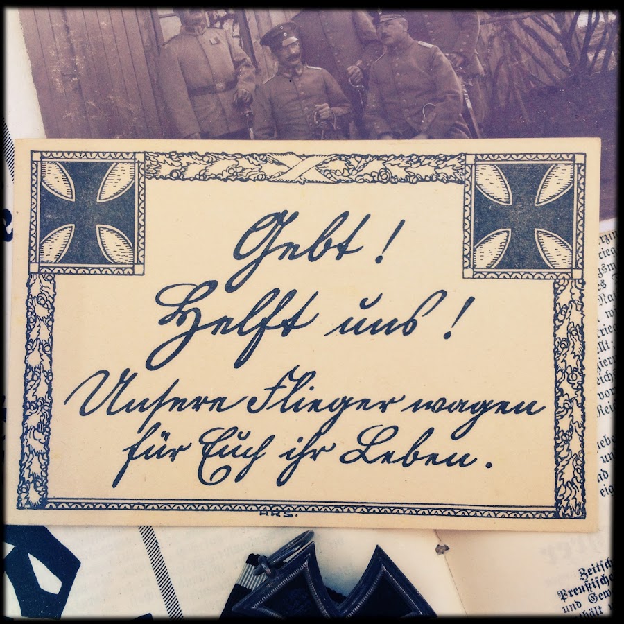
Its pretty no? Can you make out the writing? Ill help you;
Gebt! Helft uns! Unsere Flieger wagen f�r Dich ihr Leben.Or, in english;
Give! Help us! Our fighterpilots risk there lives for you.
Another strong message, to push people to give money, and valuables, to support the war. Nothing on the back of the card.
Enjoy!
I like the imagery of both of these last two cards. Strong, simple and to the point. A messenger on one and a message on the other.
Any thoughts on your cards artist
K ? HRS.
How goes the skull collecting?
--dj--Joe
Dean,
A well deserved award, no doubt about it.
Great to see that you and Karin have been adding to our thread and keeping things fresh and alive, Mikee, DJ and spacey too.
"Durch!" is a honey of an illustration, simple, direct and right to the point, "break through!" You really get the feeling of urgency and determination from the art, the rider and his animal will stop for nothing to complete their urgent mission. Many of these uncomplicated drawings and paintings are most effective in conveying their messages to us, the less we have to interpret the better and more clear the vision.
Karin's Kriegsanleihe card depicts old-style typography at its best, when different type sizes and font styles called our attention to the most important parts of the message, with a minimum or no illustration whatsoever. The same holds true for the flyer's card, a plain, nationalistic border frames the hand-written plea for financial assistance, lending a much more effective, personalized touch.
Many thanks to all who've shared their time and thoughts so that together we can explore and enjoy this wide-ranging topic. Each piece of art helps to clarify and build the mosaic of subjects that were so important to a nation before, during and after the rule of kings.
Best!
Bill
Thank you for input on the Durch card. All great interpretations.
With all the different meanings for this word I wonder if the artist wanted there to be a one and only meaning for his creation.
I did find a preposition of durch through Google that supposedly means 'by force of' and thought it could relate to the concept of the art.
Very nice looking cards Krullies. I'm a sucker for that neat looking S�tterlin script too. What a art form. Sorry to see it becoming a thing of the past.

...Any thoughts on your cards artist K ? HRS..
Heey Joe!!!
No Im sorry, havent even thought of it, but, the crosses are not very even, if you look careful, one arm is shorter, so, maybe its a cut up pasted from bits and pieces and then printed thing? The handwriting is very nice, but, everything together, not like the art that Dean puts up here. Ill look if I find anything, but I doubt that I can ...
...
How goes the skull collecting?
Actualy, I think, slow, not much added, I lost interest in everything actualy, been a while, so much going on, its a nice change of thoughts now, maybe something comes back, I dont know where we were? Well figure it out!!!
..I'm a sucker for that neat looking S�tterlin script too. What a art form. ..
...Karin's Kriegsanleihe card depicts old-style typography at its best, when different type sizes and font styles called our attention to the most important parts of the message.
Yes!!! I agree Dean and William .. I tried to write S�tterlin, but its not eazy!!! The e looks like my n, the D like my F and so on, but yes its so pretty!!! But you have to practice to read or write it properly. I have a 3rd Reich Hitler Jugend practice school book of a girl, from the early HJ or JM or BDMyears, so from before S�tterlin was banned, it helped to learn to read the script better.
..
With all the different meanings for this word I wonder if the artist wanted there to be a one and only meaning for his creation....
Yes very right, the meaning obviously is double meaning, like
DID IT or maybe more
MADE IT on 1 hand, and the (broke) throuhg on the other hand, but, mostly
durch used by itself, is meaning something like YEAH MADE IT, like exams, or the next level, or a test. The helmet in the drawing telltales its Mercury, so, yes, this is word-playing here.
...
...have been adding to our thread and keeping things fresh and alive, Mikee, DJ and spacey too.
Our pleasure Im sure William

I gotta stop using these *lol* love em and how they offend certain people is a bonus, but itsa real drag to get them in, but, I got this truly awesome card I want to show you Dean and everyone, but, please be patient, it surely will fit the group, its amazing, and it tells about a true tragedy. I promise I put it up here.
Dean your new card is brilliant btw, is it from a painting?!! It looks like socialist or communist type of art? Its really nice!!!!
'Never forgetful of the shameful peace of Versailles' according to Google translation. I like how the artist placed Germania's sword tip in the snake.

According to Wikpedia this austrian artist had his works featured in Jugend, Simplicissimus und Fliegende Bl�tter.
Looks like the dude in the backround is a little more thrilled with the performance than his wife.

'Erinnerungsblatt an die eroffnung Leipzig - 6 Mai 1914' is printed on the back of this postcard.
I think its neat how the picture is made up with thousands of fine lines when viewed under magnification.A close look reveals a viking(?) and a eagle's(?) head.
Any thoughts on meaning welcome.

Dean,
I think the word Schmachtfrieden is better translated to mean, "a yearning for peace." Most likely used to describe the political chaos and turmoil that resulted throughout Germany after the cessation of hostilities - imposed democracy, the fight against Communism, occupation of the Ruhr, war reparations, etc. Germania seems to be deep in thought, pondering the question when will there be a true peace? Never forget what they did to us ...
The second card may possibly be an illustration of Salome, Richard Strauss' controversial opera?
The third might be associated with this event - 1914 was the 150th anniversary of the K�nigliche Akademie f�r Graphische K�nste und Buchgewerbe (Royal Academy for the Graphic Arts and Book Industry) in Leipzig, and to celebrate that occasion, as well as to advertise Leipzig's stature as the pre-eminent book publishing city of Germany, the locals put on an international exhibition of books, book-making, and related arts - the Bugra.
Best!
Bill
Thanks for setting me straight on the translation Bill.
Heres one with a few signatures on back. Gotta love Karl's stylized letter on his last name.


Dean,
Not only is the stylized "B" a gem, the theme and illustration are also superb. One of the best renderings of Wotan I've seen in a long time, the look in old boy's 'good eye' is frightening ... he looks right through you ... directly into your mind and soul - clever old sod that he was!
Verlag des Vereines S�dmark, Graz, published many excellent nationalistic propaganda cards. This one titled, Sonnenwende, or Solstice, no doubt would have been a big hit with followers of Himmler's Ahnenerbe program.
By all means a lovely postcard. One has to appreciate the shield-shaped viewing aperture the artist gives us to frame the old Germanic god. Fantastic composition, drawing and painting, too, the choice of colors is magnificent, at least to my eye. This has to be one of my favorites of this entire thread, it really reminds me of Howard Pyle and N.C. Wyeth's incredible work.
Relating this to our varied taste's in collecting, can you imagine this small graphic in the proper beautiful frame in your Rustkammer..? It would be a knockout in my humble opinion, the perfect pinnacle for a fine, SS collection.
Wish I could translate it for you but I'm miserable at best when it comes to Sutterlin script, perhaps someone else can make out the signatures and line of type? Can you send me a more full-on shot of the back, I'll play around with it in Photoshop and post it back here. Hopefully someone will be able to lend a helping hand? It'd be interesting to check out if we can.
Nice, thanks!
B~
...Heres one with a few signatures on back. Gotta love Karl's stylized letter on his last name.
..Not only is the stylized "B" a gem, the theme and illustration are also superb...
Relating this to our varied taste's in collecting, can you imagine this small graphic in the proper beautiful frame in your Rustkammer..? It would be a knockout in my humble opinion, the perfect pinnacle for a fine, SS collection..Wish I could translate it for you but I'm miserable at best when it comes to Sutterlin script...
Anyone say S�tterlin??!!

Dean what a beautiful card, William, what a beautiful explanation!!! Saving it to my notes thank you very much!!!
Nice type for the word Sonnenwende, yes, I so like the black bird wih the pretty flowers in its beak very much!!! Is it a raven? Also important, in mythology, and in folklore. So maybe also in the SS way of thinking, that Williams brings forward.
I ll help and try the S�tterlin, if nobody beats me to it, ofcourse .. Not sure if it actually is S�tterlin? The type used on the back (
Verlag des Vereins blahblah) of the card is Fraktur~like, will need to check when Anton Marussig made the work, and, if the solstice was big topic in Germany before 1930s. Will have to be later, I hope today if I have some time left. Thanks for the card, and the story guys!!!! Truly brilliant!!!!
Dean, William, Anton Marussig lived in Graz, second largest city in Austria, from 1868 to 1925 when he died. He made
some nice paintings!!! About the signatures, the biggest, with the pretty B, is most easy to read. That 1stname looks like Karl, but that surely is not a S�tterlin K, and, if you take it further, and say it MUST be S�tterlin, it could just as clear read Rolf. The lastname seams to start with a
B, because it looks like our B, but it could be another letter late in the alphabet. Followed by a
c or a
e, and if there is a dot above the next pointy-up, its an
i, then an
m and a
d, but the scan is not real clear, is there a little denty shape above the last pointy-upwards? Then there is a
u. The scan, can you make it bigger and with more sharpness or contrast please Dean? The name on the left, probably starts with
F, but, it depends, how does the writer write? It could as easily be
E or
J, the 1stname ends with
d, so we can look for names that fit, there is a shape above it, a dot or a line, so there you find
i or
u, not
j, we see no curl downwards. Then, the lastname, starts with
N, ends with
Z, or
Y, we need more of the writers writing to know. It takes time, to learn specifics.
I like to add this amazing card. The card at the back says Peter Cornelius is the artist. He lived from 1783 to 1867, born in D��eldorf, died in Berlin. He worked mostly in Berlin, but also in M�nchen and even Rome, to study classics, and you can see influences.
The work is a part of the painting
Die apokalyptischen Reiter, and Wikipedia tells that this work is by Peter
von Cornelius.
Here you can see the whole painting, and this also says Von Cornelius. Still, maybe the card is right.
The horsemen, there are 4, we see 3. The back gives us the names of the riders; Krieg, Tod und Teuerung. So, War, Death and Teuerung litterally means inflation, raise in price, but it cant be litteral here, I think it must be white horse, if you look at the scales, the justice scales, judging, judgement, righteousness. Then, the red horse, war .. The swordslinger, ofcourse!!! Next, death.
Still, if we read the bible on this, the book of revelations 6, verses 7 onwards;
When the Lamb opened the fourth seal, I heard the voice of the fourth living creature say, "Come and see!" I looked and there before me was a pale horse! Its rider was named Death, and Hades was following close behind him. They were given power over a fourth of the earth to kill by sword, famine and plague, and by the wild beasts of the earth., so we can also see the swordslinger as death.
But in this case, Im sure, that rider is War. And next to him, Death. If the card at the back gives the right names. The last horseman, don t have an object, no scale no sword, just like the rider here. The green horse. Im sure it's Death. And you look at the big painting (link above) you see that Death holds the scythe, that we know clearly from Death.
You can see the card a tad bigger if you click it. Enjoy!!
Bye,
KR
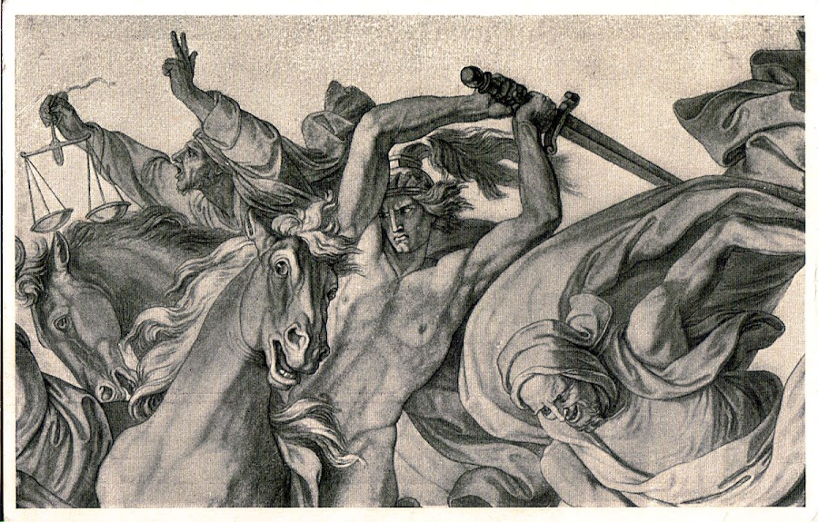
Extremly nice card Krullies.I was aware of this card but never knew that it was just part of the whole picture.Thanks for the great info.
Bill,
Thanks for your insight into this one and I agree with you, the artist has captured so much. The first thing that captures ones attention is that stare which causes thoughts to race and questions to answer. What unrest is he thinking of stirring up next. There's a mystery in his eye, looking like the old wizard that he is and what have Hunginn and Muninn told him to cause such a reaction. Is this a branch from the tree of life they bring? Old one eye looks old and wise, yet powerful and cunning, his hands holding so tight to his spear Gungmir a source of power, that his knuckles have turned white. The artistic eye and talent for such work is what amazes me.
Karin,
Another stunning image for our growing collection,
A Peter von Cornelius steel engraving of the highest quality, the tonal-range is really something - a single color - from the softest, most subtle gray to the richest of black. A perfect example of perspective, the darkest shades being closest to the viewer as the backgrounds fade away to a mere whisper ... The anatomy of the figures suggests the style of Michelangelo to me - certain, precise, knowing. Clever how PvC differentiates the allegories from their human victims - the vampire-like blank stares, the eyes having no content! Unlike their nightmare-induced riders, the horses eyes convey life and understanding while the horsemen are beyond a doubt, undead monsters. Fantastisch!
Mikee,
I agree, 'brilliant' is a good choice of words to describe the truly artistic mind. A great piece of music, literature, or image can transfer us to places as unique and diverse as our own personalities, the possibilities are literally endless ...
Many thanks for adding the names of Wotan's raven-spies and his spear. These sharp little details are what bring these old Germanic tales of gods, monsters and men to life. Oh, almost forgot, lots of beautiful and "named," magic-hammers and runic-marked edged weapons, all endowed with tremendous powers!
Dr. Dean,
Thanks for the additional scans, I diddled around a bit and will attach what I came up with - not all that much better than your original shots. That one line of type will be the key to the exact nature of your card ... maybe somebody will help and we'll see..?
also, thanks in advance to any and all who have ideas as to what it might say?
Best!
W~

2/3

3/3

Now that I look at it, my nearest guess at a translation would be:
"Heartfelt greetings from the '__ __ __' - vacation."
and then various signatures of friends/loved-ones?
I just came over this thread by chance. Normally I do not look into this section - I see now I have to regret because of the high quality art which is shown here and the very pleasuring discussion. For sure I will take a look once more from time to time.
Concerning the handwritten text in question (reverse of the wonderful solstice card):
The first line says �Herzl.(abbrev. for Herzlich or Herzliches) Heil von der Sonnwendfeier� translated �Heartfelt Heil (=hail) from the solstice celebration� (see especially the H from Herzl. is the same letter as the H from Heil).
The name with the most decorative �B� is Bruno.
Concerning pg 49, input# 267483 with the Germania/Versailles card from Dean: The translation from Dean is absolutely correct (Schmachfrieden � shamefull peace, comming from the word �Schmach�). The word �Schmachtfrieden� has erroneously the �t� put in by WWII �which is not there- and therefore would have indeed a totally different meaning (�schmachten� = to yearn fore) but as said (and shown) there is no �t� in the printed word and therefore �shamefull peace- is correct.
Hope I could help a little,
Best regards,

Wotan,
Thanks for checking on me, my peepers definitely aren't what they used to be ...
Best!
W~
Interesting Wotan. Thanks for that info and those two translations.

Windsbraut. I googled and it appears there some mythology tied to the word but I couldn't find much more explanation, other than some art and a song.

For a translation I got whirlwind, Die Windsbraut - The Tempest.
--dj--Joe
Nice card Dean,
This is a painting by Herman Hendrich called "Windsbraut" and is one of a series of five large paintings derived from Goethe's book, Faust,Walpurgisnacht(Walpurgis night). These paintings are located in the Walpurgishalle (Walpurgis Hall) museum which was built in 1901 in the old Germanic style. It's a cool building located in the Hexentanzplatz (Witches dance floor) valley in Thale Germany, considered an old Saxon Germanic place of worship, where during the night of 30 April to 1 May rituals were held. This is considered the place where the witches congregated before the ceremony, then take to there brooms and fly to the Blocksburg to marry the devil. For a follow up to this postcard, If you remember we briefly discussed this topic from another of Deans postcard in referenace to Walpurgis night on the Blocksburg, which is located on page 22 and explains it's tradition. Thank you.
I like the eagle card Dean!!! Many enemies, much honor, the German eagle defends himself with pride .. nice detail the tiny crown, very nice!!!
The Windsbraut card is brilliant!!! Mikee very good info!! I like to build on that, towards windbrides ... I love this sort of thing!!! Windsbraut, bride of the wind, but yes, mythological very interesting.
This statue tells a bit about it;
 Die Windsbraut gilt als mystische Gestalt f�r Wirbelsturme.
 So; The bride of the wind is seen as mystical creature that creates whirlwinds. So, female spirits of nature that cause whirlwinds. In folklore, the bride of the wind apears when hunting season comes. This bride of the wind was a rich noble woman, that had a passion for hunting, but she hunted so much that she wrecked the balance of nature, and she was cursed to forever walk the fields as a whirlwind. This woman pop up in different European cultural myths, as Holda, Polednica, Diana, Aello or
Melusine. but the last name was later used for a water-linked spirit. Even the
Lutherian bible, in the book of apostels (acts), a Windbride from northeast wrecks the ship of Paulus on the greek island Gavdos.
Awesome info.
I'll never see a devastating storm again without this in the back of my mind. Thank you for helping keep this legend alive.
Posting more trippy art by Ludwig Fahrenkrog from a Munich card with Hamburg cancellation dated 1919.
From what I found out he started some religous groups based on old germanic gods and mythology.

Try to do some active contribution to this thread.
From an old book (it is not dated but due to advertisments I strongly assume it was printed before 1918) which concerns to german mythology and also the Nibelungen Saga.
Cover.

Thor.
Description: Thor

Wild Hunt.

Odin.

Fenris Wulf.

Now from the Nibelungen Saga
Siegfried at the spring.

End of the Nibelungen.

All illustrations are done by Max Koch.
There are also nice ornamental chapter separations.
All for now, regards,

Amazing stuff Wotan.
The Fenris Wulf illustration is bad to the bone.
I think at least equal to the Nibelungen illustrations. In "End of Nibelungen" the next moment Hagen has lost his head too and it is roling over the floor.... As revenge for his deed at the spring.
Regards,
1909 card with great looking writing on back.
Maybe something to do with the Nibelungen too?


Gentlemen,
Thanks for the additional excellent drawings and illustrations!
The Fenris Wolf is a creature of Asgardian origin, said to be offspring of Loki and the giantess Angrboda.
The goddess Iduna walks the forests of Asgard carrying a bundle of golden apples. These "Golden Apples of Immortality" are for All-Father Odin/Wotan, and Iduna brings them to him every year. Along her journey she meets Haakun the Hunter. Haakun greets her warmly and tells her to go in peace.
As Iduna continues further down the path, Fenris sees her, and transforms himself. Iduna next comes upon "a frail stranger". The stranger offers Iduna protection along her journey, but she declines the offer. The stranger takes a strong interest in Iduna's basket and begins asking her questions. She quickly grows suspicious, saying he his hands seem so grasping and brutal, and his voice sounds like that of a beast. She finds his manner sinister-frightening, and says his eyes burn with hatred-with pure savagery. She then discovers that the stranger is actually Fenris the Wolf God in disguise. Fenris shape shifts into his true form and attacks her. Haakun the Hunter arrives and drives Fenris away with his enchanted battle axe, causing the Wolf to shrink in an attempt to escape. The axe pursues Fenris and finally strikes him, spiriting him off to the shadowy land of Varinheim.
In Norse mythology, Odin had the dwarfs forge the chain Gleipnir ("deceiver" or "entangler"). It appeared to be only a silken ribbon but was made of six wondrous ingredients: the sound of a cat's footfall, the beard of a woman, the roots of a mountain, bear's sinews, fish's breath, and bird's spittle (which explains why these things are not found today). When it came to binding the Fenris Wolf, Tyr lost his hand in the process as the Wolf would only allow the chain to be put on if one of the Gods put their hand in his mouth.
It is prophesied that when Ragnarok occurs, Fenris will devour Odin. Hela one time unchained Fenris Wolf to bring about Ragnarok only to be thwarted by Thor.
Here's another b+w depiction of Tyr and Fenris wolf.
Best!
W~

Fantastic illustrations and information on the subject.What a pleasure veiwing and learning about stuff like this.Thanks
While on the Wotan subject heres a photo I had saved off the web courtesy of Puschner4 dated from 1918 and done by Fahrenkrog. Wonder what the runics said.

Osterreich stamped card with 1909 cancellation by Czech artist Adolf Liebscher.

Germania looking like she's about to say bring it on.

Sent from Berlin on 7/7/1915

Correspondance dated 3/12/1915 and card dated 1914.
I thought the serpant was a snake at first, but after taking the photo it looks to be a dragon's head in a winged background.
Appears there is also another creature peering over the wing to the left of the knights arm trying to shake the fearless German spirit.

Gents,
The High-Song of the "All-Father," The German Faith-credo by Adolf Kroll. (could also be related to The Song of Solomon)
Lovely mystical and saga-influenced themes combined ... amazing just how popular the subject of the occult was throughout Europe through the late ninteenth, early twentieth centuries. We all know just how important many of these aspects were among the National Socialist hierarchy. A witch's-brew combining equal parts Darwinism and Nietzschean thought, blended together with liberal doses of Wagnerian fanfares to celebrate the entire German Pantheon of gods and heroes. Liberally add sausages and beer, stir in radical politics, greed, war and one fresh sprig of Versailles Treaty and there you have it, the ultimate, brown elixir of death, National Socialism. But don't forget, the 'reds' weren't a much better choice, either!
The shape of things to come ... who knew..?
I have to thank all of you again for the great recent additions, so much to enjoy and think about.
James - very nice watercolor illustrations, very nice. I'd have to have those babies framed and hung in no-time flat!
Being originals makes it even that much sweeter.
I only have one quick addition to offer, what I thought was an excellent, clever, anti-German propaganda illustration.
"Tango anyone ..?"
Best!
Bill

I love the skeleton's dancing shoes.Interesting to see another sides propaganda.Thanks
Exlibris.
Skeleton anxiously awaiting an opportunity to show the aire of youth's invincibility a lesson to the contrary.
At least thats my take.

Here is a postcard dated 11/11/14 sent to Berlin that I'm trying for a translation on if possible and not a trouble.
Also kind of curious what the letters G.O.D. in the top left are about. Thanks

Close up

Many nice things posted, wow, Wotan your book is amazing too, and your artworks Damast are very vry nice!!! William your explanations are grabbed in my notes again!!!
Dean,
Schlage, schlage denn empor what a supercard, the text is beautiful, actualy also not so simple, and, part of an old poem by Emanuel Geibel, written about 1859. But first, the transation;
Look, look up,
the cleansing glow of the world on fire!
Rise like a Pheonix from there,
Imperial Eagle of Germany!It sure is old literature language, that you need to read in the correct period, in your head, if you know what I mean? An "Aar" is the old classic orginal german name for an eagle. On this old newspaper page from 1894, you can read the sentence "Heute wie damals schwebt der Kaiseraar sch�tzend und schirmend �ber der Kaiserstadt", and
here you can read the sentence "Horstend der Kaiseraar heute die Wacht" (
also very pretty!), that means "today, nesting\from its nest, the Imperial Eagle guards", that refers to a german flag that waves above, and the proud german troops in that situation.
The poem (on your card) is from 1859, so, when Germany wasn"t an empire anymore, and YET. That empire was not really an empire, but it fell apart in 1804, when the Napol�onic wars were busy for about a year. The 2nd empire was founded after the D�nish, Austro-Prussian and Franco-Prusian wars, in 1871, so, that clears up the text of the poem, the empire rises from its own ashes, like phenixes do, to be newborn. And in this time of the 1st world war, it was very apropriate too.
You can read the rest of the poem
here. Oh, the G.O.D. thing, I ~~think~~ its the initials of the artists name? But it makes me think of G.D., as in the latin "Dei Gratia"? Either way would be a guess .. Anyone else?
Bye,
KR
Dean I forgot, sorry ... your card says something diffrent from the original poem. Yours says;
"Steig als Sieger draus hervor"
and the original poem says;
"Steig als Ph�nix draus hervor"
So, Sieger = winner, to be complete and correct.
Bye,
KR
Thanks so much for the translation and explanation Krullies.
There was no way I would of been able to do that one on my own
Bund der Deutschen in Niederosterreich postcard.

Posted to Wein.
Maybe some type of Christmas mythology.

January 1917 field posted card.
The dead horse laying in the shadows with a spiked helmet nearby was a cool detail imo.

Beautiful drawing, a tad dark tho', I like living horses better .. When life rages like a storm (or something like that anyway), look up. Blunt church propaganda, rely on god when things get tuff. Nice Dean thanks for showing!!!
Thanks for input/translation Krullies.
Here's a weird one that measures 6.5 x 4.
All I have to go on is the back and possibly the artist initials A.M. to the bottom right of image.
I googled A. Menzel and got Adolph Menzel but its just a guess.


Correspondence dated just about 1 week after the outbreak of WWI and field posted from St. Wendel.
I'm not great on translations but I think it has to do with drawing on patriotism from heritage.

Dean,
Did you have a chance to check out "images" when you searched Menzel? His drawings and paintings are brilliant - lots of soldiers and especially nice renderings of Frederick the Great.
Who but an artist would think to give us this great interpretation of looking down into the barrel of a canon? There's certainly no doubt that 'death' resides there, but to actually see him wrapped in his Krupp-steel cacoon, leering at us really drives home the point. A freightening sight.
The second card goes something like this ...
Hear you the roaring call to battle,
The old German is again awakened,
The same who in great history past freed Euroupe from Roman subjugation,
Again he draws his valiant sword,
Protecting his freedom, hearth and home,
And drives his enemies from the land,
Cutting them down in hard, bloody combat.
As always, top shelf!
Bill
Thanks for the input WWII.
I did check out A. Menzel's work to see if it looked like the same style, and did see a nice Fredrick the Great on horseback, as well as a compiled corpse sketch. I thought the style looked similar to the cannon art.
Here's another field posted one from Ingolstadt dated Nov. 1914.
My translate attempt came up with The Bavarian housekey.

The skeleton in the cannon, well drawn card. Hurling lightning bolts?
Thanks for posting it.
--dj--Joe
Thanks Derjager, Mikee.
I liked the background of the eagle on this Berlin card.

Der Todes Siegesritt.

Strange card. Maybe the main image is Barbarossa??
Nude ladies by the sword's blade, bats under the crown.
A gnome to the right of the sword's hilt.
Also appears theres a bearded man's face to the top right of the gnome and above him, a creepy face flower (maybe tripping though).
Unusual makings on back too.


Dean,
Lots of visual things going on here, plenty to see. Looks like something out of "Fear & Loathing in Las Vegas" - one of those kind of weekends! The witches (Hexen) from Walpurgis night and some bats flittering around, a beautiful sword and crown motif, an elf, and a fanciful flower character. There's a great old French (I think) book illustrated with lots of beautiful flower-people paintings. I agree, it looks like Rotbart Barbarossa sitting there rather than Wotan, but then some ravens just to remind us of the All-Father's intelligent, wonderful birds? Finally capped off with a military monument like the V�lkerschlachtdenkmal, or one of the other large architectural masterpieces? Simply things German? Maybe a panaramic view of Friedrich's sleeping chamber hidden away somewhere in middle-earth, complete with a look at the creepy things found at the lowest-depths..? Quite an illustration, great card ...
Are you going to Pittsburgh next week?
Thanks for the post.
B~
Ps just saw the posts of the reverse, yes, Kyffh�userdenkmal, isn't that from the opening ceremonies, hench the nice stamps?
Unfortunately not going to make it to Pittsburgh this year Bill.Low on funds.
Here is a 1922 Karl Ritter bookplate with graphic artist remark. Thought you might enjoy due to your trade.
Same theme as the cliche indian thinking a soul would be captured if photographed imo.
Image measures 6"x4" (Quarter for scale).
If I have the right artist, heres a few facts about Ritter's life courtesy of Annex Galleries Ca.-
Born on November 7, 1888 in Wurzburg.
Embarked on a military career before studying architecture in Munich.
Turning to the graphic arts and painting, he became involved in the film industry through his employment as a public relation agent for Sudfilm in 1926.
Owing to his early membership in the Nazi party, Ritter�s film career progressed quickly following his signing a contract with Ufa in 1933.
His first film as a producer was �Hitlerjunge Quex� (Hitler Youth Quex, 1933), one of the first films of the era to openly glorify the Nazi party.
He was appointed to Ufa board of directors and went on to make �Weiberregement� in 1936, �Capriccio� in 1938, �Patrioten, 1937 and �Stukas� in 1940/41, the story of a young bomber pilot whose depression and apathy was cured by Wagner�s �G�tterd�mmerung.� He also did a number of blatant anti French, Russian and British propaganda films.
Taken prisoner by the Soviets but escaped and in 1949 he emigrated to Argentina where Winifred Wagner helped him establish a film production company.
Have a great time at the MAX.

Dean,
The Max was a very festive as usual. Lots to see, new and old friends, plenty of good food, libation and conversation. Nothing to complain about in the 'sales department' either, and the weather held out nicely all the way till Sunday.
Great printing related card, though, I do look a bit thin ...
Many thanks and best regards!
B~
Posted January 1925 and signed with what appears to be a few signatures.

Dean,
The Jungdeutscher Orden or Jungdo, was at one time the largest national political organization during the Weimar republic. Leaning neither too far to the left or right, the Brother/Sisterhood (notice the way the artist signs his name) held an elitist, anti-communist and anti-Semitic view for Germany, with roots dating back to the crusades of the Middle Ages. Hence the choice of a Christian/Teutonic, Maltese-cross as its logo. Many say it was the forerunner of the Social Democratic Party in 1930. After 1933 its membership can be found passing into the hierarchy of the SS, as well as having staunch supporters for anti-national socialist movements.
Another brilliant facet to this visual-mosaic of German history. (Geschichte)
I meant to ask ... does your collection go on into the '33-45 period, too? If so, any particular theme or subject matter? More illustrations, I hope? Please feel free to add anything along those lines should you choose to ...
... as always, a resounding thanks!
Bill
A few graphics for your enjoyment ...
A Teutonic man-at-arms poised to do battle with Germany's foes, depicted here as a multitude of dangerous vipers. The knight's shield is decorated with the Prussian, Hohenzollern colors of black/white, and the title reads, "With this symbol we shall be victorious..."
The next two are illustrations from a music book of Wagner's famous opera, "Das Rheingold." Lovely nordic motifs throughout the drawings to include a very neat. prehistoric-looking dragon. Looks like he's dreaming about munching on young Siegfried's tasty, marrow-filled bones.
Hope you enjoy!
Bill

~

~

Beautiful book Bill. The Gotterdamemrung plate is especially appealing with sheild,helmet,sword,spears,ect,ect...
Those dragon like hilt looking objects that are holding up the artist creation make it all the more striking imo.
Believe it or not I was about to post the just recieved in the mail-Teutonic man-at-arms- card when i saw you beat me to it.
lol.Great card that you don't see every day.
Well heres a few more to add to the mix.


Dean,
Two more beauties ... the ex libris portrays the reaper taking his share, the result of the colossal explosion from a 300mm gun! Beautiful Totenkopf Husaren card, the death's-head really grabs one's attention.
Another pair for the pile ... though, these two not by German artists. Notice the English caption at the bottom right of the Wotan illustration, it says Wotan and 'Loge.' I wonder if they meant Loki? Either way, lots of work to grave this busy line drawing.

This second one has been a long-time favorite, I was trying to fit it in somehow for quite a while now ...
Looks like an outstanding pencil drawing, by the artist Mortensen, titled "Human Relations..."
Best!
Bill

Great Odin work of art WWII.Thanks for posting it.
Reminds me of Arthur Rackham's illustrations to Wagner's The Ring of the Nibelung.
I'm also lost on the Loge/Loki reference cause I'm not seeing him anywhere, but maybe the prince of evil is being true to self and lurking in the shadows.
Alls I can say on the Human Relations art is great skill and imagination. Oh, and of course Ouch!
I'm sure many in this occupation or situation can relate, but we have to try to be nice in our so called civilized society.
And the beat goes on with a simple card, art dated 1911.
Wish there was writing under the art but none.
It does have a uncancelled 1919 stamp on back that I've never seen before though.
Seems to me some artist can make Germania look so appealing while others make her look like a dog.Guess we're back to the eye of the beholder concept.

1919 stamp on reverse.

Glorious art work shown! Many thanks for showing them.
"Human Relations" my eye.
Good one Bill.
--dj--Joe
Dean,
I meant to ask ... does your collection go on into the '33-45 period, too? If so, any particular theme or subject matter? More illustrations, I hope? Please feel free to add anything along those lines should you choose to ...
... as always, a resounding thanks!
Bill
Glad you asked Bill. I do collect 3rd reich but have been getting into imperial art a little more thanks to this thread.
Heres one I'd like to get translated if at all possible.
It has a really three dimensional look to it that was tough to photograph and i'm wondering if you had any idea what type of printing process was used to get this look.
The look of the print,size,symbol at the peak of the roof, and the 3 signings along the bottom added interest imo.
Thanks for looking.

Close up

Postmarked with correspondence on October 19th 1924.
Stained and creased but I've never seen another like it.

Liked the lightning. No date.

Dean,
I have to hand it to you, you seem to trump your previous postings on a continual basis ... how do you do it? We'll have to chalk it up due to your impeccable taste.
This first image really took me out, there's just so much to take in. The style makes you pause and focus on every little detail, no matter where the eye stops it fixes, kind of mesmerizing. For me, the look is both primitive and also most modern, simple, yet extremely complex. There's so much going on there it's dizzying, mad how it pulls the eye round and round! All topped off with that wonderful eagle ... who could ask for more?
One of the beautiful hand-etching processes - could be engraved metal or even a stone lithograph? I think it's much too fine for a woodcut. Lots of hand-eye coordination and concentration involved in producing this plate. Whatever the technique, it certainly is a fine piece of work. This master printer certainly knew how to grave and get the fullest from his medium, the cuts seem almost random but they're well thought out in advance. I can't help but praise this artist, this one gets an A+ from me.
It says something like this ...
As long as the spruces grow
in front of manor and house ~
In lower-Saxony that's how long
the family tree shall never die out.
When you add that clever little verse to the knockout artwork, you end up with an out-of-the-park grand slam! ... heh, leastways, to my take ...
The second looks like a modern movie poster-illustration, something for a Quentin Tarantino remake of Conan the Barbarian. Great work here too!
Ahh, the nation calls back the guiding spirit - the good old days of the Iron Chancellor. Saw his sword once in Solingen, the Kaiser gave it to him just before he fired him, geez. Well, at least it was one hell of a nice sword, heh. Yes, great lighting and sense of distance in this rendering.
As always, thanks!
Bill
Ps Joe, glad you liked it!
Thanks WWII. Its one of my favorites.
Wishful thinking would be to someday find out more about the piece.But time seems to erase as fast as we learn imo.
Wonder where something like this hung.
Maybe the artist including the rising sun had to do with 1938 Germany once again having hope and pride in becoming a dominate force in the world after enduring bad times.Your translation seems to support that notion.
Not too sure what that familiar symbol at the roofs peak is but a seller on ebay has a item that has a resemblance.
He/she describes as odin's wolves.(Including a pic for comparison).
Shame the photography does the print no justice as far as depth, it almost appears like the print was done and reverse painted glass is on top with additional art. I thought about trying to remove the glass to check it out but don't want to risk destroying the thing.
Thanks again for your comments Bill.

This topic is going on and on, and it must be the best in here!!! Nice .. Interesting cards, and other things, even wood ornaments!! I love the "Solange noch die Eichen wachsen" art, and Deutsche Tagen cards are always interesting, those days link to the time before Hitler got political active. Here a simple card from me to say thanks to you guys ...
An Engeland. In Erinnerung an die Mordtaten des "Baralong".
To England. In memory of the "Baralong "murders. Nice postcard but also very grim.
The Baralong was a Q-boat, or, a decoy-ship. That means, a merchant-boat with hidden weapons, the Baralong was equipped to destroy submarines. This card is about the Baralong incident, or better the first scandal the Baralong caused during WWI.
In 1915, the German submarine U-27 attacked a US passenger ship, called Nicosian. Nicosian put out an SOS signal, and the British Baralong responded. Baralong used a neutral US civilian merchant flag to aproach Nicosian, and used Nicosian as a cover to hide their weapons away from the sight of U-27. The German submarine had stopped the attack when they saw the Nicosian was civilian, and waited, and emerged from the water, when they thought Baralong wanted to rescue the shipwrecked Nicosian-crew. When the Baralong came from behind the Nicosian, it opened fire on the defenceless submarine, and sunk it.
The Baralong rescued the Nicosian-crew, but the German submarine-crew swam to the burning Nicosian instead because they didnt trust the Baralong, that shot at them out of nowhere. Baralong opened fire on the German crew that jumped from the sinking submarine, and shot German crew-members in the water. The Baralong even sent a patrol to the Nicosian and hunted the Germans on that ship. All Germans got killed. Ofcourse Germany saw that as murder. A gruesome exemple of how cruel war is.
The German eagle, carrying the German Kriegsmarine flag .. In the background, you probably not see the Baralong or U-27, but the Nicosian. The submarine was the U-27, and that was the
first submarine that sank another submarine during WWI. After WWI, Baralong was
sold to Japan.
Read a good article about the Baralong
here and
here.
The card was send on july 28, 1916, it has a II. Erla� Seebataillon stamp, but Id need to go thru things
like this to tell anything about it, also I didnt take time to try solve what the handwriting says at the back, so nevermind that.
Bye!
Dean,
I agree, better not fiddle with it, it'd be a shame to harm such a great piece. The roof decoration looks like the crest of Hannover, a pair of interlocked horse-heads. That wooden examples a beauty - things like this look fantastic when tucked into almost any German military collection. The carving stands on its own merit, great lines to it.
KR,
As always, good to see you here and glad that you've been enjoying the thread too. Thanks to Dean's outstanding collection of artwork and the history behind many of these images, it's made this thread an ongoing pleasure. I'm of the mind that small nuances can be very helpful putting history into proper context and perspective. Once you know the story behind some of the illustrations, it makes the steak that much sweeter, yum ..!
The card you just posted should prove my point. If we look at the painting we see it's technically very good, nice strong colors, a super-looking eagle with a German flag and a wee tiny ship, there on the horizon ... But once you told us the "behind-the-scenes" story, we then view that impression in an entirely different way. It can change our reaction from a ho-hum, "oh yes, how nice .." to a jaw-dropping visual experience and profound understanding.
I remember my grandfather and great-uncles talking first-hand about world events and the titanic battles and struggles during the two wars, so I grew up hearing the German side of the story. When things directly related to what I heard them talking about are brought to life in so many great styles by artists, that "old German postcard," takes on a whole new dynamic for me. One of those stories I remember hearing was exactly this one, one of several U-Boot incidents. After this happened a couple of times the German boat commanders said screw this, no more helping survivors on the surface ... we're outta here, adios and goodbye!
Thanks everybody ...
Best!
B~
Nice card and topic Krullies, and as always, well presented with a write up and facts. Thanks. I have to ask how do you get your images to show up so large? It looks great.
I think its the best when first hand accounts/knowledge of history can be passed on..thanks for that Bill. You are so lucky to have family that told you like it was without there having a need to be politically correct or worrying about judgement.
Heres a 1916 field posted card sent from a infantry reserve division.

Dean,
Nice patriotic card that reads, "Germany will never be overcome if it is united."
Found this interesting card, "Deutsche Wehr," which can be translated to, German defense, or, the German weapon. The card depicts a sculpture of a German knight on horseback by one of my favorite artists, Bildhauer Albert Hinrich Hussmann. I believe there are a couple more examples of his work listed in the Imperial Allach thread, if anyone would care to see more of his excellent sculptures.
Thanks everyone and good collecting!
Bill

One sweet sculpture Bill. Thanks for posting it.
Did this artist do metal and porcelain works?
I love it when european art gets thrown back to mid evil times to try bring out reflections of heritage and patriotism.
Centuries go by, technology improves, but reasons for battle seem to stay pretty much the same imo.
Another image to add and posting the back's correpondence to maybe get input on the date 18/???/1914 (if it pertains to WWI).

Dated correspondence.

Old Sir Edward Grey ~
"O Grey, I wish with my spirit,
we had you in a Zeppelin,
to let you fall with terrific din
in a bomb on London."
There are some who blame Edward for his non-aggression pacts with France and Russia. They said this was what got England enmeshed and also caused Germany to enter World War One, on count of his secretive dealings.
Sorry I can't help with the handwritten part, maybe one of the other boys can?
Another fine card.
Bill
Old Sir Edward Grey ~
Sorry I can't help with the handwritten part, maybe one of the other boys can?
Bill-
Your id on this guy gave me the answer I was after. The purpose for showing back was the month in the written date.
It looked like July to me and brought the question about why a pre WW1 card would show the bombing of England.
I looked up Sir Edward on Wikpedia and found how it may relate:
'July Crisis 1914
In 1914, Grey played a key role in the July Crisis leading to the outbreak of World War I. His attempts to mediate the dispute between Austria-Hungary and Serbia by a "Stop in Belgrade" came to nothing, owing to the tepid German response. He also failed to clearly communicate to Germany that a breach of the treaty not merely to respect but also to protect the neutrality of Belgium � of which both Britain and Germany were signatories � would cause Britain to declare war against Germany. When he finally did make such communication, German forces were already massed at the Belgian border, and Helmuth von Moltke convinced Kaiser Wilhelm II it was too late to change the plan of attack. On 3 August, Germany declared war on France and broke the treaty by invading Belgium.'
Thanks for the sheding some light on a question.
Unposted card from Siegburg Germany.

Dean,
Once again we find our old femme-fatal Germania leading the nation's Wehrmacht into victorious, bloody combat against the enemy. She certainly had a busy schedule during the First World War, posing for so many illustrations. Funny how seldom the Nazi's called on her to lead the charge during their rise and time in office, or am I only imagining that? Maybe she lost influence with the browns due to the loss of the war and her close relationship and association with the Kaiser?
Any ideas on that?
On that note, here's a fine engraved mugshot of her boss, a young Kaiser Wilhelm II.
Best!
B~

NICE card Dean!!!! And super explanation William!!! Thanks .. Germania, was (made) symbol of the birth of the German Empire, so that means the 2nd empire. The 3rd one, rejected all higher social classes that made the 2nd empire, so the 3rd empire rejected also the symbols of the 2nd empire (Reich). Maybe Germania wasnt rejected so much, but symbol to the 3rd Reich, was ofcourse only one person with god features; the leader (F�hrer), nothing else. Germania still was part of the V�lkische things, and sometimes pplayed a big part in Thingspiele (theater plays that focussed on the cultural background of the 3rd Reich), but I wont get all lengthy about theater and culture and all that.
Dean,
Funny how seldom the Nazi's called on her to lead the charge during their rise and time in office, or am I only imagining that?
B~
Wow that's a super interesting point Bill. Great thinking.
Hopefully more can be found to link her with the 3rd Reich but both you and Krullies have a excellent valid points. Great stuff that I would like to check into. Thanks to both of you for this.
Hi Dean!! Well, then, let me add to the discusion, that Albert Speer planned to name Berlin (after the reconstructon) after Germania .. Hitler said about this (
in his Wolfsschanze) "Berlin wird als Welthauptstadt nur mit dem alten �gypten, Babylon oder Rom vergleichbar sein! Was ist London, was ist Paris dagegen". Or, only Egypt, Babylon or Rome can compare to Berlin, Paris or London mean nothing compared to it. You can find this in the book
"Monologe im F�hrerhauptquartier". She still had a part in the Reich, symbol for strong unity, but not the lead, that was the F�hrer. I think I know a book that has a model of the new Berlin designed by Albert Speer in it, I''l try to look it up O K?
On that note, here's a fine engraved mugshot of her boss, a young Kaiser Wilhelm II.
Fantastic looking engraving WWII. So good it almost resembles a photograph. Thank you for posting it.
I think he also appears in this Wittenburg field posted card dated 9/29/1914.

1914 Kriegs Karte

Dean,
All the old warriors
and all the king's men,
couldn't put Germany
back together again.
Naturally, that's not what it says, but it made me think of that ... the Zeppelin is really fantastic, sort of a Jules Verne/George Orwell, hybrid-combination. Neat illustration!
Mars, The Bringer of War ... the old Roman god always puts me in mind of Gustav Holst's, "The Planets." The score for "Mars" is very powerful and stirring, proper entrance-fanfare for the mighty God of War. It says that Thoma's art was among the best (most likely donated) chosen for the National Charity fund.
Thanks good sir!
Bill
Nice Dean!!! And always the amazing explanation of William ... "Zum Besten der Nationalstuftung", or complete "Zum Besten der Nationalstiftung f�r die Hinterbliebenen der im Kriege Gefallenen". In english, for the good of the National Foundation of bereaved relatives of the fallen. Hans Thoma, German artist, and
Mars is a painting, with amazing colors!!! Very nice card!!!
Thanks for the input Bill & Krullies.
Its great to the painted version. The colors really make the flames come to life.
Cool seeing the differences in the two.
Makes me wonder why... to show the artist had skills in both areas, or maybe to be chosen there was a requirement the art had to be a engraving.
Also was curious if the broken battle axes handles on the art's border signified anything.
Welp, heres another.
Posted from Baden on 12/13/1916. Corespondence from todays date exactly 96 years ago.
If anyone has some extra time to summarize the wording, if it's anything interesting, that would be great.

Karin,
Enjoyed seeing the color version too, thanks for finding and adding that.
I think most of us would prefer the original painted example to the black and white, but unfortunately that probably cost too much to reproduce in that fashion. A conversion to black and white was a less-expensive printing method. Considering this card was for charity, there's a good possibility that they tried to keep expenses as low as possible?
I like the fact that Thoma himself most likely added the border illustration, it certainly looks like a continuation of his hand. I'm fairly sure they wouldn't have let another artist fiddle with his original artwork? Such a transgression would have been an insult. To me the broken/curled halbred shafts don't represent anything specifically, I think it's just a clever Art Nouveau style for fitting the entire length. Great crown there, too.
The Baden-marked card is really neat and the saying is fabulous, a colorful summation of the time, from the German standpoint. I'd like to leave the translation to someone else this time, don't want to be too big of a hog ...
Thanks everyone!
B~
Death card produced in Wien addressed to Berlin.
Appears someone added glasses in pen to the hicker. Weird card I thought.

Dean,
Yes, very unusual, another card that I've never seen before. The skeleton wearing the alpine hat looks quite pleased with his work, almost as if he's pushed the victim off the cliff himself?
The printed title reads, "Fallen," and the writing says, "One speaks unbelievingly of his death ... Schiller Tho(?)" .. Thomas(?)
The old hiker should've had one of those "life-alert" thingies, you know, like on TV. "Help, I fallen and I can't get up..!"
Thanks D.
Best!
B~
Many thanks for taking your time to comment on the card Bill. As always, informative and interesting.
This one got posted to Bamberg Germany.

Berchtesgaden feldpost on Aug.11,1917 and addressed to Nurnbeg.

2 unmarked cards.


Dated 10-25-1914
Some of the nicest penmanship I have ever seen on the reverse.

Austrian artist Erich Lamm. Posted to Villach in 1917

Hanfstaengl's Kunstlerkarte by german atist Hermann Fenner-Behmer (1866 � 1913). Very similar to Lamm's style imo.
Wonder if the art publisher was the father of Putzi Hanfstaengl, writer of Hitler the missing years.
Great read imo from a source close to Hitler.

Dean,
You've been as busy as a beaver here, always the creme de la creme of images and German verse. I truly wish I had more time to comment and translate but have been fairly busy lately.
Just want to let you know your efforts are always appreciated and never overlooked. You have the proper, undaunted spirit of a true collector, and we salute you good sir!
Just a moment before seeing this latest addition I was talking to close friend about Putzi Hanfstaengl, the brilliant "Harvard-man," and Hitler's early confidant. A superbly interesting character in NS history. kismet..?
Best wishes from Philadelphia!
B~
Just a moment before seeing this latest addition I was talking to close friend about Putzi Hanfstaengl, the brilliant "Harvard-man," and Hitler's early confidant. A superbly interesting character in NS history. kismet..?
B~
Yep, for sure.
The story that stands out in my mind is him being convinced he was to be thrown off a flying aircraft into enemy territory courtesy of his pals Hitler,Goebbels, and probably Goring.
Guess I can't blame him for wanting out after this 'practical joke'.
Posted 7/3/1915

French propaganda.

More great looking cards Dean. Thanks for posting them and as always it's a pleasure!
Great thread Bill,
Will have to start again at begining as the art and beauty mixed with collectors insights ane thoughts make this thread
good reading!
Dean
Thats for sharing!
Thanks to all who share thoughts and point out meaning of subject!
I can't read german so enjoy learning whats behind postcard!
Bill
You are a treasure trove of knowledge! Enjoy your thoughts and efforts!
PVON
pvon,
Most of the credit here should go to Dean for sharing so many fantastic images from his extensive collection with us. Getting to know some background history of the artwork and artists, their thoughts, the timelines and social perspectives, always adds appeal and panache to all our various fields of collecting. When these mythic tales and historic facts are brought to life by these talented visualists, it helps fire our imaginations and furthers the basic understanding of other lifetimes. A drawing or painting is a thought or moment that captures time, and hopefully conveys some message to us, the viewer. Looking at a good picture should be every bit as entertaining as reading a classic work of literature or listening to a fine symphony by one of the masters.
In the immortal words of the 20th century composer, Rod Stewart, "Every picture tells a story..." - don't it?
Best!
Bill
Meant to add this nice illustration titled "Eiserne Wehr."
This can be translated a couple of different ways to mean,
"iron-defense," or "iron weapon." Either way it's easy to understand the gist.
Bill

Dean and William your cards are amazing .. The French "is this the end" card is very nice!!! I like Wilhelm-things!! William the Eiserne Wehr card is beautiful, the horse, very very nice!! Thanks for showing!!
Bill,
Love it! I like knight scenes and that war horse with his ears back, ready to charge is something else. And check out that knight behind the horse, great. A dam and bridge crossing a lake or river,a castle moat maybe, this is a very nice painting...Thanks!
Yes beautiful art you posted Bill. Any idea where it came from or the name of the artist? Thanks for showing it.
Here's a postcard posted in November of 1915.
My guess is it might have something to do with negativity toward the coming of the industrial age.

Friends,
Your appreciative comments, responses and additions make all this worth while. Really great to hear people's reactions to certain images, especially those that are somewhat open to personal interpretation.
Dean - the artist who painted 'Eiserne Wehr' was Angelo Jank. If you Google his name and click on "images," I think you'll be surprised how prolific the man was, and I'm sure you'll recognize many of his works. We even have some of his other illustrations earlier in this thread that weren't identified as his. I believe he also illustrated the Hindenburg Denkmal book that pvon posted elsewhere, too. I'll add a few that I nicked, though, only for instructional purposes.
The Kaiser painting/card looks very familiar, no?
I'm not certain if your latest post has anything to do with a complaint against the "industrial-age?" It could be a bit too late for that? The verse goes something like this ... "Have you not often overheard the song of the old oak trees of my German people..." asks Wotan? Maybe just asking the Germans to come together, with war's blast-furnace belching fire at full capacity in the background? I'm really not certain here, so any input is most welcome. Whatever the case, a nice, Tolkien-looking illustration, most enjoyable.
Best!
Bill

2/3

3/3

For everyone reading this topic, but
especially for everyone that posted such beautiful cards and explanations;
A card by an artist called Moratz, for the Deutscher Verein f�r Sauglingsf�rsorge 1916 e.V., or the registered charity for welfare of German babies. Moratz did many works for this charity. Early in the 20th century, the Vereins f�r S�uglingsf�rsorge und Wohlfahrtspflege was founded, and this was an initiative from the Bund deutscher Frauenvereine. From this, during the first world war in 1916, came this association. Because of the war, there were many families, especially children, in need of help. This is the forerunner of youthcare we have today over here. The card is lovely, a beautiful angel with a nice short clear message; peace. The written text at the bottom, is continued from the back. I won't put it here.

Another card, by the Bund Frauendank 1914. Another womens initiative, to help the war effort, founded in 1914. A charity for war invalids, by dankbaren Deutschen Frauen und M�dchen, thankful German women and girls. A simple drawing, with a poem by Johanna Lankau. She wrote under her own name and also a few pseudonyms, and she spoke fluent English, French, Italian and Danish. Most poems she wrote during the war for charity womens organizations, can be read in the bookseries "Aus einem Kriegstagebuche 1914-1917", the volume 31 "Kriegsdichtungen aus dem Sachsenlande 1914/17".

German girls, German women,
help the soldiers to build huts!
Habitation for wounded,
a place like home at a warm fireplace,
forever without worries.
The Frauendank will take care of this for you!
German women, move your hands,
Collect stone by stone (or, put stone on stone) for donation (or, to give)!
Look up at the blue heaven
The loving grace of womens loyalty.
You know all this, but for anyone that don''t, women didn't fight, but, WWI was important for the rights and the place in society of women. Not only to take care of warwounded. Women needed to fill the empty places of the men that went fighting. They worked in factories and kept industries going on. Also, they helped to rebuild roads and buildings, and take care of maintenancework. This helped to improve things for women in German society (
but also western society in general) after the war.
KR,
An often overlooked aspect of the war, where women and young ladies played just as important a role as the men on the Schlachtfeld. I think as men we tend to gloss-over these facts in favor of the politics, immense heroic battles and technological military advances, etc.
There must be some excellent books and novels written by these women, but can anyone recommend some good books in English?
I know from looking at the H�sken books there were many women's leagues, clubs and organizations. All had their own distinctive insignia, pins and badges - another wide and interesting field for study and collecting.
The men killed each other whilst the ladies had to put them all back together again, as best as possible. Nobody wants to think much about homes for the orphans, homeless, war-wounded and such, or taking care of men with missing arms, legs, faces and other various body parts, scarred and damaged beyond belief as human beings. The women (of all countries) not only thought about it, they did something every bit as brave and heroic as their men, they tended to the souls of their nations - the children, the weak, sick and needy.
No wonder the ladies chose "peace-angels..." ... they had also seen the grotesque realities of war.
Thanks Karin!
W~
Hi William!! Thanks so much .. And yes, very true. You ask about english books, by women (I guess??). There are many books!! Mostly by english speaking women, but I guess some good translations exist too.
Here is a nice source, but read
this first.
I've read
this book ("Lines Of Fire") myself, and it's very interesting, it doesnt' take sides, but, shows the war from a women's view, not just the triple entente, but also US as associated force, and the 16 other countries that joined the entente soon after war broke out, but also the central powers like Germany and Austria, so it shows the woman's view from all sides. I think you'll like the book, you can find your specific likes from there I think

Thanks for the post WWII & Krullies. Nice stuff.
Here's another one.
The crested sheilds and the dated reference to WWI under the guardians were nice details imo.
Also posting some text on back to possibly help with card's intended meaning.

Text

Dr. Dean,
Once again your latest card kindles the imagination, an action-packed allegorical illustration. In so many words it says, "the portrayal the battle of the nations. The Germanic (people/races) stand protected together in the deeply-rooted oak on the stormy field of battle. In the left foreground the Briton as the criminal instigator and agitator with his spear-armed compatriots, led by the poisonous snake of slander. At the right, Belgium, with broken spear is already defeated. At the (far) right, The Muskovite with hungry wolf and its creatures." I think that fairly works.
Those two were just sitting there minding their own business, harmlessly entertaining themselves with a bit of enchanting lyre music, when all their enemies snuck up to do them grievious bodily harm ... ha!
Very nice card, another I can't recall seeing before either ... how do you do that? Per chance I've seen some of these before but only in black and white, the mind plays strange tricks sometimes, no? ... well, at least mine does ...
Thanks and best regards!
W~
Thank you for commenting on that card WWII.

Dean,
In a dramatic pose he says to Russia, "Colossus, your way goes over my dead body..."
Nice!
B~
Nice translation WWII. That makes the card all the better.
I had no idea what it meant. Thanks.
I'm guessing this next item is some type of turnfest award document and posting the text on back as additional info.


Dean,
A nice strong portrait of a raptor. I believe it's known in German as, 'ein Steinadler,' a lovely bird found near the alps. A fitting representation for the healthy and powerful gymnasts who went to compete in M�nchen that fine summer.
Came across this other card from the same event, and there were a few others as well. Safe to say these yearly compititions must have been well attended and rather good-sized events. Your card belonged to one of the contestants, much better than your average generic postcards available to the public.
Best regards!
B~

Thought this was a nice one ...
German strength
and German Honor
Is our Pride
Since age gone by.

Bill-
Nice looking patriotic card bordered with national colors.
Here's a 1917 feild posted card that I was intrested in finding out the meaning behind if possible. Thanks

Dean,
What a nice graphic artwork!
Red, blue and black ink on white paper, elegant and yet stunningly powerful. Great to see how the artist utilized the white of the background so well, very clever. In a small way it reminds me of the solid, bold colors and styles used for the psychedelic band posters back in the sixties. Some of those are worth a bundle today.
Two great forces clashing for world dominance and superiority, at what cost? Rivers of blood and scenes from beyond hellish nightmare? Unimaginable cost for a set of values and a way of life - maybe the cost, penalty and burden of being human? Does the peaceful beauty try to catch the flow of death that pours out of the battle, I'm not sure? What is it that pours forth from that worldly spring, suffering, the essence of life? And who is the maiden, the German nation's healing angel?
I've got more questions than answers on this lovely work by Hermann Hempel, for the Leipziger "War Emergency Fund." Hope some of our old friends chime in and give us some further food for thought? Excellent stuff here sir, thanks!
Bill
Thank you for your thoughts Bill.
I thought the liquid would of looked far better and had a more dramatic effect if they were in blood red.
Wish I understood the artist intent, but liked the concept of a bleeding world for world war.
Two more to share.
I liked the lines inside this border that give it a actual ribbon like appearance.

Nice Germania card imo.

Dean and Friends,
The Hindenburg cameo and scroll are die-embossed and hot-foil stamped in silver, and possibly black, too? I can't make out how the type on the parchment is over-printed, whether ink or foil? Either way the type is nice and dense and very legible. Time consuming and costly methods to produce the card, though, at this early date it was much more common than it is today. If done correctly it always has an elegant and expensive look about it. One of the classic German patriotic slogans, sometimes found etched into a nice imperial sword blade...
... "Forward ! with God for King and Country."
Germania directs her storming legions into battle, protecting them with her sword and powerful shield.
"Let's threaten the enemy with terror and war,
Germania will lead her sons to victory !"
Found these two little snippets of German artwork, a frumpy little eagle for an art exhibit and a tasty bit of calligraphy.
Best!
Bill


Outstanding art WWII. That eagle appears to have egyptian traits and feathers looking like their almost in motion. Very nice.
Here's a folded postcard/bucherzettle(??).
It has a printed paragraph on the reverse of the postcard with some text and blanks to fill in on the bucherzettle part.

Heaven away from hell.

Iron cross postcard.
This older guy seems to appear in german postcards here and there.

Deano,
Glad you like those two, too. Don't know if anyone else is enjoying our postings anymore, maybe just you and me?
Now that you mention it, that fat little eagle does have an Egyptian look about it, good call. I have a skinny one that I'll add ...
Love this new batch you've posted ... "German book and German sword, bludgeons the enemy and protects the hearth." Nicely printed line-work in the national colors. Super oak leaf border and eagle, a great drawing all the way round. I believe this little folder to be an accounts or donation record for some organization..?
Home really must have heaven away from hell for WWI soldiers of all nationalities. Here the old Landser takes in the initial view of his own private paradise.
This is one of the nicest EK cards I've ever seen, and it must be pretty hard to find, no? The older man must be a veteran of the Franco Prussian War, congratulating his younger "brother-in-arms," both recipients of the Iron Cross second class. That was a very big deal in both of these wars. During the Second World War, they gave out the EKII much more liberally, even the EKI to some extent. To get the first class award in the First WW was a very big deal, especially for an enlisted man!
Great artwork old friend.
Bill

Bill, I'm still here, since I have none to offer I'm just enjoying what you all post, it's great! Taxes are keeping me busy as well.Thanks.
Dean,
The fourth card on page 62 is so full of symbolic stuff and a great translation by Bill. I noticed as well the vulture on the rock with many circling above. Doesn't take much of an imagination to guess what that means. Are those Viking ships on the water?
Dean, Bill,
The Turner fest cards I like because of it's history and it's relationship to shooting competitions. Not only that, I like the artistic design of the symbol for this organization which as you know is the Turner Cross which stands for Frisch, Fromm, Frohlich, Frei. Translates; Fresh, Pious, Happy and Free. So much history involved with this cross as well..
Bill,
Your correct, it is called a Steinadler in Germany. We call them Golden Eagles. Hunted to near extinction in the Alps by poachers and hunters. So glad they're protected today.
Concerning the "War Emergency Fund Leipzig" card. Many appeals were made for all sorts of stuff during World War one including the appeal for funds. Since this is a card from the war years, I would surmise it's a little one sided like most are.
With that said, I interpret her as a Greek Priestess, an Oracle of Delphi, a Pythia, grasping a sacred branch of laurel leaves in her left hand and holding a dish of over flowing Kassotis spring water in her right hand with vapor rising from it. The Kassotis spring in Delphi as in every spring in ancient Greece was believed to be the home to a Naiad or female nymphs who possessed magical powers. In this case, the Priestess uses it's magical power of prophetic inspiration and offering to Apollo and of course the mystic vapors have drifted to one side.
Delphi was a place were people came to give offerings to Apollo and in exchange have questions answered by the Oracles. Among other things, it was also used as a place where waring Greeks found common ground and published treaties not that this has anything to do with the message here. In Ancient Greece, the sacred laurel leaves was a symbol of honor of the highest status and used as an offering to Apollo and so we see Pythia with offering in hand.
Not known by the artist at the time but looking at this card, It might have or it seems to have foretold the hellish conditions Dresden would face in WW11. It does say Dresden!
Everything about this card is screaming to the masses in an appeal for funds/offerings. Anyway that's my interpretation. Really nice cards.Thanks!
I forgot to add this small change so please insert second to the last sentence when read. I shouldn't comment when my mind is on taxes. Thank you.
Simply put, the top portion of the card represents the grim reality of the situation, hence the dire need for emergency funds. Although not known by the artist at the time it might have or it seems to have foretold the hellish conditions the populace would face in cities like Leipzig, Dresden, Hamburg and Berlin during WW11. Death by fire!
Bill,
Your Eagle and Wappen card is a fantastic piece of art work. I like the way the artist seems to have transformed the feathers to resemble a chain mail of armor or shall we say a "coat of arms". The 1913 Jubiliams Kunstausstelung held in Cassel was part of many celebrations for that year to commemorate the city of Kassels 1000 years anniversary, which was founded in 913. This very same artwork that you show was used on their commemorative stamp of 1913 for this occasion.
This year 2013 they will celebrate 1,100 years of this historic cities existence and some nice things are being planned. Thanks for showing it Bill!
Mikee,
Always good hearing from you. I enjoy and value your knowledge of German history and appreciate you taking time to share your expertise with us. Hope the taxman will be kind to you this season, too.
So many of these fine illustrations deserve a proper explanation to understand their value and meaning relating to our hobby. Like having a good, experienced tour-guide in a foreign land, it makes everything that much more interesting and worthwhile.
Definitely the icing on the Butter-cream torte..!
Bill
Thanks for the great explanations.
To me the 'skinny eagle' Gott Mit Uns art looks like a artist draft for a fancy tumbler holder Bill. Nice.
Here are a few more to add to the thread.
1) Card posted 9/23/1914

2) This unposted one has some japanese text on the back.
I liked the lightning bolts coming off the iron cross and the oriental look.


Dean,
You're right, it does look like it would hold a stylish, cut-crystal drinking glass. That'd be a pretty nifty item for anyone's collecting room.
Two more thought provoking images, the second being quite elaborate.
Michel wields his double-hander with its serpentine-shaped, flame blade ...
"You strike at them so powerfully
and notice not your blood,
O Michel you are splendid,
Take revenge on them so in your fury!"
Solid intricate linework in the second illustration, with dates and text cleverly woven into the design. "Many enemies, much Honor," and "German people, you may falter but you will never sink."
The drawing has a slightly occult feel to it, like some of the illustations in the Ostara publications. Depicting mysticism, race theories, breeding, the supernatural and topics of lore and legend - all favorite European subject matter of the late 19th and early twentieth centuries. It also has an early Art Deco look, more modern than the Romantic/Nouveau-influenced card styles we normally see. Very unique addition for your collection and to our thread, always a pleasure.
Bill
Postcards dated 1904 and 1914.


A few illustrations out of a 1928 lebensborn book, 1 being by Durer


Small bookplate.

Another Germania card.

2 more postcards.


Dean,
As I see them ...
Red beard Barbarossa dreams away the centuries, awakened again in June of 1941, Hitler's ill-fated invasion of Russia, "Operation Barbarossa."
A distant Germania beckons the nation's youth to arms.
Hard to translate Durer's caption, though, it looks like Death is making a bargain of some kind with the soldier..?
The wise young woman.
A great depiction of mirrored wolf images, possibly Fenrir, inspired by the old Nordic sagas?
Germania and her handmaidens beckon the warrior/statesman/hero with a poem to rescue the country from the Bolsheviks.
Who will lead us?
A stunning war eagle carrys the nation's sword against Belgium, most likely an early, 1914 postcard.
A humorous card that reads, "Deutschland �ber alles - daily song practice - today with music." The Austrian and German soldiers lead the defeated Allied choir. A bit premature but funny nevertheless.
Another brilliant selection from your vast collection of German art. Many thanks for sharing these fine images.
Best!
Bill
Thank you once again for your input Bill.

Baldur by Fahrenkrog.

Odin

Nice iron cross in the background detail.

Posted in 1916.

2 post imperial period works to throw in for a translation if possible. Thanks


Dean,
You've done it again, so many great images to ponder. Many thanks!
Odin/Wotan - "The Cloud Wanderer"
"So it should befall the French rooster"
"The Liberator of the East" - Hindenburg
"Once again Lord in the aerie"
"Very sick, full of vermin was
And weak and sore the German eagle.
Yet he has molted and
Will soon be healed and healthy.
So he may powerfully wing upwards
And bring us closer to the sun
In the New Year,
Wishes Doctor R.Vare.
Scheidegg in Bavaria New Year's 1934"
This one's for Mikee, another rendering of Totentanz. This one is hand carved limewood, with lots of nice snakes and vermin to keep the old boy company.
Best regards!
Bill

Bill!
WOW! WOW! WOW! Where in the heck did you find that? It looks just as good in Lindenholtz? as it does in ivory. The quality of carving is beyond superior. What a fantastic find! Must of cost a small fortune. Tell me more.
What a great study in restoration of national pride under Hitler's rule on the New Year 1934 bookplate.
Thank you for the translation WWII.
Dean,
You're more than welcome. We're indebted to you for sharing your wonderful collection ...
Mikee, JB - I thought some of us might like this sculpture, it certainly is a fine interpretation of death, having marvelous details. I had this image tucked away for some time, only wish I owned the actual carving. If memory serves, it's from a postcard that shows an example from a museum collection, though, I can't remember which? I'll try to keep better notes in future.
Here's another even more macabre image, a Scherenschnitt (black paper cut with scissors) that illustrates, "Death and the Children."
Wishing everyone good collecting!
B~

Might be macabre, but what a conversation piece. If one goes very far back into history, even in this country, there are stories of vampires, witches, w-wolves and other strange beliefs. I think of it all as a time in history and another form of art. Still love the Totantanz statue as a work of art. James
Thanks for the art and translations Bill.
Heres a few more to add.


Detail on a card

James,
Those are nice, I like them and I'm sure everyone will as well. Thanks for the look.
James,
Thanks for sharing your fine bronze sculptures of Professor Wilhelm Albermann's, "Der Schmied - Peter Hahn." As of 2007, the city of Solingen is trying to have the original sculpture re-created, which was destroyed where it stood in the Old Market section of the town. These old bronzes make for fine additions to any collection of German edged weapons.
Dean,
Glad to help when I can, appreciate your latest images too. Germania on the high-seas proclaims ... "You false England, keep yourself true, where we catch you, we will smite you."
Best!
Bill

2/2

WOW. 1st time I'm seeing this,,What an Excellent interesting topic!!
Gentlemen,
Some early and elegant fish images from the Swiss physician, naturalist and artist, Heinrich Rudolf Schinz. (March 30, 1777 - March 8, 1861)
Schinz was born in Zurich and studied medicine at W�rzburg and Jena, returning to Zurich in 1798 to practice. In 1804 he became a teacher at the medical institute and in 1833 he became "extraordinary professor" of natural history at the University of Zurich. Schinz was also curator of the Natural History Society of Zurich, and was the author of many important zoological works between 1824 and 1852. These included Das Thierreich (1821-4), Naturgeschichte und Abbildungen der Reptilien (1833-4), and Europ�sche Fauna (1840).
Karl Joseph Brodtmann lithographed his plates. The lithographic technique seen here is a copperplate engraving (black linework) which was then professionally hand-painted. These fish images date to approximately 1833.
Sorry the plates aren't of a military theme, but I hope you might enjoy them just the same.
Good collecting to everyone!
Bill

2/3

3/3

i think i will have fish and chips tonite. paul
Well Gents,
Sorry if you didn't like the fish engravings all that much, I thought some of you might appreciate them even if they're a bit off-topic.
Hope you'll enjoy these two fine illustrations of Ritter von Epp Freikorp members. The second drawing even features a lovely PSS Seitengewehr. Who could ask for more than that..?
Best!
Bill

2/2

I'm going to frame this 18x24 and with the extra room on matting I thought I would put a small descriptive in.
Problem is I am not positive what these names are.
Is it a worthwhile research project and if so where could I begin.
I'm hoping to eventually throw in a few pertinent items on a small shelf below but am not really too sure what would fit in.
Any ideas? Thanks

Names-

Dean,
Good to see you here again, it's been a while.
That's a great engraving you have there and a perfect size to frame - not too small, not too big, just right.
It reads, "Memorial to Our Fallen Comrades" - "Field-flyer's Detatchment 67 / later, Flyer's - Detatchment A 281"
Have you tried looking up the unit? You could find out were they were stationed, what kind of aircraft they most used, possibly locate a unit insignia, etc. Maybe an imperial Pilot's Badge? I'd imagine some of those things might display well with the artwork.
If you need more help finding that info let me know, I'll check the German listings that might be available.
That's a very fine piece of artwork, superb detail. Those who specialize in WWI German aviation items would most likely love to own that nice image.
Best regards!
Bill
Bill
I'll take any help I can get. My knowledge in this is next to nothing but I am enjoying the trip.
So far the only luck (courtesy of Frontflier) is with Maguhn, Wilhelm who is 5th down in 1st row of names...possibly showing his grave marker and unit symbol.
Got to say it was pretty exciting just to find that.
Art still doing its intended job honoring these heroic soilders nearly 100 years later.
If you don't mind the extra questions...
What exactly is a feild flier?
Would your huntch be that some more of these names are pilots?
Do service list exist of WW1 pilots/personel and their achievements?
Is it difficult/expensive finding other items to go with this?
Thanks


Dean,
I only have a very limited knowledge of the German aviation troops of the First World War, though, German google yielded a fair amount of good information and photos, much more than I had expected.
This is the first time I've heard the term Feld-Flieger, or literally, "field-flyer." I would guess these units that were stationed in open, grassy fields near the front lines as opposed to those posted to proper aerodromes and airports, however, that's an assumption on my part.
I would say most of these names belonged to more and less famous pilot's and observers that died while serving within the ranks of FFA 67. Some may have been auxillary ground troops as this unit also was an artillery outfit.
Yes, some records still exist, but in my experience the German archives usually request a date of birth and hometown of the individual. In-depth research might prove to be a daunting task.
Looking at the photos from this unit it's obvious that the pilot's and observers wore the Prussian Pilot and Prussian Observer badges. You can check various dealer's websites for prices on those. They seemed to fly a lot of Rumpler C IV aircraft in FFA 67. I'd think a model kit would be rather inexpensive if you're inclined to build one?
I borrowed some nice photos that I won't post without permission, but I'll send them to you privately at your email address. I also found brief mentions of Willy Beck, Kurt Jeschonnek and Hans Albrecht Freiherr von Digeon von Monteton, as being members of the unit. These three are among the names listed on your engraving.
Best regards!
Bill
Bill, Dean;
In referencing the book "Handbook of German Military and Naval Aviation (War) 1914-1918 originally published in 1918 and reprinted by The Imperial War Museum, London (whew!)....there are references to Feldfliegerabteilungen on pages 31-34. These units were the basic aviation units whose primary responsibilities were reconnaissance, photography and occasional bombing. They consisted of 6 observation machines and 2 machines for protection or escorts of these planes. These evolved through time to split out guidance of artillery from general recon. They are distinctively different than fighter units. Therefore, it is my conjecture that the word Feldflieger more relates to a recon flyer (does not fly fighter planes but rather Rumplers and Halberstadts as opposed to a fighter pilots belonging to a Jagdstaffeln. My opinion only.
Good luck. Rick
Hi Rick,
Thanks for taking time to add the additional info, that makes perfectly good sense to me. Hope everything's fine in Texas and your naval dirk collecting is going well, it's been quite a while since last we spoke.
Dean - I was reading through more of the German postings and thought these little tidbits might prove interesting too...
Kurt Jeschonnek was on a mission as observer with Franz Ulrich piloting the Rumpler aircraft. Sometime after the objective was fulfilled they came into a battle with three French fighter planes and were shot down from an altitude of 5300 meters. Later it came to light the the French pilot Bisonnade scored the victory. Observer Jeschonnek was killed and Franz Ulrich suffered a broken arm.
Another member of FFA 281 (formerly FFA 67) was Friedrich Wilhelm Plumpe. While flying in bad visabilty he landed and found he had crossed the Swiss border and was interned there. After the war he continued his interests in theatre, especially silent films. He changed his name to F.W. Murnau and became one of the most famous German film directors of that era. He was best known for his silent film classic, "Nosferatu," the ghoulish vampire story. He then went to Hollywood and died in an automobile accident in 1931.
Best regards!
Bill
Thanks for the info Rick and Bill.
Thanks Bill. Recently picked up an Imperial Navy dagger named to an aviator. A great year all around this year for my collection. Thanks. I need another of your beautiful custom cases for a very special acquisition!
Rick,
It's good to hear you've had a successful collecting year, I hope 2015 will be just as rewarding too.
It was great working together with you on our last imperial dagger project. Let me know if I can be of assistance, I'd enjoy doing it again.
Best!
Bill
does your collection go on into the '33-45 period, too? Please feel free to add anything along those lines should you choose to ...
Bill [/quote]
This on is folded like a 6"x6" card. What is it???

Inside has stamp: Sammlung K.W.J. Albrecht Bad Gandershelm
Also signed: Hanns Bastanier Berlin 1936

Dean,
Another great addition to your collection and the graphic-arts thread. One normally expects to see this subject associated with the SS but this seems more in tune with the Luftwaffe, as there are nine aircraft above the raptor.
The artwork seems to be a hand-engraved and embossed print on first quality cover stock. The paper may also be handmade, does it have a deckle-edge? Looking at the second photo, I see it does. All earmarks of high quality in the printing trade.
I haven't looked up the artist but he was certainly very talented. The images are lovely as well as the typeface he chose for the lettering that carries that old Germanic look and feel to the message. Can you imagine how tedious it was to cut all those tiny lines in the graduated sunlight, especially at that small of an image size?
The caption goes something like this ...
"A light-filled summer solstice
and a persistantly lucky year in 1937!
The Ancestoral Father"
Many thanks and best regards!
Bill
Bill-
My guess was some type of placecard at a New Year's luftwaffe event because the 1937 date on the front, then a 1936 date under the artist name on the reverse.
Maybe the summer solstice thing would rule that idea out.
Ancestoral Father...awesome.
Wonder what thats refering to in the card's context.
Thanks once again for your insights.

Dean,
I checked the Wikipedia Bastanier English translation from the German and found it so-so at best. Here's my take if you'd like to have it for your files ...
Hanns Bastanier was born in Berlin on December 24, 1885, and died in Freiburg in Breisgau on January 16, 1966.
He was the son of a professor at the Berlin University of Applied Arts, Ernst Bastanier. In his father's studio he practised varied artistic techniques. From 1903 until 1907 he studied sculpture under Janensch and Breuer at the University of the Fine Arts in Berlin. After 1925 he involved himself with painting, (mostly landscapes) and after 1930 practised enamelwork and watercolors. He also completed many examples of Exlibris bookplates and is best known for his engraving skills.
During the Second World War he lost his family and all of his artworks. He moved to the suburb of M�lheim, near Berlin in 1951.
It seems to me that Herr Bastanier had a great repetoire of engravings, as well as book illustrations and even the occasional bronze. Quite a talented artist in my humble opinion. I always learn something new from your posts. I'll add a few more of his nice engravings that I found whilst looking up his background.
Your latest engraving is also very, very nice. A very fine dragon rendering, quite a nasty beast that one. Is it signed?
Many thanks!
Bill
ps not really sure of the Ancestoral Father meaning? Possibly in this context the All-Father, Wotan? Just a guess ..?


2

3

4/4

ps not really sure of the Ancestoral Father meaning? Possibly in this context the All-Father, Wotan? Just a guess ..?
Maybe Bill.
I have seen a work of Bastanier's depicting Wotan.
Here's the one (off the web) that I think is his most familiar.
Many thanks for all the info btw.

Feldpost on 7/29/1917

A turnfest postcard to show.

Classic Germania.

Hans Thoma art

MG Card.
Not the best art but good content.

Die Alte Flagge

Maybe pre world war 2.
"They should not have it the free German Rhine" according to google translate.
A majestic german eagle looks on in disbelief as black crows overtake it's homeland.

This one I was unable to translate.
Maybe the message along the lines of the previous card's art?

One more rhine card. Great art.

Apparently, tough times for germans.
Perspectives or summary of text/translation would be awesome if anyone feels up to it. Thanks

In keeping with tough times for german's theme...another few to post.

1 more and by far one of the best cards that I know of showing sentiments of some germans in 1923.
Amazing detail on the executioner's and vicim's face.
Wish I could do it the justice it deserves with a write up or commentary... but all's I got is stating of the obvious.
Maybe a sword weilding executioner getting ready to whack a helpless shackled blond haired german, with 4 hungry vultures (signifying blood thirsty countries??) wanting some of the action too.
The warriors broken sheild and sword lay beside him, all this under the Hermann monument.

Or maybe it's a freikorps man about to rescue the German from the vultures...pommel of the sword almost looks like an sa. Certainly could be a German helmet too...just my thoughts. Great cards and art dean, thanks for sharing them with us!
For you edged weapon lovers out there..

Nice illustration Damast. Is that some type of blade cataloge?
Here's a nice size book plate.
Looks like someone pissed off Germania again judging from the blood on her sword.
The mighty German eagle's talon has got her back on the clean up... clutching what life is left in her dying foriegn victims.

Bayern Lion helping the cause while enjoying tender morsels.

Myth hunting art?

Wotan? Similar to the previous card posted.

St. Michael Hans Thoma art.

Reich has it's hands full.

Trying to get a translation summary but google's isn't making a whole lot of sense.

Variant

Nordic Mythology?

Mythology/aeirial combat card?
I think Barbarosa and Thor mentioned.

Another by Hans Thoma.

Pretty nice bookplate imo.
Guessing the artist may be Heroux and I think the face resembles Hitler's. Cool looking headgear too.

Looking for info on the crest behind the eagle.
It looked like a military or political award to me.

2 more..

2

More

Beautiful artwork the last 2 especially
Thanks for commenting Byzanti.
The skill these artist had is two fold...first the ability conceive the idea, then the talent to draw,paint,or sculpt their creation and have the result visually appealing. What a God given gift imo.
On this one I thought the warrior's foot on the french rooster's neck was a subtle but powerful stateent.

Germania

Bismark

Anti-french card?

The beautiful gold lettering stands out.

Art(I)

Art(II)

Man, Bismark had that cult of personality thing going for a while!
That last card,[armored fist],,just plain cool looking!
Postcard to view

My god Dean, what an impressive thread!
Thanks for showing this beauties!
Thanks for the nice comment Odal.
You guys have an amazing and informative thread going on yourselves in the ring department, so back at you.
2 more...
Printed on reverse:
Starkt den deutschen Sieges willen
Tretet der Deutschen Vaterlands-Partei bei!

Headlined on reverse:
Deutscher Shutzbund Berlin
Deutsch oder nicht?

Misery

POW's

Deutscher Turnerbund with quite a few names or entries written on revese.

WWI

Feldpost from a Inf. Battalion.
Correspondence dated 29-3-1918.

No writing on the reverse.
Guessing pre 1933

Unposted

Field posted 30-5-1918

1914 german eagle

Zepplin stamp on this card's reverse.

Stamp on back.

1930

Feild posted

Embossed eagle postcard that looks to be hand colored.

uboat

Another.
Artist signed top left

Anti England

Anyone have info on this division? Thanks

Berlin publisher w/ correspondence dated Feb. 16, 1915

Posted and cancelled WWI era

Same theme (may be same artist??) as above.

"Kulturbruder" card, field posted Dec.27. 1916 with nice correspondence.

Religous german eagle among venomous snakes after WWI betrayal.

Symbol of infantry. Field posted late war 8/31/1918.

Volksbund Deutsche Wacht. Posted with deutsch wacht ink stamp.
Shield has seen too much use and rebuilding the sword just in time.
.jpg "rsz_p1020026 (3).jpg")
Germania after being surrendered and subjected to treaty of versailles.

All these sure do tell a story and so graphic. I never see pieces like this for sale. Where do you find them? Thanks for showing, James
Hi Jager-
A lot from ebay but from my experience you look at a thousand before you find one thats decent. It's hard on the eyes.
E-stand & Wietz have nice ones sometimes also.
Here's a 1917 thick stock embossed field posted card with correspondence found off ebay.

Printing on back with reference to flieger,Nurnberg,and June 29,1917.
The Great War 1914-18 list that date as "Russian Summer Offensive begins".

1900 antisemitism card.
German virtues watch as their land is bled white.
Interesting stamp on reverse.
.jpg "rsz_1p1020039 (1).jpg")
Jew free hotel stamp on reverse.

Not a bad way to go.

Franz Stassen. Der Deutsche Kampf 1914

Posted March 30, 1920

Gold highlights Germania
.jpg "rsz_p1020057 (1).jpg")
Eule & Tod bookplate - 1898
.jpg "rsz_p1020058 (1).jpg")
Nice human portrayal of Germania.
The postmark applied on the reverse almost came clear through.

Delicate stock bookplate.
Death taking no prisoners with medusa and ghoul remark.

Very nice ex Libris examples and Germania examples, Dean! Great art!
I think the lion head shown on one of the cards is the emblem of the Ritter Von Epp Freikorps.
Super collection.
Thanks Tristan.
.jpg "rsz_p1020083 (1).jpg")
Red Cross card with beautiful correspondence dated 7/8/1915

Posted from Austria w/correspondence dated 10/9/1922

Fieldposted

Glad you like it Mike.
A change seeing it's humans on the receiving end this time versus poor defencless animals...Joaquin Phoenix narrates a great eye opening documentary called 'Earthlings' regarding the subject for anyone interested in their cause.
Here's a early-on WWI field posted card that looks like a trip out of a opium den.
Dated Dec.4,1914

Maybe this has to do with french occupation of the Rhineland using black troops during the treaty of versailes.
My translation from google and if I read the letters correctly (a big maybe).
If anyone can correct or improve I'd welcome that.
The black disgrace
So a French artist represents the
rape of the breed.
Printed on reverse: 'hamburgischen landesverband gegen die schwarze schmach'.
According to google translate:
?? federation against the black ??

Heavy, thick stock

Feild posted to Berlin in January 1915.
What's the snake represent?

Good question! Maybe it's just symbolic of deception, or an anti Semitic reference.
I'm hoping this item coincides with the field flier unit art on the bottom of page 67 of the thread.
I attempted a google translate but it wasn't making too much sense.
With the prop and bomb remarks, 1925 weimar republic date, along with crashed out Ikarus... maybe a reference of germany losing it's air power during treaty of versailles.
Only an interpretation on my part based on the art and could be way off base.
Any additional thought or correction welcome.
On reverse artist signed and ink stamped bammlung Heeren?? (army collection??)

Flieger oriented card posted with correspondence.
Some swords and pilot badges to look at...and of course the cool aircraft.

Feild posted from one soilder to another August 21st 1915.
Has difficult to read script on reverse.

Thor goes to work for the fatherland.

Mailed from Berlin July 17, 1915

Sent to Stuttgart on 3/4/1915

Correspondence dated 28/2/1923

The cancellation date on this one is illegible.
There's about 20 signatures on the reverse.

Thanks for looking and commenting Alex...Glad you like them.
This card went unposted but has roughly 150 word corespondence very neatly penned on reverse dated 9 October 1931.

Berlin publisher. Posted 19/5/13 with brief correspondence.
Hung at one point and thought the runes and hakenkreuz above the arched door were cool.
Maybe peasants having a solstice fire but that's only a guess.
I'm not familiar with the symbol at the top either.

Feldpostkarte hand written in ink then 'feldpostexpedition' postal stamp dated 29/12/14 with correspondence from 2 days earier.
Grenadier Regiment 100, 5 Komp.*(Lieb) Briefstempel ink stamped.
Adler teamwork.
6 eyes better than 2... sword clutching eagle cleaning up whats left over. Cool art imo.

Mailed in Munich 11/10/16

I'd love to know what the crossed horse heads represent...It's seen in art, pins, medallions, and on old architecture (especially peaks of roofs).

This article contains lots of information about the Germanic use of horses heads/crossed horses heads -
Article Link
Thanks Vern for that great link and useful information on the history of this ancient tradition.
I had no idea it dated back so far.

1914 signature on reverse.

Feild posted 1/11/1917 and appropriately marked with a Minenwerfer-Ersatz-Regiment inkstamp...(motar regiment)??
Who knows... maybe the sketch/artwork was done within the regiment.

Feldpost 27/10/1915

Jungdeutscher Orden posted in 1921.
Bleak times for Germany by the look.

Snakes never go away.

Posted 1915

Nordic mythology

Another in the pile.
Is Death's expression of joy because she's enjoying the ride or anticipating whats to come??

Bismarck setting things right.

WOW!,,, first time I'm looking at this topic.. Got to say,,,,,THIS IS FREAKING FANTASTIC!!!
What great imagery. Fine artistry,,,just cool looking pieces overall..
What a great collection you guys all have.
Thanks for sharing them here,,,,keep'em coming!
Thanks Gaspare. Glad you like some of them.
Great eagle with oak branch on this one imo.

Witches of Brocken... not too detailed but I thought that added a eerie effect.

100 years later and uncle sam has not changed.

More writing in purple pencil on reverse but I doubt it was ever posted.

Imo...Art symbolic of Germania attempting to keep the race of her country pure and untainted.

Treaty of Versailles german air force.
Great facial expression of covet and yearning.

Thor??

U-boat related art in postcard format.
1)unposted

2) This one wasn't posted but the reverse has 27 lines of writing dated from 1917.

100 years since Bismarck's birth.

Sent 3-5-1917

Anti semitic character?

Thor representing.
Wikpedia cites Battle of Tannenberg on August 30 1914-
German forces almost completely annihilated the Russian Second Army with 92,000 captured, 78,000 killed or wounded, and only 10,000 escaping. German forces only lost 12,000 out of the 150,000 men committed to the battle

Austria unamused

Numerous signatures and some script on reverse as well.

Unknown date.Looks like a charcoal sketch.

Familiar

Feild posted in 1918

Used 1916 library book plate. Signed Max Landsberg on reverse.

Great Franz Stassen library book plate.
Germania's crown replaced with thorns as she still defends her reich while at a disadvantage.

Hand drawn and artist signed on the postcard. Field posted.

Artist initials right side along border.
Adler overseeing project.

Thinking the 4f turnerbund symbol and breaking chained bonds would date this art to pre 1933 when sports organizations disguised military activity getting around treaty of versailles terms.
Note jewish star above snake's head, and facial expression of resentment.

Wonder how the Preysing Palais listed ties in with this pre 33 flying club.
Anyway...cool looking eagle

Dean ,,,,what nice images!
I'd say your right on the money with the 4fTB image,,,that is definitely pre 1933 in my opinion.... That PC size??
Postcard with a WW1 fighter squadron from what limited info surfaced.
.jpg "Webp.net-resizeimage (1).jpg")
Large print.Super thin stock glued on top edge to cardboard.
.jpg "Webp.net-resizeimage (5).jpg")
Looks a little like the National Recovery Administration eagle from Roosevelt's administration
Card showing france's black colonial troops being cleansed from Germania's hair at the end of occupation.
Wikipideia has a article entitled 'Black horror on the Rhine' pertaining to the issues that brought intrernational attention.
.jpg "Webp.net-resizeimage (8).jpg")
Feild flier card posted when aerial combat was in infancy.
.jpg "Webp.net-resizeimage (9).jpg")
Black background next to green makes a dramatic effect.

Barbarossa awakens

even more super images! ,, JagStfl20,,Death from above!
Looking at the 4fTB PC again.. I'm not thinking its TB anymore.. Was looking into the Jerusalem Cross for something else and found this:
https://wiki2.org/en/Fatherland_Front_(Austria)
https://en.wikipedia.org/wiki/Fatherland_Front_(Austria)
Very interesting PC, a fenced in, guarded camp in background,,man in broken chains, that cross on flag in MG placement. Maybe something to do with Austria breaking away, Germany ready to take it [?].
Intresting links Gaspare. Thanks for the info.That symbol looks identical
On axishistory forum JLEES mentions searching
Nazi Turnerbund and found a small article that this organization sympathized with the Austrian Nazis and clamoured for Anschluss, was anti-Semitic and hated minorities like the Slovenes'

Posted march 1917

since halloween is getting close.
1) Austrian born artist 1870-1928

2

3

4

Artist grade paper postmarked on August 2,1931

Super thin, see-through, and delicate paper. Amazing it survived in this condition.
A exhausted Germany tries to recuperate as jewish interest spook through the window in search of any blood left to be had.
Death at the door expressed german life in 1924.
Not sure why there is 2 signatures or what the letters above the door represent.

Postcard with the same point at issue.

Old print about 1.5' x 2' in need of a cleaning.

WWI postcard

Postcard

Looks like the German officer - two above - has a fireman's bayonet.
1898 Frankfurt doctor's book plate.
Google translate-
The black rises, the light falls, that's how it often goes in the world.
But thank god! the daring justika is still there

WW1 postcard

Unknown signature.

Durer knock off

Dean,
Covid poster ? or anti- Smoking ?
Thanks for your enduring effort on these cool images.
Dave
Pleasure is mine Dave.
Covid or anti smoking... each determines reality and who knows if it is all a dream.
1914 bookplate here.

Dean,,,how do you keep these? It a photo type box. Or an album with pages for 2 / 3 cards per page?
Hi Gaspare
They're kept in mylar sleeves.
I do have a carved WW1 box that houses some, other tan that just stacked here and there.
There is one WW2 photo album that has period photos & cards that are original to the album.
Another Bismarck 'cult' type card to add.

antisemitism

True Dave. Guess every government has their own brand of brainwashing and propaganda to help 'their' people believe they are on the side of righteousness. A powerful tool.
Nurse Cavell's execution by firing squad for treason probably didn't help give a humanitarian impression.

Italy

Stage controller

Here is a great one:
.jpg "120621 (14).jpg")
The photo of death carrying the iron cross is very cool.Thanks
Here is one with france's new friend.
Goolge translated for what it's worth:
You who drove
of the heart knows.
Say: is it love
What is so hot here

WW1 era postcard

Oak branch in the wind to the side of cannon set this one off imo.

Dean
All very interesting, thank you.
My fear of drowning just went away a little.
Thanks
Ed
This has always been a fabulously interesting thread. It should be a remembrance of our great friend, William "Bill" Warda "WWII" every time we read it through or post to it.
RIP Bill.
--dj--Joe
This has always been a fabulously interesting thread. It should be a remembrance of our great friend, William "Bill" Warda "WWII" every time we read it through or post to it.
RIP Bill.
--dj--Joe
Yeah, for sure Joe .
A fantastic help that will be missed. Thanks Bill for your time and contributions to GDC.

WOW, they just get better and better!! Thanks very much for showing!
A lot of symbolism in that card. I'm having trouble deciphering the text.
Anyone good with the translator?
--dj--Joe
Thanks for the comments and sorry for the lack of time for translation.
I wish it was a easier process than squinting, pecking, and guessing letters. With this inflation it's all work and no play just to keep up.
Hopefully this one isn't too much a mystery due to next to nill text and picture is worth 1000 word concept.
Medusa dropping bombs in opening stages of WW1.
What town or if this is even right I'm not sure but was impressed by the 3 dimensional art (that doesn't photograph well) and subject matter.
Makes me wonder what this 8"x11" print was even produce for or represented.

8 x 11 ?!?!? Dean,, do you think this is just a blow up of a postcard? and this maybe done post WW1 or even just after 1915 because its so cool and a nice piece of artwork..? Seems shes pretty good with a razor

For the hell of it ,,Have you done a UV on the rear of the paper?
Dean,
Thank you for the translation.
Medusa appears to be dropping fire bombs.
It is quite interesting. I find nothing online. Can not make out the town. Enlarged it to see if the artist had signed it but appears not. Unless that is a signature on the house in the lower right corner. (Or just rafters). Thanks for posting it.
--dj--Joe
If the medusa print is a re-do of a postcard I've never seen it. The paper seems high quality and is u.v. negative, plus it was done on a printing press. Under magnification there is age to it...maybe art for a publication or who knows?
I just took the mayhem as regular bombs from above...then searched the year fire bombs invented and got 1918 so very close to the dates listed on art. Good interpretation on that detail. Thank you.
Another search revealed "The first incendiary devices to be dropped during World War I fell on coastal towns in the east of England on the night of 18–19 January 1915. The small number of German bombs, also known as firebombs, were finned containers filled with kerosene and oil and wrapped with tar-covered rope. They were dropped from Zeppelin airships." accordding to wikipedia.
Here a postcard what looks to be a WW1 vet.
I internet search turned up on All Things German...'The day was first celebrated in Germany during the time of the Weimar Republic in 1919, but it was not until 1933 that the bank holiday status was confirmed as being an annual event.' Other sites state it had ancient origins.
From the read it would seem that Mayday was pretty big and somewhat political.
.jpg "rsz_p1020492 (1).jpg")
“Tag der Arbeit” - Labor Day. (Or Labour Day). May Day celebration.
--dj--Joe
The hammer looks like a one of those WW1 trench warfare weapons used to bash heads rather than drive nails.
The quote translated reads 'Rejected be the abuser of the holy blood'.
My take is along the line of diluting a blood line.
May be the hammer holder is drawn to resemble God.

Could it be Thor? I have seen Mjölnir depicted in a number of configurations.
--dj--Joe
Could it be Thor? I have seen Mjölnir depicted in a number of configurations. --dj--Joe
Could be Joe...thanks for your interpretation.
I guess it's up to the viewer and there's no right or wrong answer. Each perception brings a different train of thought and is eye opening.
I haven't seen Thor with anything but a squared off hammer but am definitely no expert on the subject.
My perception was a God like character similar to what I've seen referred to as 'Altvater' with a four pointed trench hammer/mace ready to mete out justice if need be.
The translated quote "Rejected be the abuser of the holy blood" brings to mind theories from the 1871 publication 'The Descent of Man' by Charles Darwin.

Another God of Thunder artist depiction posted in 1909. Translated to 'Defense creates honor'.

Back on #329584 (page 80), a similar hammer can be seen superimposed over the curved arm swas.
--dj--Joe
If we succumb.

Very interesting these graphics; I like them a lot !
I have no graphics but a little brass sculpture (13cm high) as a addition: Thor with Hammer.
cor W.jpg "statue THOR (13)cor W.jpg")